HOME | DD
 1saint — tu tu Tulip

Published: 2003-11-02 03:12:35 +0000 UTC; Views: 2161; Favourites: 19; Downloads: 851
Redirect to original
Description
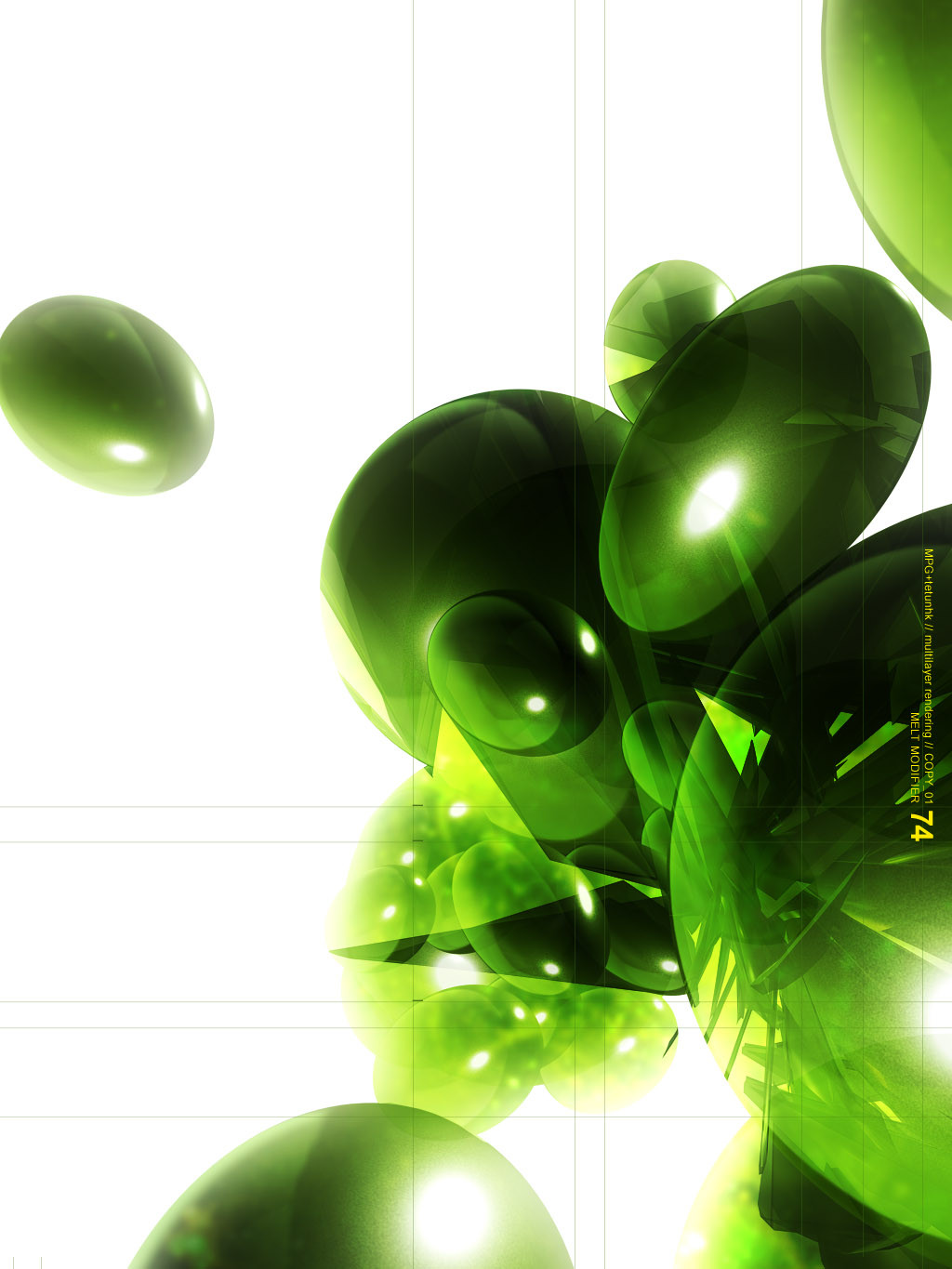
Battle:v.s.
Tulip Version One : [link]
Made in photoshop 7.
enjoy
Related content


Comments: 24

Really cool the way you redraw flowers!!! Really really original!!! *O*
👍: 0 ⏩: 0


pimp as fuck +fav
the drop shadows look ill
i just dont know if i like the dripping
👍: 0 ⏩: 0

magnificent.
this has so much depth.
and awesome colors.
👍: 0 ⏩: 0

this is by far the coolest picture i have seen from u!
the 3d effect u add to the tulips with the shadows is such a kick ass idea!!...amazing peice of work this one ")
en i love the colors, the green en purple work very well
👍: 0 ⏩: 0


so so pretty. ... how was it with the circles and leaves? "if anything else doesn´t work hit the circles and arrows, right?"
you both do a good job. but please work on those glow effects, gradients or however you´re calling it. and the font!
i really like how the tulips themselve look. the "heads" are covered with a wonderful color and a good flowing design! i really like those!
typography is a big field.. i know. you can do that! i enjoy to watch the battles. great motivation
 (Wink)")
👍: 0 ⏩: 0

Wow! Love those tulips! I love finding art like this, it makes me want to create...
Oh and I dig the drippy circles, just my style
.netghost
👍: 0 ⏩: 0

Now those are some rad lookin' tulips!
The type could be a little less opaque, but everything is well done here. The background is definately a strong point. I found a new fav...all because of those sexy tulips.

👍: 0 ⏩: 0

BAH...I like the drop shadows (Smile)")
👍: 0 ⏩: 0

wow really like this love the colours looks really good!
👍: 0 ⏩: 0


uy fuckin sicko, u vector too well ")
👍: 0 ⏩: 0

yum.
tasty..im with meta..
not sure on the drop shadows..
definately styling though.
word.
👍: 0 ⏩: 0


