HOME | DD
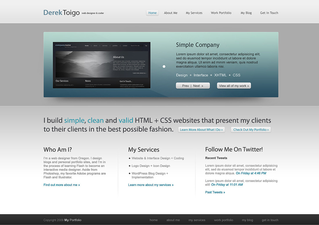
 acidflow —
derektoigo.com Homepage v2
acidflow —
derektoigo.com Homepage v2
Published: 2009-05-16 09:14:21 +0000 UTC; Views: 48268; Favourites: 528; Downloads: 0
Redirect to original
Description
Click image to fullviewA re-design of [link] . Comments and / or critiques welcome.
 (Smile)") View this design live here !
View this design live here !EDIT: WOW! Thanks so much for the DD to `NunoDias - I'm flattered! And big thanks to everyone for the wonderful comments and Faves!
If you like this design, you can purchase it and see my other templates from ThemeForest here .
© 2009 Derek Toigo.
Related content


Comments: 90

Awsome. I'd go nuts if I had to think about how a site should look.
I'm way better at the actuall coding.
👍: 0 ⏩: 1

Haha, I understand what you mean there. Perhaps I should keep you in mind if I need someone to code my designs in the future?
And oh, thanks so much for the Fave and DevWatch; much appreciated!
 (Wink)")
")
👍: 0 ⏩: 1
lol, thanks for even saying that. As long as I have the needed pictures, I can usually get a site to match the PSD.
Most welcome for the watch. I always look forward to seeing nice designs.
👍: 0 ⏩: 0

I absolutely love the blue centerpiece.
Gorgeous work, congrats on the DD!
👍: 0 ⏩: 1


Looks fairly cookie-cutter in nature. I've seen thousands of other designs similar to this. That's not to say it looks horrible though, because it absolutely doesn't.
👍: 0 ⏩: 0

wow, this is great! I really love it, how much are your web designs by the way? *is interested now*
👍: 0 ⏩: 0

Just read your comment about using gray. It's such a wonderfully neutral color to go just about anywhere, when in doubt. IMHO
👍: 0 ⏩: 0
Very clean, easy to read and pleasing to my eye...
👍: 0 ⏩: 0


definitely one of the finest web design I've seen recently..
👍: 0 ⏩: 0


Hi, I really like the design! One thing that I think would make a small improvement to it; the links up the top seem a bit out of place. Maybe a fading transparent gradient toward the top to blend it in with the background.
Good luck!
👍: 0 ⏩: 1
Thank you for your feedback. Yeah, I understand what you mean about the header region. There's actually a gradient there, but I made it super light, so it isn't very visible. I was actually mainly concerned about the gray background being so plain behind the feature region, lol. Anyways, thanks again for your support and feedback.
👍: 0 ⏩: 1
No problem! They grey and white minimalistic style works very well, so there's nothing to worry about.
👍: 0 ⏩: 0

Is really awesome. 
👍: 0 ⏩: 0


Wow, comparing from your previous version, this is amazing. The concept is still very similar yet the little details have really brought this together. Amazing design!
👍: 0 ⏩: 1
I appreciate hearing that; thanks so much for your feedback!
👍: 0 ⏩: 1


Simple, clean, precise, sleek, sexy, professional! It's all there and looks great! Excellent work and congratulations on the DD!
👍: 0 ⏩: 1


I used Myriad Pro for the logo, and Trebuchet MS for the navigation.
👍: 0 ⏩: 1

Wonderfull and clean design. Good usability with very pleasant colors. Good job!

👍: 0 ⏩: 1


<= Prev |