HOME | DD
 amandhingra — Webgraphix Logotype2
by-nc-nd
amandhingra — Webgraphix Logotype2
by-nc-nd
Published: 2007-10-07 20:37:06 +0000 UTC; Views: 18776; Favourites: 205; Downloads: 1063
Redirect to original
Description
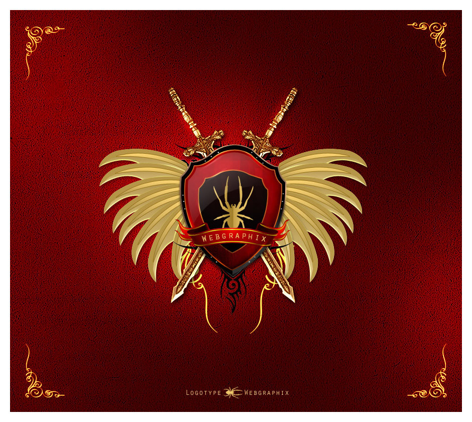
LogotypeThis is sunday Boredom
")
everything is vactor by me except swords.
Hope your like it guys
 favs appreciated
------------
edit : more work on details
 (Smile)")
Related content


Comments: 225

 (Wink)")

thank u so much means a lot
👍: 0 ⏩: 0


personally, get rid of the black tribal stuff it's against the grain of the rest of the emblem, and I'm not a fan of the texture in the background....i'd like to see a leather book cover style perhaps to offset the gold and seemingly royalness of it. Way better font could be used for the "web graphics" but I am usuming that is a company trademark or something..
👍: 0 ⏩: 1
thanks u so much for your great comment and time . i like your critic and will work on it definitely
thanks again 
👍: 0 ⏩: 1
yeah try and think regal! gold, guilded, expensive, refined.
👍: 0 ⏩: 1


beauty....
How to made this background?
👍: 0 ⏩: 1
o...
but this work is beauty too.
👍: 0 ⏩: 1


Agree with roboflexx.
Not the first time
👍: 0 ⏩: 1
yaah i m also agree wid the roboflexx and you dude. its not our idea. more then 1000 people already tried this before
👍: 0 ⏩: 1
I can come with more examples if you want?
👍: 0 ⏩: 1
that what i m said... there are so many
👍: 0 ⏩: 0

wow !!! just awesome
👍: 0 ⏩: 1
hahah lol . thank u soo much bro. means alot
👍: 0 ⏩: 1

This is logo or logotype ? and is it vector ?
nvm sweet
👍: 0 ⏩: 1
this is boredom
👍: 0 ⏩: 0

wow looks cool.. but somehow i didnt like the background + borders and WINGS too.. rest is looking really SUPERB ")
good stuff
👍: 0 ⏩: 1

Looks like the logo was inspired by [link]
👍: 0 ⏩: 1
no bro. i hav seen your logo many times but its my own creation.. no inspiration
👍: 0 ⏩: 1
Actully that kinda logo always design in this manner.. one shield and two object cross bhind this. its not new. its use many times before.. u can c everywhere. u cant say that that u idea bro
👍: 0 ⏩: 0

aaaannnddd the winnnnneeerrr iiiiisssss...... AMANDHINGRA!!!!!
very cool!!
👍: 0 ⏩: 1
hahah lol thanks dude

👍: 0 ⏩: 0


")
thanks dude
👍: 0 ⏩: 0

WOW ...
It's great, really, really great !! Red is my favorite color
I like the shield ... it looks like those shields of Warcraft. But, it also demonstrate power, strenght ... I like that.
Congratz, it's a DAMN great job \o/
👍: 0 ⏩: 1


Great work, Love!
This wouldnt show up yesterday
so Im glad I ran across it again.
👍: 0 ⏩: 1

IMHO id take the wingy things out.
a. the detail on them just dosent match the other parts of the logo
b.the color is awry and dosent really go witht he gold on the logo
c.it takes away from the overall presentation of the logo.
👍: 0 ⏩: 1


<= Prev | | Next =>