HOME | DD
 apples-ishness — A Distinguished Gentleman
Published: 2014-05-10 13:57:27 +0000 UTC; Views: 2310; Favourites: 46; Downloads: 0
Redirect to original
Description
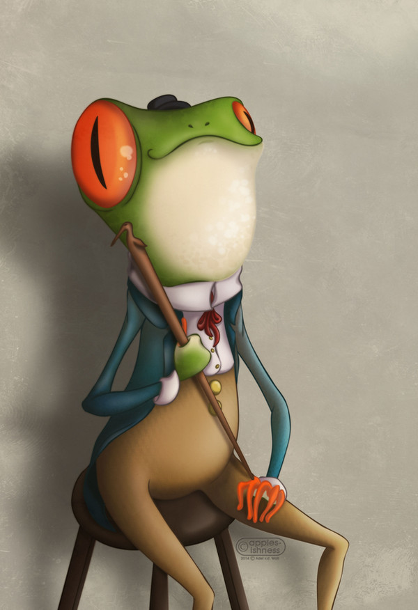
| PRINT AVAILABLE |Originally inspired by an illustration in a book from my childhood about a frog with a cane that has to rescue a princess.
Comment for a Comment Project
If you give me feedback/comment, I will return the favour.
Some feedback on the shading would be appreciated. Some feedback overall would be very appreciated. I struggle a lot with the shading, but at least everything is blending in with the background.
Made in Photoshop. All textures from lostandtaken.com
======
2014 © apples-ishness (Adél v.d. W.). All rights reserved.
Please do not alter, reupload or sell without written permission from me. Thank you.
Related content


Comments: 78

The first impression I got was "this is well rendered". Not only does the shading work well with the texture, it is very smooth and blends in nicely with the colours.
The colours, however, are not a personal favourite of mine.
I have a bigger problem with the lighting. The shading is consistent, both as far as the light source and as far as the overall rendering is concerned. But the brighter spots are a bit off. Light seems to come both from the top right and from the right.
The shadow on the wall looks good. But the longer I look at it, the more I get the impression that it is warped - and there is no sign of the wall being warped...
The overall design is really great. Amazing, even. Here are a few things that I liked and disliked:
The left leg seems smaller than the right one.
The mouth is both cute and doubles as a moustache.
The cane is resting on his knuckles?
Hat to eye ratio.


👍: 0 ⏩: 1

Very well put! I couldn't say it any better myself.
👍: 0 ⏩: 1
everything except for the inconsistent lighting. I'm looking at it, but I don't see where you are coming form with that.
👍: 0 ⏩: 1
The eyes are coloured differently from each other.
Together with the shading, they also imply the light coming from the top right.
The white spots, however, are really bright and I assume they are reflections. But they behave as if the light would come from the right.
The arms. One arm is much brighter than the other one.
The stool and the clothes imply the light source is on the top right again. But the belly is brighter in the middle instead of further above.
👍: 0 ⏩: 1
Oh! Now I see them!
Thank you
👍: 0 ⏩: 0

Overall I think the shading is good some spots on the face are little flat but overall a job well done. I like the style of dressing especially the colors that complement each other. I also enjoy the expression of the frog.
👍: 0 ⏩: 1

Indeed he is a distinguished gentleman!
As for constructive feedback: Love the shading, it's perfect to me. Only thing that I noticed, which could be "me", is that the stool isn't in the right perspective in relation to the frog. You're looking from above at the stool, but from underneath if you're looking at the guy's head. Does that make sense? Could be "artistic freedom" though. But that is the only thing I noticed that you could change to make it more perfect.
Love the quirkiness, love the hat! Love the background! Awesomeness!
👍: 0 ⏩: 1

Thank you!
The chair was a bit of a slip-up on my part...
👍: 0 ⏩: 1
 (Smile)")

I love the whimsy of this and that is one cute frog.As said above,I love the color contrast between the subject and background.I love how you remembered his shadow. I noticed there's more shading under the right end of his mouth than most most places,was that on purpose? His hat needs to be a little more pronounced so it can be identifiable.
👍: 0 ⏩: 1
Thank you,
I tried to emphasize the odd shape of his head to make him more comical, but I can see how the shading on the right side might seem off.
👍: 0 ⏩: 1

I think the vibrant colors you used in this, they really go well on this whimsical picture. You did a good job with blending the colors together.
Your shading has enough contrast to stand out which makes it effective in giving the picture some depth. Overall it's really good, or at least sold me on the effect.
There are a few places where it wasn't quite as effective though, or at least it didn't look right to me.
On the head you the top half was done very well, but along his chin and neck it's fairly flat. You do have the spots darkening at the bottom and along the left edge, but the base color remains the same. I think if you were to give it some sphere like shading it would help bring that out.
The top of the staff also has an odd flatness to it. The highlight color carries through unbroken from the bird's eye down to the shaft of the staff, making it all appear the same distance from the viewier. Perhaps darkening the bird's neck would give a little more dimension to that? Sort of like how the beak is darker and appears like a difference surface than the head and body.
You've got great cast shadows by the way. The frog's shadow on the wall lines up, even including a bright spot in the crook of his arm, and has a nice fuzzy edge from distance. While the staff has a sharper shadow across his belly.
Though I wonder if the staff's shadow should have some arc to it? It might help to reinforce the shape of his belly, with the curvature of his stomach the staff should be nearest him by the buttons then further away down by his hip where his body curves away. Ok now I'm staring at it and the tip of the staff looks off a bit. The way the shadow goes it's keeping close to the staff itself, except the staff tip seems to be on his knuckle, which means the cast shadow should be further away.
One last point and I'll stop, the three stool legs appear to have the same shadong value to them, which makes me see them at the same depth. The middle one like ought to be darker to push it further away from the viewer.
Despite these points I do think you did a good job with it. When you aren't staring at it seeking out things to nitpick about the shading does a great job of giving him the proper depth and form.
Found your picture on ProjectComment
👍: 0 ⏩: 1
Thank you and thank you the advice and feedback
👍: 0 ⏩: 0

")
 (Wink)")
👍: 0 ⏩: 2


Not as obnoxious as Mr Toad.
👍: 0 ⏩: 1
But only half as trendy!
👍: 0 ⏩: 1
Needs more badgering
👍: 0 ⏩: 0

This looks - PROFFESIONAL !!
I love your line work and how you did'nt use black . It makes the character look more lifelike
I love your shading , espesially in the eyes - you gave them that iridescent glimmer . His expression is so sweet too
And the little details like the stork on his cane , and his little gentlemen's hat EEEEKKKKK So cute
Wow , well done on this , you did a Freak'in awesome JOB !!!
👍: 0 ⏩: 1
thank you so much, dear

👍: 0 ⏩: 0

ahaha he looks quite manly and distinguished.
This looks amazingly pro by the way dear. ^^
👍: 0 ⏩: 1
<= Prev |