HOME | DD
 atleastwedream — untitled III

Published: 2003-06-24 01:32:06 +0000 UTC; Views: 2159; Favourites: 29; Downloads: 615
Redirect to original
Description
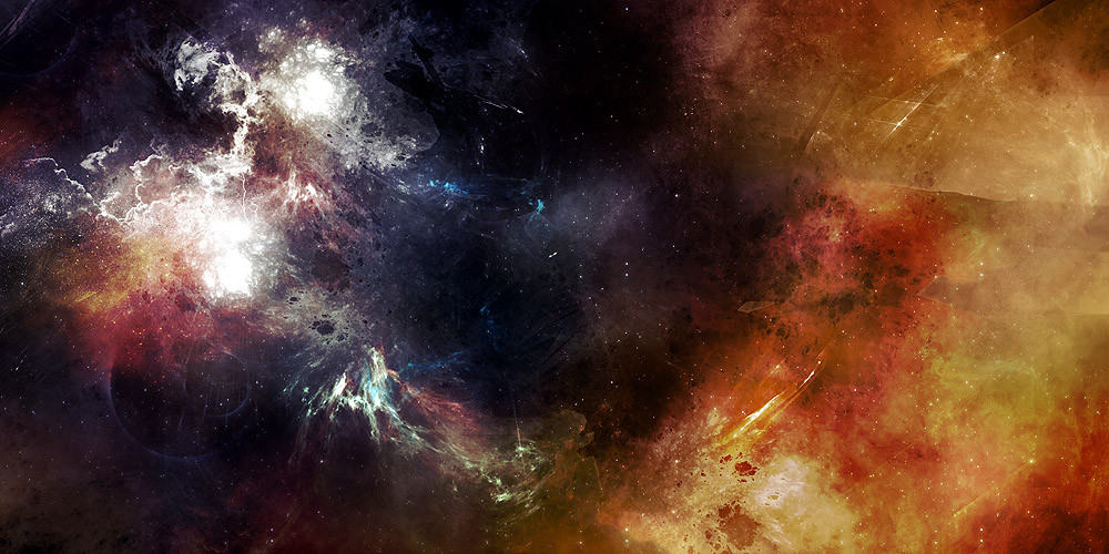
done last october, only a couple of people have seen this, another mess around peice, photoshop only.Related content
Comments: 51

wow! fantastic use of colour an tone.. a nice blend of imagery.
favorite.
👍: 0 ⏩: 0

ow wowa! this is very nice. looks like a used pallette. great!
👍: 0 ⏩: 0

you create brushing like I have never seen. I love it
👍: 0 ⏩: 0

wow this is awesome...reminds me of one of the 1970s epic paintings of starships and space stations that look impossibly huge...this could be the perfect backdrop for such a piece...amazing!
👍: 0 ⏩: 0

only photoshop?
there's no way man lol...
again, great work
keep it up
*mP
👍: 0 ⏩: 0

gj, but it irritates me to see the same brush-pattern used all over.
it's very visible in the white areas and in some other places too.
you could vary them more...
other than that, just amazing, reminded me of greg martin's work.
👍: 0 ⏩: 0

wow !
I am speechless. It looks realy nice.
cYa
CrewLer`
👍: 0 ⏩: 0

Photoshop only ???...
Whaouh !!! Splendid brushing !!!
👍: 0 ⏩: 0

NIce work as always . nice choice of colors and I like the flow of the img . The only thing I dont like is that the painting looks kinda kills the depth in this .. but other then thats its great.
👍: 0 ⏩: 0

I dig that white stuff, though I can't imagine what it should be
👍: 0 ⏩: 0

I love the colors, I have always been a fan of the choice of colors you put in your image mate. Although the brush is unique I can't tell if I like this or not. Its one of those iffy things. Since this is old I can't really say much because I am sure you have improved dramatically since then. The one thing I do like is how it looks like a painting. I'm not saying that you did this but is this a filter. I doubt it is i mean it is coming froma great artist.
👍: 0 ⏩: 0

holy shit that is great!...this is a masterpice and i commend you for using your imaginatiion to create it! instead of like alot of peole who just use the application settings to make a sky which isnt created by them but the creators of the app they use!!!!!!!!!!!!!!!!!!!!!!
👍: 0 ⏩: 0

its a liltle bit the same what desekt is saying. There are actually 2 images..the focal point is at the left side that distracts the right side. The colors at the right side dont fit with the colors at the left side. To make the picture more attractive you can add by example more light to the right side so it becomes more attractive. Or make it the same color.
Btw. The left side is good
👍: 0 ⏩: 0

I'm quite glad that you're back. Always loved your stuff in the past, and now you're back for more wonderfulness. Yay.
👍: 0 ⏩: 0

awesome colors blending and lighting things
looks like very 'artistical'
👍: 0 ⏩: 0

i dont like it all. the right side doesnt fit in whatsoever and is just distracting from the rest of it. the left side is pretty good, but would be much better on its own. cut out the right side and replace it with empty blue of the left, so theres lots of negative space - then it would be much nicer. also, id like to see more vibrant colours on the left side, such as stronger pinks and purples and blues like the baby blue on the bottom.
right now its sorta dull and looks just random with the two completely contradicting sides. of course, maybe you wanted contradicting sides, but when that is done, the two sides still complement eachother to make the piece flow nicely.
👍: 0 ⏩: 0

now this is the top-class work very nice! the motion inside is captured wonderfully in this image
👍: 0 ⏩: 0

Wow, incredible brushing, amazing that it's photoshop only.
👍: 0 ⏩: 0

from october? really sweet, one of the best brushing pieces!
👍: 0 ⏩: 0

All photoshop?! This is amazing, I'm really at loss for words! I don't hand out that many favs but this is definitly getting one
👍: 0 ⏩: 0

I love the colors. Unless its my computer some parts seem a bit grainy. But it is old
👍: 0 ⏩: 0

thats some crazy brushing man. top notch stuff
👍: 0 ⏩: 0

amazing brushing..and nice sharpening or whatever you did!
its incredible!
great colours too
👍: 0 ⏩: 0


