HOME | DD
 b0se — Codename: Opus 3.0
Published: 2004-07-27 02:32:07 +0000 UTC; Views: 605234; Favourites: 667; Downloads: 390678
Redirect to original
Description
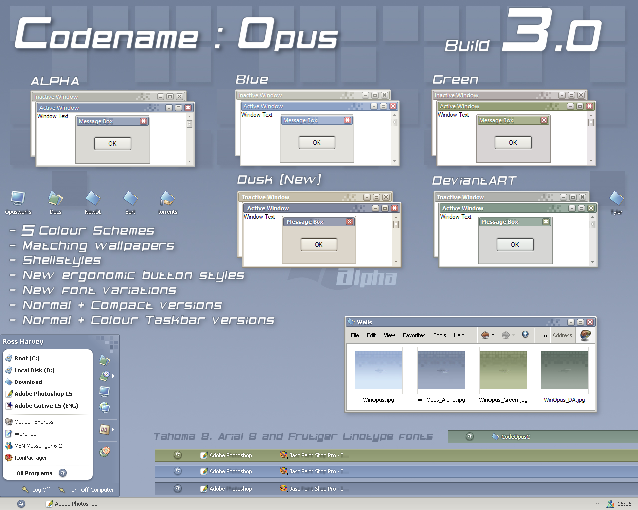
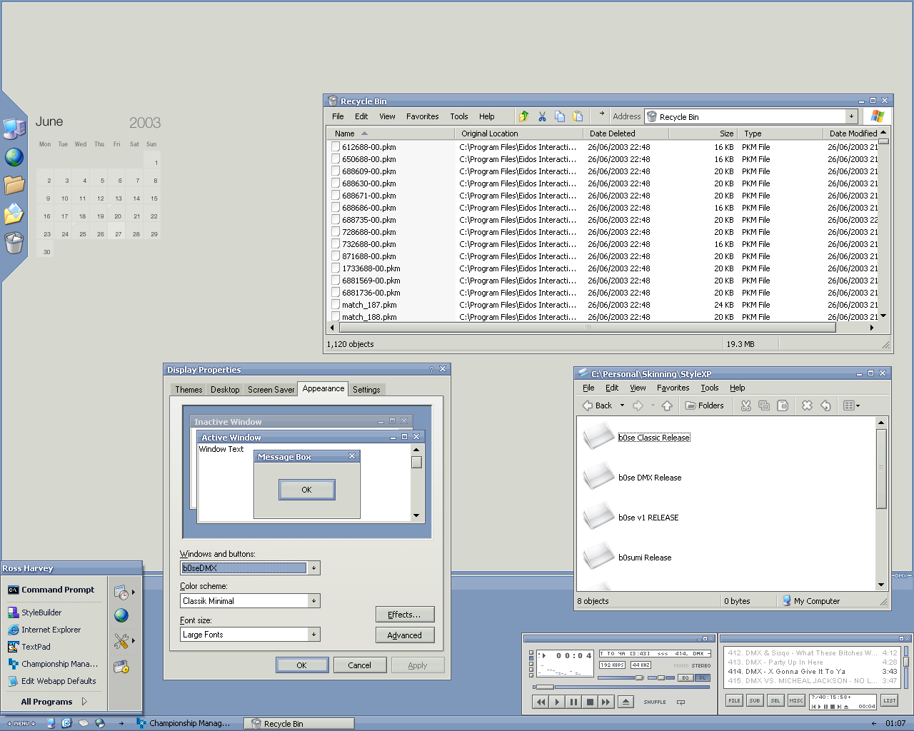
CO is designed as an ergonomic replacement for the default Windows Classic theme. It was designed with long-term use and compatibility in mind.Features
- 5 colours: Alpha, Blue, DeviantART, Green and Dusk
- Normal & Compact start panel versions
- Classic and Coloured taskbar versions
- Matching wallpapers and shellstyles
- Yz Dock by Manyk (no Dusk)
- new font choices:
Normal: Tahoma 8
Large: Arial 8
XLarge: Frutiger Linotype 8
The icons in the screenshot are Marvilla's Pastel set ([link] ).
The GANT set goes very well with the new Dusk version!
Please refer to the readme (included in zip) for full theme information (and update history).
Hope you enjoy the theme, comments would be appreciated :¬)
Upcoming---
1. Working on a WindowBlinds port
Related content


Comments: 294

We've got a serious winner here. Great work, as usual!
👍: 0 ⏩: 0

Most excellent VS. I love your Opus line of skins ... this skin is the only one that has been able to replace OpusXP on my computer for more than a day.
👍: 0 ⏩: 0


After the weekend I'll be fixing every bug thats been reported, so expect an update soon after :¬)
Thanks for all the comments and favs!
👍: 0 ⏩: 0

Quick Update:
I noticed today that the clickable expander of the system tray is very very small, and you have to target it perfectly in order to activate it. This is a bit of a problem as I use it a lot. I often have to click 5 or six time before I hit it just right.
👍: 0 ⏩: 0
Dude, I love your work. It makes me drool. The only problem I have with you is that you keep putting out such awesome VS's that I can't make up my mind which ones I want to use. I have one question. Any of the programs like Photoshop that use the many different tool windows always paints a dwarfed version of the normal size minimize and restore glyph beside the normal small caption close glyph. I know its only nit picking, but its pretty damn annoying. Any suggestions on how to fix that, or is that just a limitation of the MSStyles Engine?
👍: 0 ⏩: 0

This is just sooo amazingly detailed. i love those little squres pattern on the corners of each window. and the start menu looks great. just the way I like it. so little, yet usuful. 
can I have a suggestion or better say request plz? I so need a pink or black visual style and this one looks so great. can U make a pink/black version plz? I'll be sooo thankful for the rest of my life!
👍: 0 ⏩: 0

Damn you Bose!, stop updating the theme everyday
👍: 0 ⏩: 0

*cries* Argh it's torture seeing this screenshot and name in my "Deviations" section, than learning it's STILL not the Windowblinds port.
Hope it's coming along B0se, this skin looks absolutely amazing, I even downloaded StyleXP and used it back when the taskbar was only grey, but didnt like StyleXP. ")
👍: 0 ⏩: 0
Thanks for the sarcasm. This was neaver meant to be a new theme, like Vector-Cell. Its a classic replacement, so it WONT look 'original' (even though its made from Luna, so it is 100% original).
After all the effort I put in, I just love these troll-like comments.
👍: 0 ⏩: 1

dude....i like your other work.....Deep Opus was awsome.....i'm not bashing the theme...it is nice.....maybe you could even darker themes....for the people who like dark colors one day
👍: 0 ⏩: 1


Whoaaaa Brother! This is Smooooooooooooooooooth. Awesome. Love your work.
@ 2.4 MB it is a big file for a Visual Style. Must have put in a lotta hard work.

👍: 0 ⏩: 0

Amazing, amazing work. 👍: 0 ⏩: 0
I just want to say that the majority of visual styles installed on my machine do not stay on for long.
The reason? Not
Yours are different, though.
I've used b0se DMX since it was released, and now I'm going to be using Opus.
Great work.
-alip

very very nice theme. I will be using this for ages
@silentpixel: I also failed to have the text size arrow in PS, i reapplied the theme and now its there, odd.
keep up the ace work b0se, just going to check out your old pieces now ¬_¬
👍: 0 ⏩: 0


Ahh, you never disappoint Sir b0se. I'll be waiting for the WB conversion though...
👍: 0 ⏩: 0


sweet.. you added it for me
sorry to still have something .. in 8 point frutiger is too big...it will look cleaner at 7 pt
but i can change that myself.. except in the startmenü.. but i am happier than with arial
")
👍: 0 ⏩: 0

Very class, nice 'watercolor' effect.
goes with other classics like Reluna and such!
thumbs up!
👍: 0 ⏩: 0

WindowBlinds, WindowBlinds, WindowBlinds, WindowBlinds  (Smile)")
👍: 0 ⏩: 0


As ever, amazing work b0se, the dA colour scheme is a great addition.
👍: 0 ⏩: 0

Really usable and nice, but I don´t like those default min/max/close butoons (But I know it was designed to replace the default style).
Good job indeed!
👍: 0 ⏩: 0

Just gotta say again how awesome this skin looks, I can't wait for the WB port. ")
👍: 0 ⏩: 0
Thanks
Added Frutiger Linotype, I agree b23, it is a lovely font!
The shoutout for a DA colour got added also :¬)
👍: 0 ⏩: 0

That is very awsome! I love the look of it! Dling it now.
👍: 0 ⏩: 0


Very nice theme, and usable too.
Most themes I use (Chaninja, Xbox and Carbon) have lots of rough edges. this one doesn't. Great work.
(Maybe a DA color scheme...  (Wink)")
👍: 0 ⏩: 0
hey man why you put the grfx in the inactive state
was better in plain grey in your previous version.. and the coloured taskbar should be more plain like the one in the first one... except of that still as good as before ^^
👍: 0 ⏩: 1
I prefer it in, it adds completeness to the theme. You can always mod it yourself by using the old caption bar image.
You also need a slight gradient on the coloured taskbar, it looks odd without. The original grey version is the 'plain' version, use that :¬)
👍: 0 ⏩: 1
how can i modify your theme?
and how can i change the font of your theme?
👍: 0 ⏩: 0


Tonight. Kewlness! Where are you in the world, it might be night already. hehe. Lookin forward to it.
👍: 0 ⏩: 0
Thanks guys!
Info on the update:
- Fixed a few small bugs
- (Still) Adding coloured taskbar (which will have close caption always red)
- Rounded tab headers
- Added inactive style caption bars
- Misc ehancements
The next release, which will jump to Codename: Opus 2 will (should) be out tonight (wednesday), with a grey or black colour scheme included.
👍: 0 ⏩: 0


Make that into a window manager for x.org, and I'll use it.
👍: 0 ⏩: 0
<= Prev | | Next =>