HOME | DD
 BITEGHOST — kovacz - Butch
Published: 2014-02-11 03:28:19 +0000 UTC; Views: 650; Favourites: 28; Downloads: 0
Redirect to original
Related content


Comments: 2

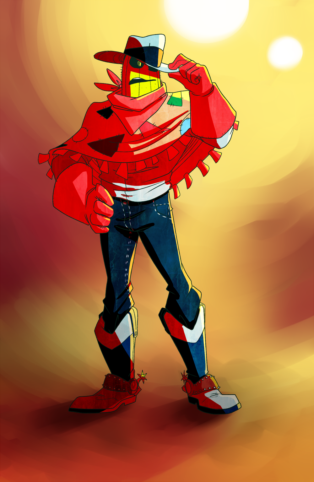
I feel like this is the first time I've ever seen a cactus character with actual hands! Although the feelings of love for this character are mutual! Butch has a simple, but lovable character design. Your decision to make the spines more subtle makes a bigger difference to the appearance and my first impressions of the character than I thought. Without a doubt, Butch's appearance definitely matches his personality, so don't worry about that. Again, I'm just intrigued how the subtlety of the spines just makes his face look different.
The painted background by itself looks incredible. The soft brush strokes contrast well against the hard line art and coloring. I'll admit I have some mixed feelings about using red for shading though. It just seems a little too strong/vibrant for me, even as a result of the lighting/background. In future instances of adjusting some of the lights and shadows, I'm starting to learn that complementary colors tend to work well. Just making the necessary adjustments (tint/shade, possibly opacity, etc.) can be a bit tedious. "Color Shifting" can take that a bit further in some cases.
Still, I like the fact that your characters are starting to look less flat now. Some variations of line weight could be used to strengthen that even further. It looks like you're using a little bit, so forgive me if you did a lot more of that than it seems. I can relate to that after I finished working with a recent deviation.
In spite of my nitpicky constructive criticism (sorry about that....), rest assured that this is still an excellent piece. Just keep working at it, inside!
👍: 0 ⏩: 0

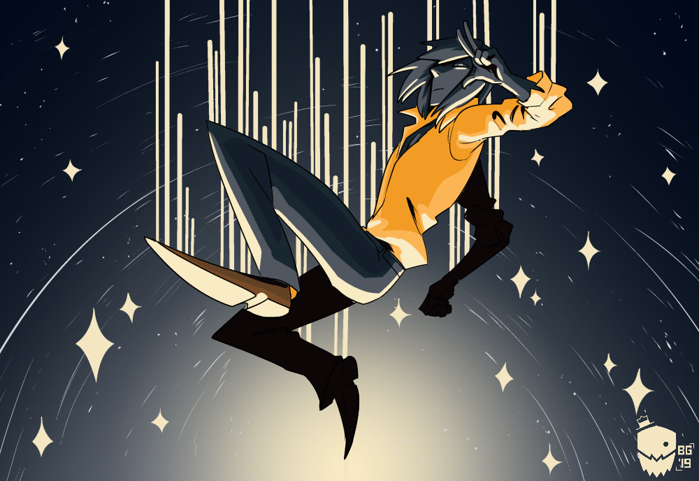
Ooooh I was wondering where this guy is from! (Thanks for the link haha, I shalt add it to my endless list of comics to read)
But looking preettyyy spiffy! I've liked the intense, almost neon colours on this guy whenever he pops up on Tumblr, and you've kept true to that intense-ness. Again, lovely line work and expression in pose, and the shading's pretty neat too.
Also I've noticed you're adding more undertone textures into your work. Gives a nice sort of organic feel to the normally flat colours and cell shading. I would only suggest you keep an eye out on these repeat textures and try to keep them minimal, because it can get obvious when the grain is too small/repetitive (in your Backlash comic pages it becomes a little more apparent). Try the stamp tool and overlaying some more organic brush textures on really low opacity just to make sure any larger areas with a texture don't get too automatic.
👍: 0 ⏩: 0