HOME | DD
 blahguy0 — WARPS2
Published: 2008-05-06 20:07:10 +0000 UTC; Views: 163; Favourites: 1; Downloads: 6
Redirect to original
Description
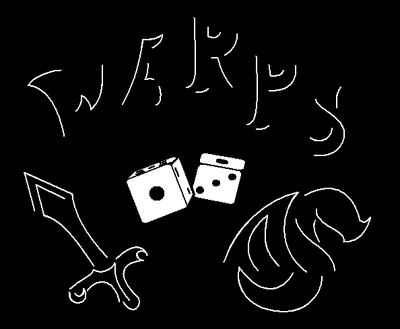
Here's my second attempt at this. Just keeping it simple, again. Dragon and a sword to the right and left of the dice which are the only things colored solid to draw more attention. WARPS is written in a Law&Order-ish outline kinda way cuz it's just simple lines that go with the dragon and sword.Made for s contest. Should probably ask for a limit on entries to avoid overloading her with crap, lol.
Made entirely in Paint.
Related content


Comments: 1

I like this...I love the way you've done the dice, they look really good. From the reaction of the judges so far, the main thing they're noting is that the writing saying WARPS isn't quite clear enough...and they mentioned the same for the first logo...
Personally, I love the way you've drawn the sword, it looks so cool...would be an awesome tattoo!
👍: 0 ⏩: 0