HOME | DD
 blastafuzix —
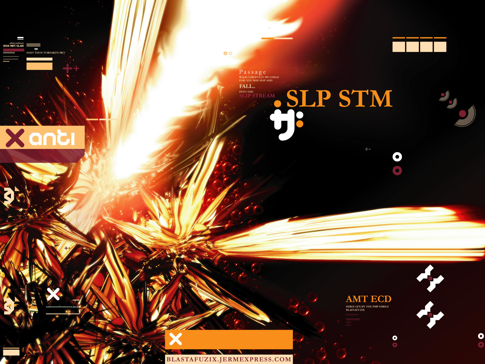
SLP STM
blastafuzix —
SLP STM
Published: 2002-11-24 00:08:46 +0000 UTC; Views: 17644; Favourites: 63; Downloads: 8642
Redirect to original
Description
SLP STMThe slip stream.
Trying hires stuff out. This is a cropped shrinked part of a 300 dpi poster over 2400x3300 pixels. Decided since i got the firepower on my comp id put it to use to make a poster image for myself.
3DMAX+PS+ILL
RESOLUTIONS 800 - 1600 IN ZIP
Later!
Related content


Comments: 112


You have your own style mate, and I am seriously digging it Top work!
👍: 0 ⏩: 0

it's quite interesting. i'm liking the colour scheme and composition. great as a wp. well done m8.
👍: 0 ⏩: 0

overuse of trendhore, unoriginal, you probably used every bit of design, ie all the little 2d things, in this design, there is not much flow since the 2d surrounds a certain part creating a static flow which probably wasnt what you were going for
👍: 0 ⏩: 0


I like it, but I see so much of this kind of art that it bugs me.
I'm interested to know what you people render in!
👍: 0 ⏩: 0


very inventive. I prefer small crosses and lines and that crap, but nevertheless. Very effective.
👍: 0 ⏩: 0


This is how it's done folks, take notes. Althoug a bit busy in some areas, overrall it's everything a wallpaper of it's kind should be. Excellent work.
👍: 0 ⏩: 0

I think the typography is overdone and it's a tad oversaturated, but aside from that it's excellently composed.
👍: 0 ⏩: 0


Question , the poster you scanned and then cropped , was it copyrighted?
I didn't see any permissions here so just wondering
👍: 0 ⏩: 0

finnally you get the well deserved DD man ... congrats bro !!
👍: 0 ⏩: 0


Very nice
I don't like the smudge though, it's too obvious
👍: 0 ⏩: 0


it's late so i won't go on a blabbering rampage
excellent work as usual, i kinda wanna take a trip into the slip stream just for fun.
👍: 0 ⏩: 0


awesome work on this piece, the colors flow excellently together
and every element works great (3d, illustrator)
but a tad to busy for my desktop
👍: 0 ⏩: 0

i would like to see the full size version, set it up on a site somewhere
👍: 0 ⏩: 0

You sure as hell have got the firepower, but it seems to me like it's trying too hard to be something it's not. Typo and vectorsketch skills are alright (but this is me, haha, you DID get a dd.)
When it comes to this kind of trend stuff, it's a good rule of thumb to rule against roman fonts.. It feels a bit disheveled too, but over all the work's got some status.
👍: 0 ⏩: 0


whoa.. looking at the full (seriously) took the wind out of me... that is one seckzie render... instant +fav. once i get home its goin on my desktop.
👍: 0 ⏩: 0


~ yow! DD! go ~blastafuzix GO! nice job here and you know your style is converting the masses...rox.
👍: 0 ⏩: 0


Yeah, those renders are awesome... damnit. I've fooled with 3dMax for months and still haven't gotten anywhere.
👍: 0 ⏩: 0


Not a fan of the plain looking 2d, but the render is sweet.
👍: 0 ⏩: 0


Look nice but i don`t like duplicate the shape ! The whole is nice
👍: 0 ⏩: 0


woah, this peice is so stunningly wonderful, i love it
👍: 0 ⏩: 0


the colors are what made me look in full view.
awesome.
👍: 0 ⏩: 0

| Next =>