HOME | DD
 CuriousCucumber — Faces
by-nc-nd
CuriousCucumber — Faces
by-nc-nd
#angular #myoc #oc #cartoonystyle #stylechallenge #testingstuff #myoccharacter #myocharacter
Published: 2014-12-08 10:04:20 +0000 UTC; Views: 1235; Favourites: 50; Downloads: 0
Redirect to original
Description
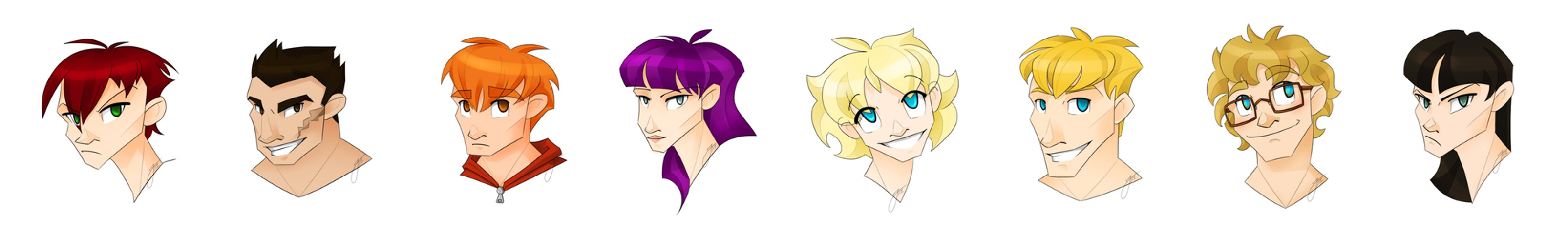
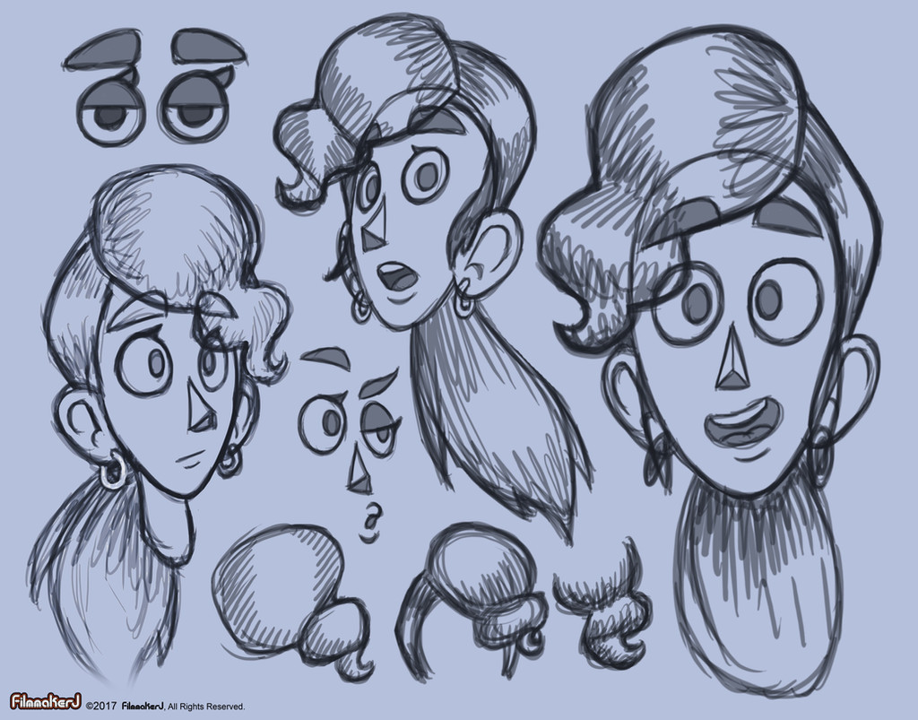
I had a boring media-lecture ....Just testing something new for a change.
I started out with a random Raze-doodle, and since my classmates really liked it - I ended up drawing the whole crew
Sidian07 and Blink2 being my inspirations with their awesome styles
Related content


Comments: 50

Hello! I’m here from with some constructive criticism.
First of all, this is an interesting lineup of characters you have. They have a wide variety of hair colors and styles, which means that most of them stand out from one another despite some similarity in facial features. My favorite is the one that’s second from the right. With his dreamy expression, messy hair, and big glasses, he seems to have the most visible personality out of all the characters here. I also like the red-head on the left, whose hairstyle is really unique, especially for a girl.
As for anatomy, all of these look good! I’m especially impressed by how you conveyed slight natural differences in the shape of the ears, the necks, and the mouths. The mouths on the three blond characters do look a little too big, though. I also think the eyes on a few of the characters (the blonds) look slightly off. The pupils don’t stand out enough against the irises, in my opinion, which gives them oddly blank stares. If you darken the pupils just a little, I think they’d look better.
In addition, a lot of these characters seem to have similar face shapes. This is especially apparent on the characters with the red, purple, (middle) blond, and (right) black hair. I understand that you’re trying out an angular style, but there are other ways to give them an angular look besides giving them all the same sharp cheekbones. I think it might also have a lot to do with the fact that they’re all in basically the same pose. Like another commenter said, I think it would be nice to try adding more variety in the angles of their faces, instead of just sticking to one line for the side of the face, one line for the jaw, etc.
The black-haired character on the right and the purple-haired character look especially similar, which I think detracts from the black-haired characters’ design. Because the purple hair, with its unusual color and style, stands out more, that character seems to have more personality, at least at a first glance. Of course, the black-haired character’s outfit could balance that out, but judging based only on these busts, she seems like the least detailed of the bunch. The middle blond also suffers from the same sort of effect compared to the two on either side (the glasses distinguish the one on the right, while the one on the left stands out more thanks to her(?) lighter hair). I think showing a hint of their clothing, like you did for the orange-haired character, would help fix that problem.
I see that you said in a comment that the resemblance was intentional for the red-haired and black-haired characters, but I’m not sure about the others. If the resemblance was not intentional, then you might want to reevaluate how you can add some more variation to their facial structure. (I wish I could be more specific than that, but drawing people is not my strong point!) If it was intentional, maybe you could add a little bit of context to the description before posting it in a group like Project Comment. While your watchers might be familiar with all of these characters, most people who see a piece of art like this won’t be unless they go through your entire gallery looking for context. It’s not the most important thing, but I think it would be helpful to prevent commenters from misunderstanding things (like the gender of the character on the far left, who I guessed was male until I looked at the comments). It would also make it easier for newcomers to your gallery in general to figure out what’s going on.
I also think that when you draw characters with hair that hangs over their eyes, the hair should actually block the eyes instead of overlapping with them. As they are, it looks like the hair is somehow slipping underneath the eyes, which is a strange effect. (I’ve seen other artists do this, too, but it’s always looked incorrect to me; it gives the whole piece a sort of sketched, unfinished appearance.) If you don’t want to block the eyes at all, I’d consider making their bangs a little shorter to avoid the overlap.
The same sort of thing goes for the hair and eyebrows. This is especially noticeable on the character with the orange hair; as it is, the way you drew his eyebrows showing through his hair makes me think that his hair is sort of transparent. I doubt that was your intention; it seems more like you’re trying to convey the characters’ emotions better by showing their eyebrow positions. But only part of the eyebrow is covered by the hair, so I think you could erase the eyebrow line where it overlaps with the hair and still not lose any of the nuance in the characters’ expressions (which, for the most part, look really good. I mentioned earlier that the second from the right has the most visible personality, but they all do have enough for me to hazard a guess at what they might act like).
Overall, I liked getting to see these characters and analyze their designs. It’s clear that they’re all well thought-out, and it’s cool to see you experiment with something other than your usual style. It’s always good to push the boundaries of your comfort zone as an artist. In the future, try to push yourself even further with the different expressions and poses to really highlight each character as an individual, while keeping the way they contrast with each other in mind. Keep up the excellent work!
(Also, while proofreading this comment I realized that what I wrote is pretty much an essay. I’m sorry to make you read so much of my rambling thoughts, but I didn’t want to cut anything out! 
👍: 0 ⏩: 1

Heya, thank you very much for your long and throughout comment ^^ I really appreciate the time you took to write it.
You've made many good points, this is an older piece and I think I've already overcome some of the issues (such as the large mouths, they used to be my Achilles' heel, same-face syndrome I suppose I still need to work on - believe me here they look way different from one another compared to my usual style)
this was also a style test so most often my character don't look this angular - the style was what I wished to have feedback on.
👍: 0 ⏩: 1
You're welcome!
👍: 0 ⏩: 0

Hello from ProjectComment !
Experimenting with new styles is fun.  (Smile)")
The first impression I had when looking at these disembodied heads is that it felt very adorable. Cute. Easy. Effortless. It felt like seeing a lineup of a series of characters from a regular animated show, and so since it appears that this was your actual intent, I would say that's a success! The blonde guy with glasses in particular reminds me of the, "I knew I should have stayed at home," neurotic kid from the Magical School Bus, and he is easily my favorite head out of the whole line-up. Probably because he is the most attractively drawn to my particular interests.
I think what stands out to me, the longer I stare at these portraits are the noses. All forms of anime tend to have very similar looking characters. Take off the hair of most anime casts and they all look like they have the same head for the most part. Small things can distinguish people here and there--jawlines, for instance. You've done a fair amount of work to create those differences in thinness of face, the height of the cheekbones, the thickness of neck, but the one factor that varies the most between each portrait are the noses. They have so much character! And heck, maybe I'm putting too much importance on the noses. They all look individual, unique, and have their own sense of base personality. As someone who has never watched the series that this is from, I can already kind of make rough guesses as to what type of personality each might possess.
Which is probably the more important part about using a different style to portray characters and art. If you can impart the subject's personality and uniqueness into the style, if you can give them each a sense of individuality, then that's all that matters for stylized portraits.
So, if you were to try this style again, a fun idea might be to create more complicated angles. For example, most people's cheeks sink in beneath the cheekbone, and even morbidly fat people will have a slight contour in their cheek beneath the bone. So instead of just strawing a straight outside line from cheekbone to the start of jaw, maybe a short, tiny diagonal line inward, then back out? Just really sort of play with it. Use those small, sharp angles to super exaggerate certain features, etc. Maybe you might find you like a super exaggerated angle style! And it will further help break the desire to draw everything in curves.
👍: 0 ⏩: 1
Thank you for your lovely comment and insight!
My style as it is ... it's very cute and round and sort of chubby ... I don't get all the Disney-comments for nothing, so I wanted to try something more angular and stylized and exaggerated and I probably had most fun with the hair and the different face shapes.
While this kind of aesthetics isn't what I'd usually do, it was nice to see my characters differently for once. This style is not from any existing series, but my own mix-match from several style of my friends'.
And I'm so happy to hear you like the noses - because noses were (and still are) something that I tend to struggle and sometimes I feel I have the same-nose-syndrome with my drawings.
👍: 0 ⏩: 0

These look really cool, but I feel like sometimes the necks are snapped/face structure is wrong. Like with the guy with light blonde hair, the way he tilts his head looks like he's broken his neck. You did do the person with dark blonde hair well in this perspective however. I think this is because of your front-faced perspective with the character. Although drawing a facing forward character is hard. Other than that, the female face structure (chin, shape etc.) looks too manly for my taste. Normally, unlike men, woman have curves and soft areas rather than block-y looking characteristics. It'd make a little more sense for the face to be more rounded. Also, not to be that person that scrapes the bottom of the barrel, but some faces have hints of same face syndrome or really similar faces. Like the very far right woman and the very far left man. Their faces almost look exactly the same, with some features slightly moved, or you rotated the face. The man with the scar and the man with blue eyes and blonde/yellow hair also look the same, not only in face, but in structure.
Overall, I feel like studying anatomy, even cartoon anatomy would help you in the long run. You're doing great so far though! Ciao~!
👍: 0 ⏩: 1
This style was not supposed to have any curves at all - hence the female have more angular faces too - making them rounder would mess up the general aesthetics I was going for.
Also I gotta disagree with your opinion on the faces looking the same - the noticeable similarities are merely due to the style and not facial structure if you compare the facial features, their proportions and sizes...that I think vary well enough to tell the characters apart.
Also I might need to point out that the first redhead on the left is actually a woman... who does share similarities to the dark haired lady on purpose.
👍: 0 ⏩: 1
I was just giving friendly criticism. You can choose to leave it and I respect that but you won't get better if you don't.
It may be a stylistic choice, but cartoons do have proper or correct like anatomy. (unless comedic-ly exaggerated or exaggerated expressions.)
However if you want to stay with the same style go ahead.
Have a nice day, ciao~!
👍: 0 ⏩: 1
That I surely understand and I really appreciate the time you took to write the comment ^^ This isn't my regular style by any means - but an style experiment I did.
Since this is an older piece I do agree on there being some fixing needed to be done when it comes to anatomy, but as for the same face syndrome you said you spotted
I'd welcome some more clarification and examples of how you would improve it.
👍: 0 ⏩: 1
I've been experimenting and trying to fix SFS by doodling. I think you should draw more emotions since the faces are already pretty different in detail (Not in the current face they're making). The only 2 emotions I can see are happy and...frustrated? Mad? Annoyed? I don't know.
Maybe try to draw more emotions that you haven't explored such as shocked, or sad and that kinda stuff. It helps distinguish characters. And of course if you want them to have the same emotion, you can make differences (one has their eyes closed and the other is winking, one's teeth are showing and one is smirking etc.)
👍: 0 ⏩: 0


I liked the orange haired guy. He seems cute and lil shy.
Also the blond with glasses. He's handsome :->
Nice work
👍: 0 ⏩: 1
Lil shy wouldn't do it really ... he's hella shy XD Rody doesn't talk and he's one of those people who almost run away if they have to interact with people.
Mercury is almost the complete opposite then
👍: 0 ⏩: 1
Oooooh <3 Rody is so cute! Why shy guys are just so cute?
👍: 0 ⏩: 1
I guess it's the general "people go away" attitude that makes us not wanna go away XD
👍: 0 ⏩: 0

Lots to study and learn here. Thanks for posting!
👍: 0 ⏩: 1
Anytime ")
👍: 0 ⏩: 1
When I can draw faces like that, I'll know I've improved! lol
👍: 0 ⏩: 0

Awww look at all of these lovely babies! I really love this cartoony style!! Simple but still fun!
Dang now I'm tempted to do human headshots of my characters...
👍: 0 ⏩: 1
Heh it was a fun experiment and who knows maybe I'll doodle around more with this style
DO IT! doo eeeeet ... you know you wanna ;D
👍: 0 ⏩: 0

OooooooooooooHHHHHHHHHHH ANGULAR FEATURES
Simple and effective, absolutely fantastic!
👍: 0 ⏩: 1
Ah thank you 8D I'm pretty happy with these myself
something different for once
👍: 0 ⏩: 1
My pleasure! It must be refreshing in some way XD
👍: 0 ⏩: 0

musta tuntuu että vaikka piirtäisin ne perunoina ne näyttäis hyvältä XD
👍: 0 ⏩: 0

Wait… you say l really inspired…? Like, l inspired someone? º-º… how can that be even possible!
Groovy style, like it!
👍: 0 ⏩: 1
Yup - that style you developed for uni looks so cool and I kinda wanted to try something similar out with my own style
👍: 0 ⏩: 0

rlly dig the style variation!!! it's v expressive <33
👍: 0 ⏩: 1
Thank you
it was fun to try something less round and cute like my usual style
👍: 0 ⏩: 0

Jos näistä tehtäis piirretty, ne näyttäis tollasilta.
👍: 0 ⏩: 1
ite kyllä suosisin perinteisempää tyyliäni XD
mutta nää vois olla jotain ... en tiiä sarjista
👍: 0 ⏩: 0

Oh god i love it! You draw them look so cartoonishXD
The way you draw those boy faces it makes them look more manly
And for the ladies they look great too, but maybe you should make their face a little bit round or heart shape (but for raze she's okey with square face)
Ooh boy i think i'm in love with speedwind

👍: 0 ⏩: 1
I just wanted to try something more close to your style that I love to bits
haha Rody at least looks manly with that chin XD but he actually has the strongest chin line (after Kron that is)
in general I just wanted to go more angular this time - since my style usually is so soft and round
but did you see Mercury? I mean loook at that cutiepatootie <3
👍: 0 ⏩: 0


100% cartoon! 8D
I notice they had three blondes XD
👍: 0 ⏩: 1
yup - and no one is a pure brunette since even Kron's hair is more close to black than brown XD
whoops
👍: 0 ⏩: 0


Näyttää hyvältä, tuo tuollainen cartoon-tyyli! ^^
👍: 0 ⏩: 1
sitä oli kiva kokeilla
mut tuskin teen mitään tän kummempaa
👍: 0 ⏩: 0

just a test though :3
took me long enough to accept the fact that my style is round and cute
but this was a nice experiment
👍: 0 ⏩: 0

I don't know why, but I'm getting a moonin feel from this. Maybe the hair style? XD
👍: 0 ⏩: 1
Moomin? they are not that angular
👍: 0 ⏩: 1
It's the hair mostly...Or i was dead tired making that comment? XD
👍: 0 ⏩: 0


wow nice for my fav is Raze Rody Amy Piper and Mercury
👍: 0 ⏩: 0

