HOME | DD
 demix — SSR-wp
Published: 2004-08-24 12:44:20 +0000 UTC; Views: 9331; Favourites: 99; Downloads: 4480
Redirect to original
Description
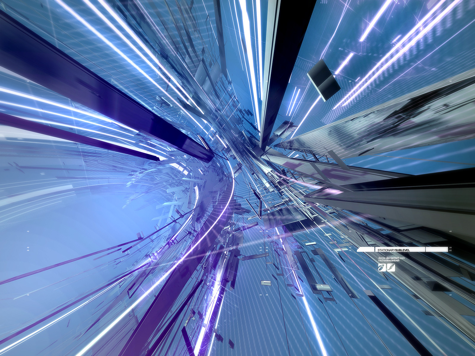
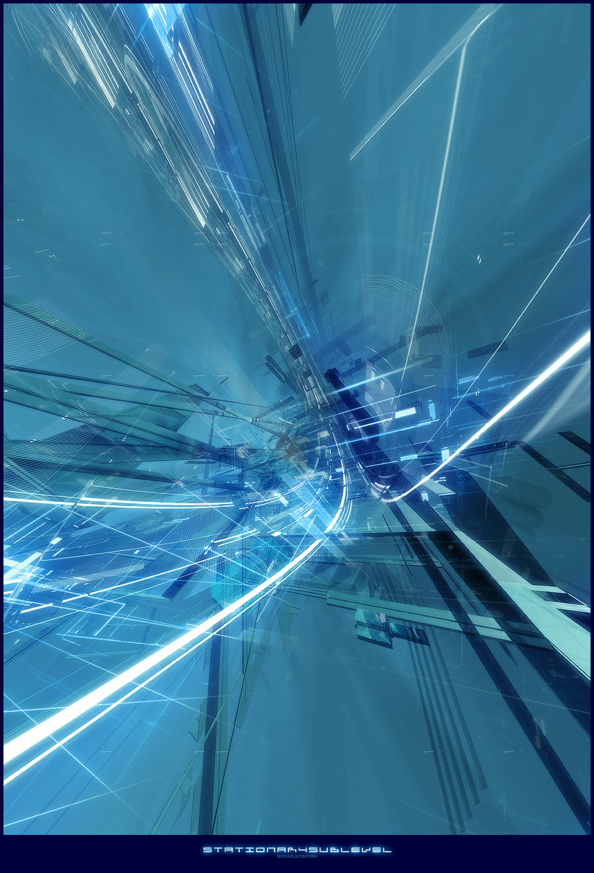
stationary sublevel remix, wallpaper editionas requested. just duplicated the 'station' 4 times, chose a new camera angle and added some depth, and changed some textures here and there too. the .zip file contains:
- 1600x1200
- 1280x1024
- 1024x768
- 800x600
c4d and ps7 as usual
edit***
took out the 'depth of field' after alot of complaints
Related content


Comments: 71

nutty...cause its like an organized mess...great stuff...
Jonathan
👍: 0 ⏩: 0


This is pretty Sexy /me love it 
Nice Depth and perspective
 (Wink)")
👍: 0 ⏩: 0

")


nice render and brush work  (Smile)")
👍: 0 ⏩: 0


still really nice but I like the other one more because there is some empty space, but this is still sweet as hell,
👍: 0 ⏩: 0

Same as before, excellent typo and rendering. Even more depth too. :+desktop:
👍: 0 ⏩: 0


nice idea, but it dose'nt seem as refined as your other works
👍: 0 ⏩: 0

awesome piece bud, love the colour, 2d and 3d look ace, great work
👍: 0 ⏩: 0

i like the blurred part even if some ppl dont like it .. its cool
me likes
nice depth awesome render nice 2d and the colors rocks
a real beauty
")
👍: 0 ⏩: 0

Looks good, just don't like how the top left is blurred like that. Otherwise, great.
👍: 0 ⏩: 0


Love the typography in this one. The slight glow is great. But I'm with secroit, the blurriness on the left is bothersome.
👍: 0 ⏩: 0

Awesome perspective and render,liking the colors to

👍: 0 ⏩: 0

great piece, but i dont like this blurry thing on the left. Anyway, its a fav worth.
👍: 0 ⏩: 0
<= Prev |