HOME | DD
 dform1 — Swg4 socket
Published: 2002-05-25 16:16:12 +0000 UTC; Views: 966; Favourites: 7; Downloads: 91
Redirect to original
Description
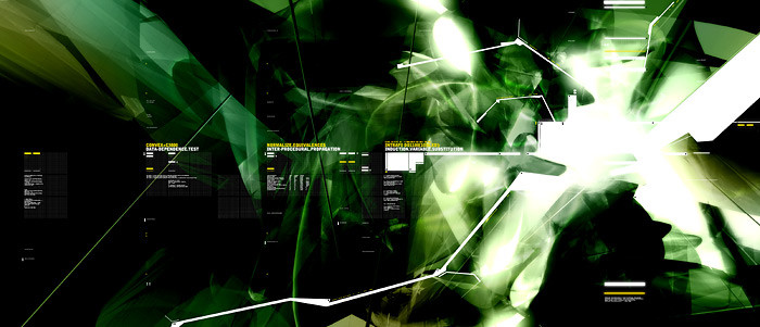
Copyright 2001 Anders SchroederRelated content


Comments: 15


green rox.. so does this +favs
-----
BIN LADEN SUCKS [link]
👍: 0 ⏩: 0

Great typo work. Like everyone said, it's a shame it's so small.
👍: 0 ⏩: 0

WHY?! why is this so goo?
this is amazing!
+fav...
-----
++ corrodedsoul ++
++ edward babb ++
3hird world collective
[link]
👍: 0 ⏩: 0

and i'll ask again: why is it so small...? cause it looks so good!
-----
°°°Two people are needed to make a good piece of art: the artist and someone else to hit him on the head with a hammer when the piece is finished.°°°
👍: 0 ⏩: 0

WHy are these so small?
-----
{++trendwhorekud.com
cancer bad. cure good. help cure. kill cancer. [link]
👍: 0 ⏩: 0


i really like this one. the white lines really reach out to the rest of the composition and draw the eye all over the place. but also my eyes will start at the lest and follow the text to the right as the white square shapes grow more complex.
-----
:watching the world through SLR:
-=[Nitsuj-EX]=-
👍: 0 ⏩: 0

wow nice design, typo is excellent and so is the lighting.
👍: 0 ⏩: 0


Very cool looking!!!
-----
___________
+ + + + + www.njyn.tk
👍: 0 ⏩: 0

again, the typo is fantastic, love it
-----
-
++ WastedYouth Programmer - [link] ++
++ deviantMAG Staff (Software Reviews) - [link] ++
👍: 0 ⏩: 0

