HOME | DD
 digitalshock — untitled
Published: 2006-06-10 03:09:35 +0000 UTC; Views: 511; Favourites: 23; Downloads: 378
Redirect to original
Description
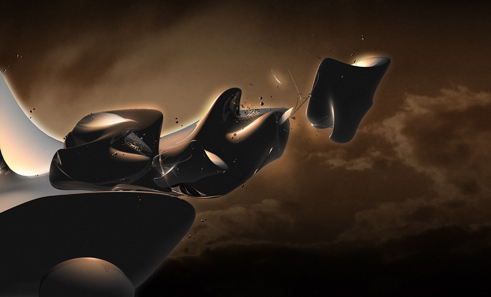
more of an experiment arther than anything important.Related content


Comments: 27

I really like the lighting on this; and the sense of ordered organic.. This style could make a really great alien-ship scene.. not conventional "space battle", but more of "inquisitive travellers in the sunset"
👍: 0 ⏩: 0

very modern shapes! (like in ... before post-modernism)
 (Smile)")
👍: 0 ⏩: 0

i like the background! but doesn't matter because it's your art!

👍: 0 ⏩: 0


I could take or leave the clouds, but the foreground forms are top quality.
👍: 0 ⏩: 0


if you used that render otherwise..the background is gross ><
👍: 0 ⏩: 0


render look realy great.
Background look realy shitty man. low quality.
👍: 0 ⏩: 0


I really love the soft glow that came of the render
👍: 0 ⏩: 0

Looks really cool. Just not sure about the clouds.
But its a fav though!
👍: 0 ⏩: 0


For a minute I thought this was work from polaus. It's good except I'd get rid of the glow and the background.
👍: 0 ⏩: 0

I think I understood why you chose that background. I think it's compliments the focus because it reflects the same colors on the render, but becuase it's dull, it's telling the viewer, "Look at the Render!" Good job man
👍: 0 ⏩: 0

I like the model, its good. But not feeling the background or the colors
👍: 0 ⏩: 0

I actually like the shapes quite a bit, but not the colors or background.
👍: 0 ⏩: 0

that is nice man but not really feeling the colors and the glow sticcs out a bit to much
👍: 0 ⏩: 0


That model is fucking gorgeous. The sky looks really low quality though, and it makes some of the edges of the model where you dodged/added lighting look pretty odd. Sick work though
👍: 0 ⏩: 0

hey, thats pretty cool what did you use to make that?
👍: 0 ⏩: 0