HOME | DD

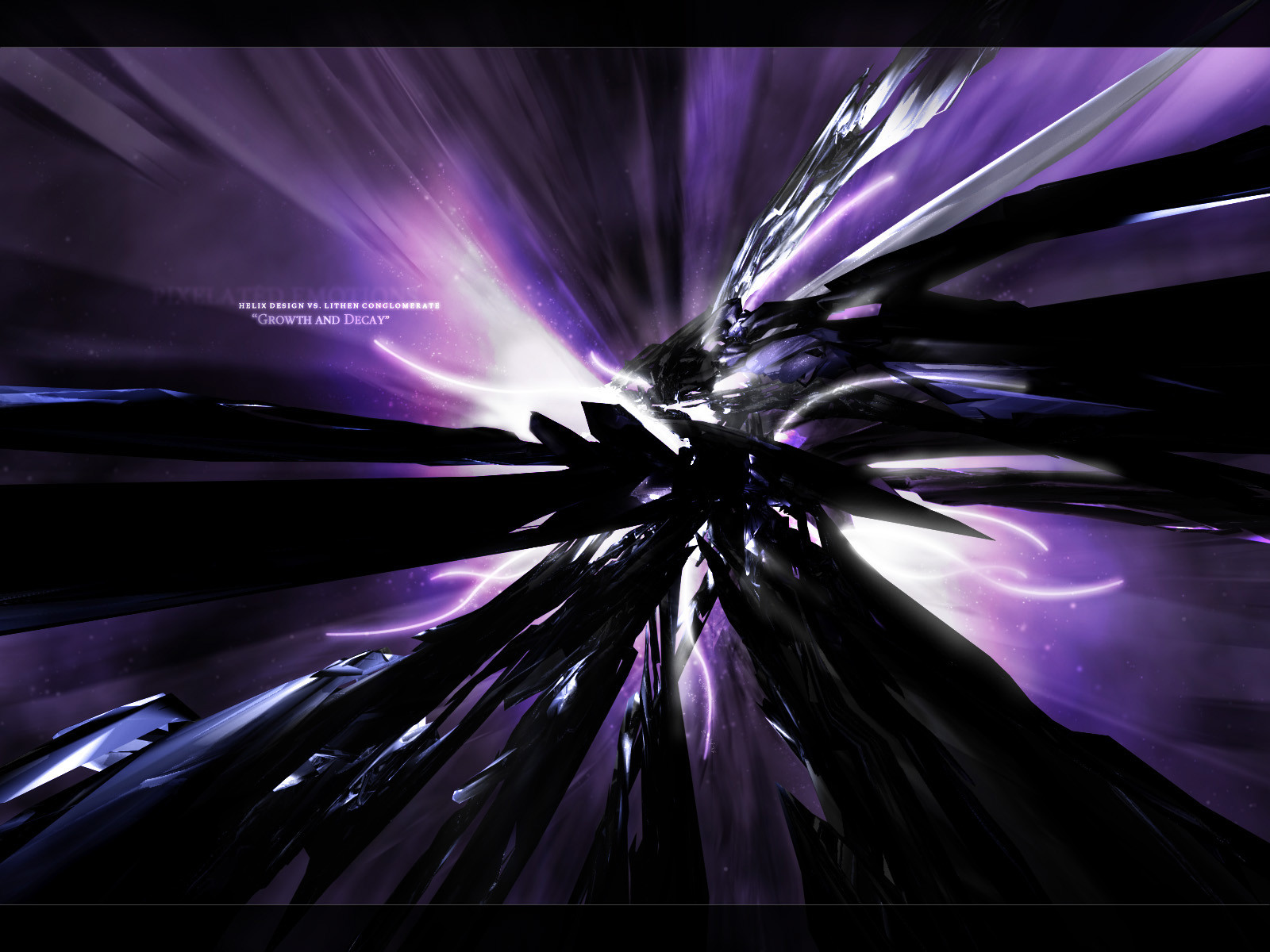
dink — GROWTH AND DECAY

Published: 2002-09-19 09:27:51 +0000 UTC; Views: 1159; Favourites: 8; Downloads: 93
Redirect to original
Description Another piece for the helix launch, 1st of october people!
respect to niteangel for inspiration and to kiotec and nome for the criticism.
comments and criticism would be greatly appreciated
Related content
Comments: 28

forexus [2007-02-25 05:15:04 +0000 UTC]

Awesome!

👍: 0 ⏩: 0

bloodpixel [2003-09-22 16:46:19 +0000 UTC]

nice stuff dude

👍: 0 ⏩: 0

shardz [2003-05-21 15:27:10 +0000 UTC]

very tast, i like this a lot!

👍: 0 ⏩: 0

skythlee [2003-01-26 05:50:05 +0000 UTC]

Nice work. I love of the purple and black go together, plus movement is always good!

👍: 0 ⏩: 0

nova-e [2003-01-22 13:29:51 +0000 UTC]

nice work! I especially like the backlighting effect.

👍: 0 ⏩: 0

power [2003-01-12 12:56:17 +0000 UTC]

you have some good talent keep it up bro

👍: 0 ⏩: 0

ann-426 [2002-12-24 17:01:05 +0000 UTC]

this is so cool man
keep doing things like this

👍: 0 ⏩: 0

zkreso [2002-09-29 14:52:18 +0000 UTC]

Cool work man. My new WP

👍: 0 ⏩: 0

getcarter [2002-09-27 09:50:05 +0000 UTC]

great colours - love it!

👍: 0 ⏩: 0

kiotec [2002-09-23 14:49:02 +0000 UTC]

nice work m8!

👍: 0 ⏩: 0

kiotec [2002-09-23 14:48:15 +0000 UTC]

nice work my friend.. nice colors you got there

👍: 0 ⏩: 0

func8tion [2002-09-22 23:51:13 +0000 UTC]

wow thats nice great job!

👍: 0 ⏩: 0

niteangel [2002-09-21 14:02:11 +0000 UTC]

ekud: very niteangel
-_-"

glad to see someone inspired by me very nice idea, but the rendering needs more work...

👍: 0 ⏩: 0

rg-fn [2002-09-21 10:52:32 +0000 UTC]

great work. this has all the mankings of a great piece, nice colors , nice 2d work and above all damn cool render.

👍: 0 ⏩: 0

husjaf [2002-09-21 10:12:01 +0000 UTC]

excellent work man keep it up

👍: 0 ⏩: 0

sekt [2002-09-20 06:51:33 +0000 UTC]

That's damn mad dude. But I'm not surprised eh
I think the render could use a bit more structure. A bit more technical and less random. I'm not to sure about the big black bit in the middle, it sucks away the focus from the rest of the piece.

But hell dawg, that shit be wack! Y'know.

👍: 0 ⏩: 0

nome [2002-09-20 06:49:37 +0000 UTC]

Turned out real nice dinky, but you forgot the jaggies didn't ya. The colour's came out good eh.
I'm loving that little twisty bit comin off the top of it, tis cool.
Your best yet dude, can't wait to see more.
Thanks for the voice in the comment.

👍: 0 ⏩: 0

a14 [2002-09-19 22:03:40 +0000 UTC]

i see jaggies

👍: 0 ⏩: 0

endregan [2002-09-19 19:53:24 +0000 UTC]

nice work. typo is nice. render is really good, just a bit jaggy

👍: 0 ⏩: 0

antisleeper [2002-09-19 17:00:20 +0000 UTC]

oooo very nice. sexy like woman. yes

i love you

👍: 0 ⏩: 0

phyre-arms [2002-09-19 13:49:54 +0000 UTC]

wow very cool dink! i love it +fav

👍: 0 ⏩: 0

ekud [2002-09-19 12:59:53 +0000 UTC]

killer colours, very nitenagel typo!

GJ!

👍: 0 ⏩: 0

r0b [2002-09-19 12:39:58 +0000 UTC]

looks pretty cool. love the colours and shaped.. very nice work

👍: 0 ⏩: 0

scorpio [2002-09-19 12:04:27 +0000 UTC]

Wow...... That's neat

👍: 0 ⏩: 0

phillyplaya [2002-09-19 11:13:45 +0000 UTC]

Nice, especially since it is a big resolution, nice color choice.

👍: 0 ⏩: 0

parash [2002-09-19 10:04:05 +0000 UTC]

not bad.. the background rox

👍: 0 ⏩: 0

vylium [2002-09-19 09:57:35 +0000 UTC]

Render isn't to good worked out, the background is very nice

👍: 0 ⏩: 0

ph1r3st4rter [2002-09-19 09:31:26 +0000 UTC]

spacey!! i like the colours!

👍: 0 ⏩: 0