HOME | DD
 docdoom —
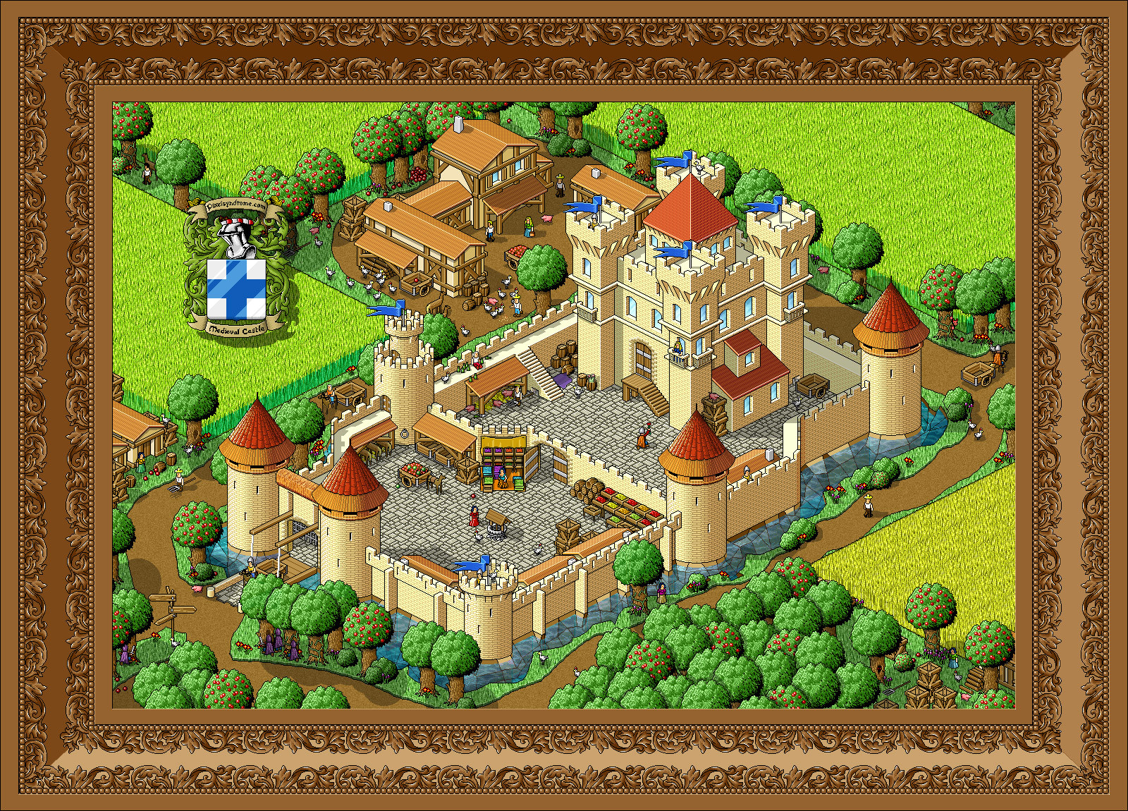
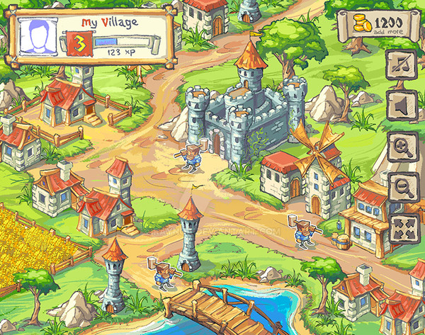
Medieval Castle
docdoom —
Medieval Castle
Published: 2004-07-25 16:39:13 +0000 UTC; Views: 84311; Favourites: 1202; Downloads: 21384
Redirect to original
Description
Hi!I'm new on deviant art and this is my first submission.
It's a big pixel art showing a medieval castle with some little pixel details.
It took me 70 hours of work in photoshop.
Comments are welcome!
ps : scuse my poor english!
Related content


Comments: 377

and 70 hours of work!
i only hope he has another one
saved as like a .bmp somewhere!
👍: 0 ⏩: 1

lol ditto my friend ditto...
I pity the pixel subjected to jpg...
👍: 0 ⏩: 0
OMG!
Well thats it... I'm gonna have to name my first born after you or something. lol


👍: 0 ⏩: 0

very nice i love the lushious colors and detail.
my favirote part of it is the mote around the castle the whater effects are awesome.
👍: 0 ⏩: 0

Well, I really don't have anything else to add beyond what the others have said. But wow. This really deserves DD. It's just incredible. I 


Pixie18

👍: 0 ⏩: 0

I love this. :3
👍: 0 ⏩: 0

Wow this is awesome! Great job
I like the cartoony look of everything.
The textures are very nice overall, but I find the paved floor texture is a little too present. Which draw away attention from the people who are on it. The textures of the crops and on the trees look realistic.
The trunk of the trees are a little too thick imo, but also add a little humour to it. The crop fields are a little boring, maybe you could've added some gaps and/or other details (like a farmer working in the field, a scarecrow, etc).
I like the dirt paths and how they have a wavy shape which gives this whole image a more organic feel, instead of the regular stiffness you quickly get with isometric pixelart. I like the architecture a lot of the buildings, especially of the farm. The glass windows look a little strange, and perhaps it would've been better to add some kind of window frame.
The horses look a bit odd and small, but that's just a tiny piece of the pic.
The frame you made around this, and the castle logo are really great and original, they also add even more feel to the medieval scenery. Very nice. Overall I think you've made an excellent pixel piece, 
Keep up the good work!
👍: 0 ⏩: 0

Fantastic work!
I really like this one! I dont really know what to say... the water looks a little odd but!
Anyway good work indeed
My favourite piece here... in a long time
Cheers
Callan
")
👍: 0 ⏩: 0

I was checkin your pixel past on your website. It's impossable to get such a great pixelartwork having no past. But I found some less-quality pixelart at your site which means you have grown as a pixelartist
Amazing work! Truly amazing. Not many works of this level could be found here at dA.
Hope you will enjoy your staying here and pixel some more amazing pixel scenes.
Keep it up!

👍: 0 ⏩: 0

It is truly a great beautiful job, itis extended even if not complex and it is rich of particular.
👍: 0 ⏩: 0

Awesome, I really like all the little details that you've added. And the frame is beautiful
👍: 0 ⏩: 0

I dont understand why there arn't more favourites and comments on this!
👍: 0 ⏩: 1

Not enough publicity, though I hope ^ halfliquid got my note.
 (Wink)")
👍: 0 ⏩: 1

Sorry that I'm posting two comments here, but I couldn't get my other one done before lunch.
There are a few more miniscule details that I would like to point out, though this post will be mostly positive.
First, the roofs. The shading on the roofs are overall, excellent, especially on the red metal ones. They're wonderfully shiny and they look like metal, instead of the usual matte wood look that you would get without highlights. The same with the straw roofs on the towers. They look pretty excellent to me.
The roofs on the little village houses are great as well, but they aren't quite excellent. They look a little too plain, like the new coloured tar-paper roofing that they make nowadays. They look a bit too normal, not organic enough, but they can stay that way, it keeps a nice uniform look.
I have also noticed something else that's wierd about the boxes, they are about as tall, if not taller than a person. That strikes me as sort of odd, because those kinds of boxes would generally require at least two stack one on top of the other to reach a grown person's head. Or is that just your style?
I absoloutely love the assasin/soldiers sneaking up to the castle with swords. I wonder if they'll make it, or if they will get killed by the knight offering flowers to the princess, which is a great touch as well. Those are two things that are necessary for a complete castle scene, and I'm glad you included them.
One little detail that I'm not quite sure of: What is that thing behind the fruit stand with the lady with the brown dress? Is it a closth backdrop, or is it a roof that you put a few layers too low?
The trees look great, trees are one of the most difficult things to draw pixel style, I like the vines as well.
The devil/demon creature sneaking up to ambush the knight with the empty cart is pretty good too, though I feel slightly sorry fpr the poor knight. Maybe the chicken will protect him.
The pigs are exceedingly cute as well, their grins make it look like they are plotting something. Maybe they are the reason why that knight's cart is empty.
Anyways, good work.


👍: 0 ⏩: 2

im surprised that you didnt mention that the pitchfork is a tad bit too big for the farmer and the head is bigger than his body
👍: 0 ⏩: 1

")

Dammit, forgot about the frame.
The frame is excellent, really. It looks like a real fancy wood frame when I see it in your gallery.
The leaves pattern is great, very well and smoothly shaded, so are the beads.
I don't like the difference in colour between the plain bits of the frame, they look way too high contrast and not realistic enough, I think you should tone that down a little.
Also, progressive .jpeg might not be the best format for pixel art, because pixel art usually requires 100% quality, which makes huge files sizes. I'd recommend .gif, or if there are too many colours, a single layer .png.
👍: 0 ⏩: 0
J'espère que ce commentaire ne soit pas trop compliqué pour vous, ma première langue est l'anglais et je peut voir que vous parlez le français comme langue primaire. Si vous avez mal à lire ça, je peut l'écrire en français aussi.
(J'espere que je parle assez bien le français)
This is, in my opinion, one of the best pieces of pixel art that I have ever seen. It's huge, detailed, and original.
I love all the vibrant colours you used. It's nice and cheerful, instead of boring and drab like many pixel pieces I have seen before. You have captivated the medieval castle look better than I have ever seen before. I like the way all the various colours contrast as well, but are approximately the same brightness so that you can be drawn into any part of this image, that way the flags seem no more important than the apples, the knight no more special than the farmer, letting you see every single detail perfectly.
The brickwork is amazingly well done, it looks like the bricks were laid nice and randomly, not uniform and boring, also giving more of a medieval look, as they could not always find or make uniform sized bricks. They are shaded pretty well as well, they don't look to bright and modern, nor too dark and sooty. They look about right for the time period. The grouting looks pretty realistic as well, I've never managed to do good grouting, personally.
The variation in size and shape on the bricks is good as well, but some variation in colour would be even better, in my opinion.
All the fruits look really good, bright and juicy, nice and delicious-looking. They're well shaded as well, you can see that there are many fruits, and they do not look like they are merely a lumpy grid like I have seen in some pixel fruit stands. Mixing the red and green apples on the donkey's casrt looks especially good, you cna tell that they're apples becuase of red and green, as opposed to thingking that they're oversized cherries.
However, it looks like the fruits are, instead of fruits, various kinds of jam in large quantities in some of the boxes, but that is probably inevitable if you don't want horrendous-looking black lines everywhere. If you have time, you might want to see what you can do for that minor detail, though I wouldn't obsess over it.
Where the bricks end in front of that drawbridge, it doesn't really look right. Shouldn't they fade slowly into the dirt, instead of stopping cleanly, and inch above the soil? Maybe some dithered brown for the dirt overtop of the bricks could be excellent.
The grain or corn fields look quite nice, very well textured, I forget at times that they are pixeled, but they look a bit too uniform and repetitive. Maybe some holes here and there, some discolouration, picked patches and dead plants could do the trick.
I like the path with the guy with the horse or donkey, it's sort of concealed, so it seems like you're discovering something, but the donkey/horse looks too much like a llama to me. I think that the head might be a little small, and maybe the horses/donkeys should be a bit more muscualr, their thinness could add to their horse/llama identity problem.
More livestock critiquing: The pigs and chickens look very good, I absloutely love them, but shouldn't the pigs be bigger than the chickens, or at least if they ar baby pigs, shouldn't there be a mama/dada pig around? Or is he having a nap. Or of course, they could be mini-pigs, I do realize that there are very small pigs, but I'm not sure if everone does.
Also, there is no rooster. A farmtown is not complete, in my opinion without a rooster. Maybe in the classsic pose on top of a roof. Or are those ones with the red on top roosters? But a rooster on top of the roof would be just perfect.
The boxes inside of the main courtyard are a bit wierd as well. The board holding them together are rather oversized, and awkward looking. Maybe they should be flat, instead of 3 pixels thick.
The flags look all the same as well, but that's okay, I kind of like them like that.
Now for the moat. That is my main problem. The water is excellent, I wasnt sure if you had pixeled it at first, it looked way too good. But the black lines look not so great, I rather dislike black lines in the middle of a pixel piece. It would also look a lot more realistic without black lines.
The windows on the castle are also a bit stange. Do castle really have glass windows, perfectly flat glass windows, perfectly flat reflective glass windows. Or is it a modern castle?
I hope I was not too harsh, but I usually am when a pixel piece I see is really good, I want to make it perfect.
I have added this to my
Bienvenue a 
👍: 0 ⏩: 4

wow..biggest comment in DA jaja

👍: 0 ⏩: 0

This was like playing the game "wheres Waldo".  (Smile)")
👍: 0 ⏩: 0

"Where the bricks end in front of that drawbridge, it doesn't really look right. Shouldn't they fade slowly into the dirt, instead of stopping cleanly, and inch above the soil? Maybe some dithered brown for the dirt overtop of the bricks could be excellent."
Perhaps the slabs are laid on top of the soil, as if they were perhaps thinking of paving a whole road at a later date? just a thought...
I agree about the windows and moat though...
excellent comment.
I purely enjoyed the piece!
👍: 0 ⏩: 0

boy you really did examine the deviation up there
oh god, if all comments were like this deviantArt would become heaven...
👍: 0 ⏩: 0

This is some amazing iso-work that you have here. All the hours of work you put into this really pulled off for the better as there's loads of detail and little things that your eyes can get fixated on around the scene itself. All the people you incorporated in here also brings this to life.
(PS -- Sweet job on the frame as well! Design is intricate.)

")
👍: 0 ⏩: 0

<= Prev |