HOME | DD
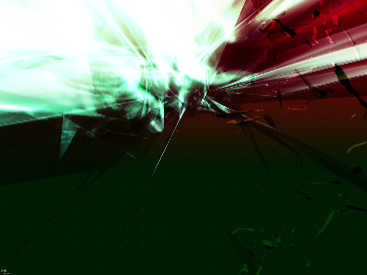
 doomchen — focus 2
Published: 2001-11-06 08:39:09 +0000 UTC; Views: 306; Favourites: 1; Downloads: 100
Redirect to original
Description
focus X focus = out of focusRelated content


Comments: 5

My only problems with this are the overlayed 'focus' text and the odd colors. They don't look good applied to this image at all. Otherwise it's good stuff.
Just like clockwork.
👍: 0 ⏩: 0

very cool effects happening on this...
i agree that theres a little too much space at the bottom, but hey its a wallpaper...
great color combo...
keep it up!
DAVIDIAN
DARE TO FAIL
👍: 0 ⏩: 0

tasty! some interesting effects going on here... good colours too.
👍: 0 ⏩: 0

great dark and bright.. seems like something blown.. and i agree it too much blank at the bottom.. may be you can put some text inside the dark area and make it transparent.. anyway.. nice work...
BAD HABIT DIE HARD!!
..seni itu juga satu kebaktian..
👍: 0 ⏩: 0

crikey, that's a pretty rare colour combination. usually it would end in disaster, but you seem to have steered clear of that, and come out with a nice piece of work. there's maybe a little too much blank space at the bottom, IMO. but otherwise, very good.
Xhaos - Lord Of The Spline
👍: 0 ⏩: 0