HOME | DD
 dremex — Minator WIP
Published: 2003-07-29 04:30:00 +0000 UTC; Views: 313; Favourites: 1; Downloads: 77
Redirect to original
Description
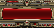
This started out as a winamp2 skin, but since it's not the right size, and none of the button placements are right, it's going to be a winamp3 skin So you can expect a lot of colorthemesI dont really know how I came up with the name "Minator", it just kind of popped into my head. I like it, it matches the skin style very well I think. Anyway, this skin is obviously inspired by Vida's awesome work. I'm getting into the whole "insanely detailed" style. Of course, it's no where near comparible to his work, I'm getting there.
The LCD is yet to be completed, I've run out of ideas on it so I thought I'd post it here to get some opinions on what I should do or change. I will try take all suggestions into consideration I had such a hard time with the buttons, heh. I went through all kinds of button designs until I came up with one that I could live with. (I'm a very picky perfectionist)
So anyway, watch out for this skin in the winamp3 skin section on DA
Related content


Comments: 20

very classy, would be my new favorit skin if this makes it to the final stages.
good luck
👍: 0 ⏩: 0

unreal ... love the intricate detailing.
maybe it's the colours, but for some reason, i'm thought "egypt" when i saw this skin
no useful advice other than keep going
")
👍: 0 ⏩: 0


By the way, who didn't close their HTML bold tag? Heh...

👍: 0 ⏩: 0
I think it's great, really nicely detailed. I don't use Winamp3 very often as I think it's a pig, but I'll definitely download this and give it a try when it's finished. Excellent work-in-progress.

👍: 0 ⏩: 0


")

I am with a few others, cool design here. However; you the top part around the buttons are a little bright, it seems as though it's 'lite' on 'lite'. Adding a little darkness will definetly make your buttons stand out more. GJ!
👍: 0 ⏩: 0

its bright..
i think you need to make the side parts of the skin seem more attached to the button and titlebar 'rows'. the control button area needs defining more, maybe by seperating the control buttons from the 'window' buttons on different perspectives/levels.
its a strange effect with the highlights on the outside of the skin and it not being brighter in the middle.
👍: 0 ⏩: 0


Nice metallic skin, I do like the buttons, they fit. Maybe make them just a tiny bit brighter then the rest of the interface so they stand out a little bit from the rest, personal opinon tho. It's small too and that I like, a skin shouldn't take up half the desktop.
👍: 0 ⏩: 0

Really nice.. very nice design.. the buttons look cool.. the whole piece looks wickedly awesome.
👍: 0 ⏩: 0

Its nice , define your controlls better though , they get lost in the highlights abit , maybe dimm some parts , but dont add more light.
👍: 0 ⏩: 0


Hey man, that looks really great!
Really good job on the metal and red buttons
 (Wink)")
👍: 0 ⏩: 0


I so want this as a WA2 skin. Wish you would have continued to make it one.  (Smile)")
👍: 0 ⏩: 0

looks quite classy and smooth from this little preview. shame that it wouldn't fit to be a winamp2'er ... i recently dumped winamp3 (didn't compare as well w/ what winamp2 could do ... when i figured out that i just wanted an mp3 player).
heh, classy either way. hope i see it complete in the future.
👍: 0 ⏩: 0