HOME | DD
 ekimver — Revolution of the mind v2

Published: 2002-06-06 07:05:00 +0000 UTC; Views: 6489; Favourites: 22; Downloads: 1023
Redirect to original
Description
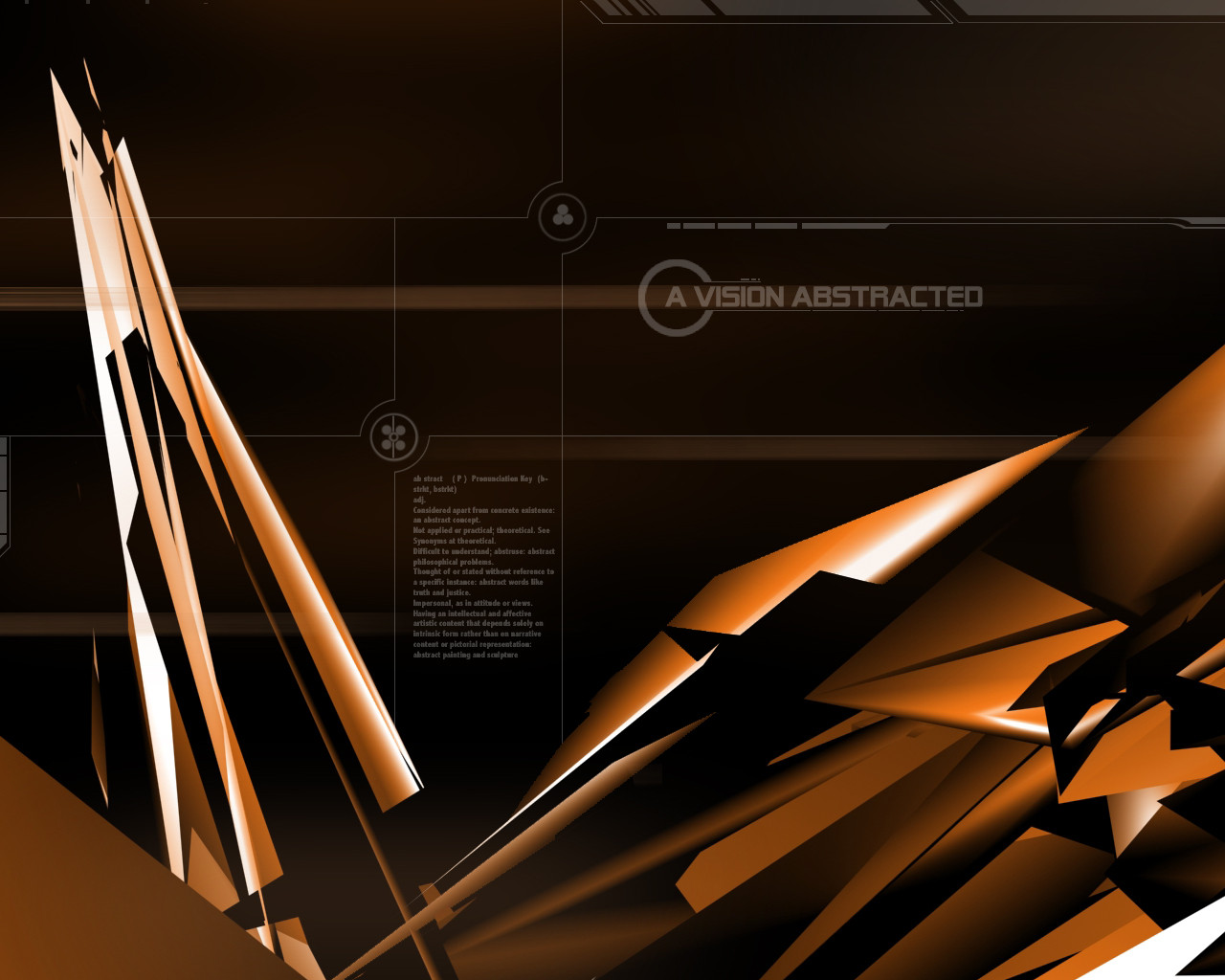
Revolution of the mind v.2 :This piece is based off of the first one I created. I felt the first one was missing something. I think this has the feel I was originaly going for. This is my first trendy wallpaper and the first wallpaper that took much time to create.
Hope you guys enjoy it as much as I do.
Comments are welcome plz.
Related content


Comments: 40

Great peice. Something one could get many good ideads off of.
👍: 0 ⏩: 0

quite nice. i like how much effort you put into making it way trendy, while still keeping it unique: i especially dig the curvy blue lines, and the glossy triangles. nice.
👍: 0 ⏩: 0


Text sux///needs more work//__________Colors dont blend/\_______vectors dont fit in totally....//needs a lot mroe work...THATS ALL I GOTTA SAY....HAVE A NICE DAY
👍: 0 ⏩: 0

iF the first Version makes me feel wanna die.. imegine how this EXCELLENCE and mastefull makes me feell..
👍: 0 ⏩: 0


very fucking cool. that you can tell you put your heart into
👍: 0 ⏩: 0


Oh I love this +Fav
the colors and everything are very nice
👍: 0 ⏩: 0


Looks like electronic flowers or something... very cool... love the detail that the text creates and the very thin lines... nice work.
👍: 0 ⏩: 0

Wow... i'm not much into that abstract style, but this one looks awesome. I like the whole design. Great work.
👍: 0 ⏩: 0

I love this one, the contrast, and clean, smooth colors really made it stand out... I'm watching you, man!
👍: 0 ⏩: 0

WOW...this color...i love this wp..and it look's so good on my desktop..good job man.......rock on...
👍: 0 ⏩: 0

the color and the spider on the top reminds me of spderman
👍: 0 ⏩: 0

very awesome!! i love the colors how they contrast w/ each other...very tite ^_^ gj...
-----
ORANGEGUY
-----
_____________________
¯¯¯¯¯¯¯¯¯¯¯¯¯¯¯¯¯¯¯¯¯
[link] >> Featured Deviation: 'orange box v2'
[link] >> website
[link] >> deviantart website";
👍: 0 ⏩: 0


woow! awesome..i lovethe red and blue contrast each other!! it's sweet.. !! +fav for you!! and a download!!
👍: 0 ⏩: 0

Totally awesome choice of colors. This caught my eye and got me excited, thinking, "Wow! Cool!"...great job!
-----
--
👍: 0 ⏩: 0

LOL... nah.. its not a spiderman wallpaper. haha though now that i look at it.. it could very well resemble it a bit. Thanks again for all these comments.. you guys are great.
👍: 0 ⏩: 0

What can i say.... *FAVOURITE*
Colours, effects, vectors... all amazing!
Just guessing, but is it a spiderman themed wall
Keep up the good work...
👍: 0 ⏩: 0


trendy? yes! but, if youre gonna make it then make it well and...holy shit gotta love those colors!
-----
[link]
👍: 0 ⏩: 0
Thanks a bunch for the comments so far. They are very much appreciated. I am also happy to see that people are finally posting negative stuff to help me improve.
Glad to see that im doing ok so far w/ max and bryce combo. Im learning as I go, so the following images will get better
Thanks again, and any comments are welcome!
👍: 0 ⏩: 0

I really dont like this. The colors really dont mix well, and the text and 2D work just seems to clutter the image. I love the background work..those blues are awesome, but the forground 3D stuff is just not as good as it could be.
-----
-amphex (Dan)
👍: 0 ⏩: 0

this has become my new wallpaper..i usually am not too fond of these wallpaper types..but the colors and clearness of this I love.
👍: 0 ⏩: 0

To me these colors don't go to well together...the text needs work and so do the matricies..not really likin the redners either..
-----
[sig][link]
[Link] [link]
👍: 0 ⏩: 0

AHHHHHHHHHHHHHHH this is too cool, man nice work, can get over the coolness, you now your stuff.
~DjKnowledge
-----
Knowldege Is Power
👍: 0 ⏩: 0

I prefer this over the original too.
Good work. I just gotta make a color scheme to go with it
-----
*Im not balding, as my avatar would have you believe.
-----
When choosing between two evils, I always like to try the one Ive never tried before. [Mae West]
👍: 0 ⏩: 0

Fwoah, man. Amazing. The only gripe I have with the wallpaper is the text, it's opaque and bold but too small to be legible. Otherwise, I love it. The colors reminded me of Spiderman, really stood out in thumbnail view. My new wallpaper!
+favaroonie
👍: 0 ⏩: 0

i like. i like. there's still something to be said about "trendy" design. i know it's not cutting edge, or cutting the path for others but when done nicely, you get something really interesting. such as your piece. good job.
-----
At the heart of imagination,
lies the flames of desire.
burning to be released,
as dancing fire.
to capture this spirit,
is the design one must admire.
solarflare design
freelance passion
👍: 0 ⏩: 0

Ahh, this is great... Freaken' awsome! good work.
_-_-_-_-_-_-_-_-_-_-_-_
95% of the average person think's he isn't
so click here [link] for the hell of it!
👍: 0 ⏩: 0

Very cool. Definitely some nice color choices there
-----
[¤] [¤][ [link] ][¤]
👍: 0 ⏩: 0

The scanlines, the colors, the spiders.....
Awesome wallpaper!
-----
[link] - My Site
👍: 0 ⏩: 0


yO..
Nice colors and blending.. Great vecotors.. Like the spidys!
Peace,
DC
👍: 0 ⏩: 0

Very nice... clean and crisp nice colours great job
-----
👍: 0 ⏩: 0