HOME | DD
 elusive — Curve
Published: 2008-02-12 23:13:11 +0000 UTC; Views: 35222; Favourites: 365; Downloads: 0
Redirect to original
Description
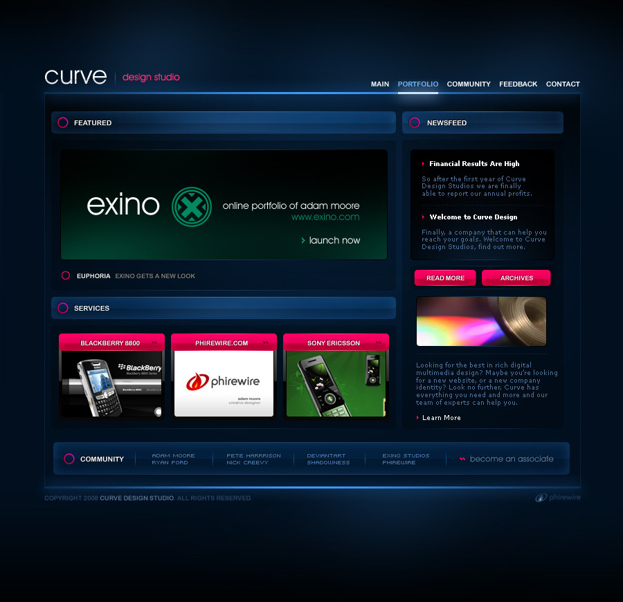
Laying around from the Exino.com - Project Euphoria era. Finally got around to posting it.It's intentionally suppose to be a spin off of the Euphoria design. This was done awhile ago. Nothing special. More work to come soon.
Related content


Comments: 221

YOU'RE LOVELY!
IN YOUR FACE! YES! OH SNAP!
<3
What's new?

👍: 0 ⏩: 1

haha you're retarded. that's what's new.
👍: 0 ⏩: 1
That's not new. Let me know how Classified is! And we need to do something soon, remember.
👍: 0 ⏩: 1

No offense! I wasn't laughing at you or anything, I was just expressing my amusement at your quick conversation. Sorry if you got offended.
👍: 0 ⏩: 1
Haha I wasn't offended at all dude.
👍: 0 ⏩: 1
")

Very nice! Love the light effect... perfect!
👍: 0 ⏩: 1
 (Smile)")

Oh I spotted the smallest error ever! lol On the bottom right side of the NEWSFEED bar there is a slight joining error.
I love this design though. With all that gradient work though there must be a lot of images in the final working website - hell for dial-up users.
P.S. Kan I haz a cuckie?
👍: 0 ⏩: 1
")
Now I can tell you it's SECKSI!
👍: 0 ⏩: 0

I feel so cheap when I favourite something that's already so popular, but this one deserves it.
👍: 0 ⏩: 1


Nothing special you say lol. Man i love all your work. GJ and keep them coming
👍: 0 ⏩: 1

very very nice !

👍: 0 ⏩: 1

I actually like your design compared to the other site you based it off. Mainly because Im not a huge fan of big buttons, which the other site used more of for the pages. I really like how you have it highlighted underneath the pages, rather than huge buttons.
The overall idea is sleek and sexy. The blue and the selected highlights work extremely well. Great layout and overall execution of the site.
👍: 0 ⏩: 1

 (Wink)")

Really nice. Though, I don't really like the pink parts of it. It's too bright to the somewhat dark blue.
👍: 0 ⏩: 1
Yeah I noticed it is a bit bright on the eyes :S
👍: 0 ⏩: 0

")

this looks great and can see its same style as the others. Hows your own website coming along am waiting for that design???
👍: 0 ⏩: 1
It's going slow =-/ I have no time it feels like
")
👍: 0 ⏩: 1
ahh diddums. how come it took 2 months to reply?? lol
👍: 0 ⏩: 0


Love the blue color theme. Yet another amazing work from you!
👍: 0 ⏩: 1
| Next =>