HOME | DD
 elusive — Journal - Elusive

Published: 2007-05-07 15:05:34 +0000 UTC; Views: 7102; Favourites: 58; Downloads: 0
Redirect to original
Description
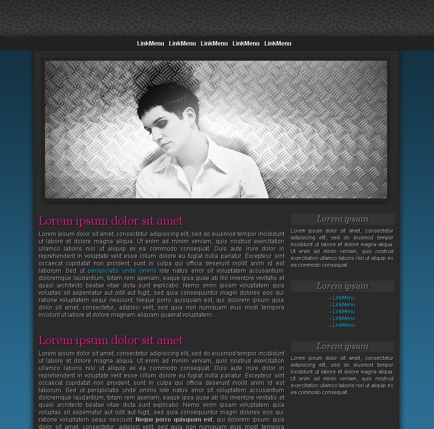
Pretty close to the final version I was hoping for. I don't think it's quite done yet though. Something is missing in my mind. Keep checking back for updates.*I'm trying to keep the whole 'Dark Fella' theme going, that's why it's so dark.
Related content


Comments: 193


I don't see anything wrong with it. Very clean!
👍: 0 ⏩: 1

hehe, nice!
aww. gotta scrape some money from somewhere, to get a sub, so i can make one hell of a css for myself ^^
👍: 0 ⏩: 1
")
doh lol.
gotta get a job >
mmh, webdesign perhaps?
👍: 0 ⏩: 0

I'd do either friends or features in that area. I think the usually bright colors of stamps won't really fit the theme. Looks pretty finished to me
👍: 0 ⏩: 1
I'd do either friends or features in that area. I think the usually bright colors of stamps won't really fit the theme. Looks pretty finished to me
👍: 0 ⏩: 1

 (Smile)")
👍: 0 ⏩: 0

looks... i don't know.... perfect ")
I like the header and the colors... le me guess black is your favorite color, doesn't it?
👍: 0 ⏩: 1
oops i wrote "le me", i mean "let me"
👍: 0 ⏩: 1
What about "Black is your favourite colour, doesn't it?"  (Wink)")
👍: 0 ⏩: 1


man, that's awsome! Of course I expected nothing less from you.

👍: 0 ⏩: 1

looks almost finished to me, maybe try to add a color somehow, in the link rollover or something, would be nice imo ! have fun
👍: 0 ⏩: 1

I think the navigation and footer needs some effects like your carbon interface.
👍: 0 ⏩: 1
Yeah I was playing with that idea
👍: 0 ⏩: 1

yeah, i'd add some elements from your carbon design. i think this journal needs some color to it. just like some blue lights or something on the nav buttons.
👍: 0 ⏩: 0

i guess u dont have to do anything it looks kool
👍: 0 ⏩: 1

I like the header and the buttons! If you're not keeping it I'm stealing it ^_^
👍: 0 ⏩: 1

1) the loren ipsum text needs more contrast... too dark IMO
2) I liked the way u did ur old journal better.... the way u had "elusive" and the dark fella pretty much the same size. The one now doesnt quite work out well centred. Perhaps right justified would suite it better?
👍: 0 ⏩: 2
Thoughts? *updated*
Changed font colour, added old header (resized).
👍: 0 ⏩: 2

looks good mate, i dont think id change anything to it now
👍: 0 ⏩: 0
much better 
but it's missing evil fella?
and "notes | favourites... " is too dark as well
")
👍: 0 ⏩: 2
Thoughts now? Added some new things. I am more wondering about the header (I have no idea what to do with it).
👍: 0 ⏩: 1
better but i think it still needs a bit of work

👍: 0 ⏩: 1
Yeah i'm still debating how to do the header.
👍: 0 ⏩: 0
That's why this is a work in progress
👍: 0 ⏩: 1
I know... and those were suggestions
👍: 0 ⏩: 1
looks nice and clean to me i guess, maybe put the logo on the absolute right? maybe leaving a gap of 4 - 5 px from both the right and bottom corners? just a thought.
👍: 0 ⏩: 1
Changes will keep coming to this, I have a feeling.
👍: 0 ⏩: 1
they always do man, they always do
👍: 0 ⏩: 0
<= Prev |