HOME | DD
 exit — lookintomyeyes
Published: 2000-11-08 20:37:16 +0000 UTC; Views: 791; Favourites: 1; Downloads: 113
Redirect to original
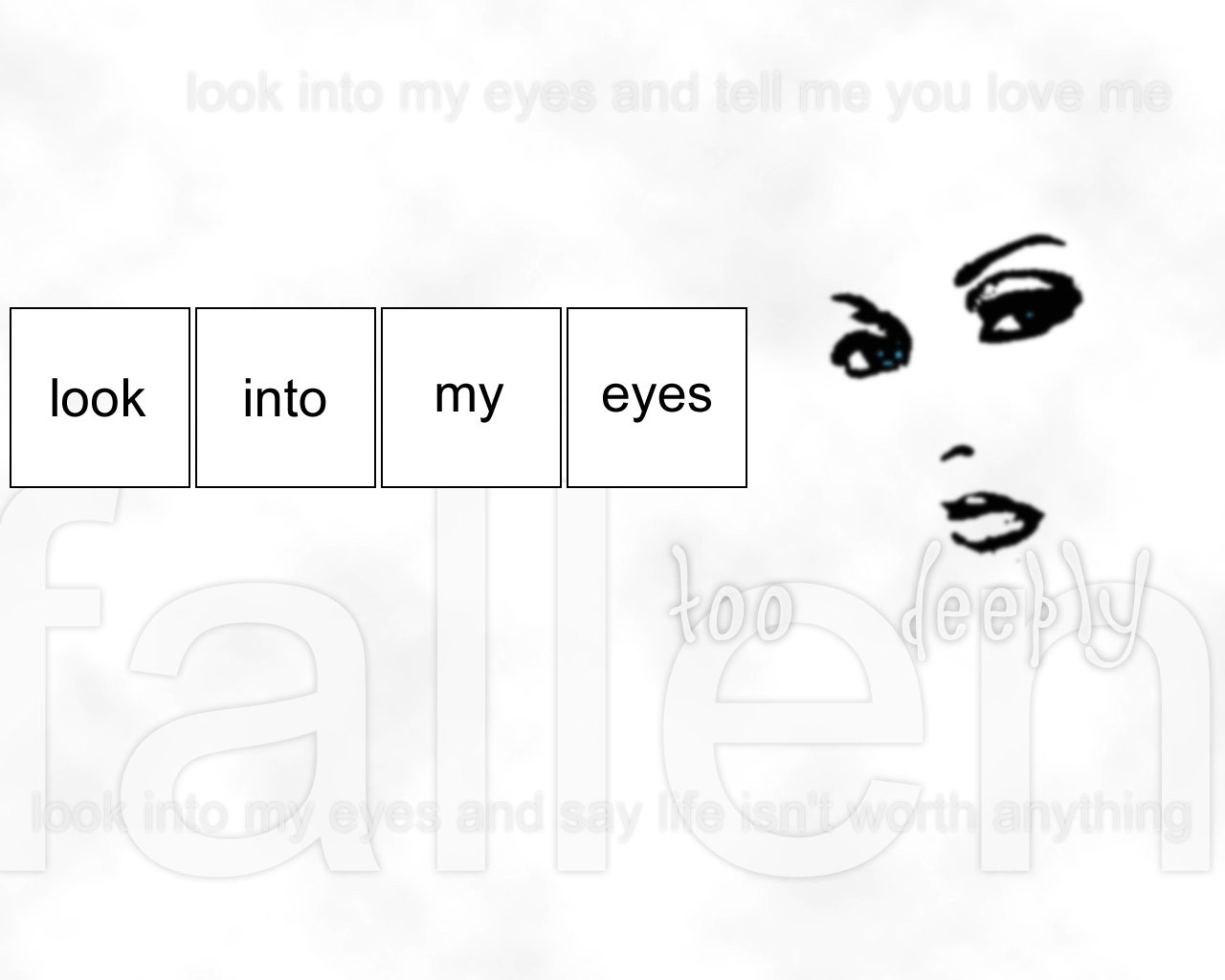
Description
need some feedback desperately on this.... not too sure, but there is something about this that I likeRelated content


Comments: 6

i would keep it the same but remove the repetetive text..
once is enough for each phrase
👍: 0 ⏩: 0

I can see where this is going.. But the white is too harsh. I actually like the weight of the makeup on the girl.
👍: 0 ⏩: 0

the face is too dark. it's like it is "caked on" as in the way makeup gets caked on. other than that i really like the simplicity of this.
--[ jark ]--
👍: 0 ⏩: 0

I'd take away the boxes and make the "face" a little less heavy, is that what you want to hear? I like the idea!
Paul
👍: 0 ⏩: 0

nice idea. but i would recomend a prettier font for the text. some kinda script would make it look a lot better. just anything but arial.
try to make some glow behind the darkest letters.
👍: 0 ⏩: 0

Its rather plane, but the majority of the peice shows emotions. I like the concept you are trying to show. Who says plain is bad?
if you change this I would like to see the end results
👍: 0 ⏩: 0