HOME | DD
 expansiondesign —
Reflect
expansiondesign —
Reflect

Published: 2006-02-23 13:23:31 +0000 UTC; Views: 12035; Favourites: 425; Downloads: 816
Redirect to original
Description
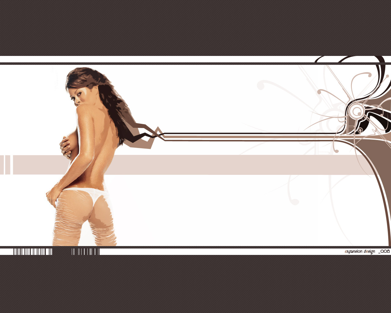
Well I didn't intend for the face to be realistic. But I'm not complaining cos the way I went about it made it really quick to do. I'm not sure about the background. Need a bit of practise with that. Or maybe the composition made it hard, because it puts more focus on it. Who knows. Anyway it's of ~skip821 again. I may do something else with the head. Might submit a vertical piece instead. Yeah I'll do that tomorrow. Screw wallpapers")
Forgot to say. In the orig image Ellen had a beanie on, but I made it hair cos it was easier. Does the forehead and the proportions look right?
Edit: Changed dimensions as I said I would and the mountains are now transparent with an outline. Changed colours, added title. Changed lips, added "breath"
Comments and favorites appreciated!
Must full view!
I hope you like it!
Related content


Comments: 147

")
👍: 0 ⏩: 0

even though you didnt try to make the face look overly realistic, the goggles are very very good. there is so much definition and the shading is perfect. i like this picture a lot, cos it reminds me of when i used to go snowboarding. definate favoutite. keep it up
👍: 0 ⏩: 1


love how you get the reflection  (Smile)")
👍: 0 ⏩: 2
chheers was really easy too!
👍: 0 ⏩: 0
chheers was really easy too!
👍: 0 ⏩: 1

Yup. This is STILL really cool. Its given me inspiration for another piece...although really different....oh well, originality is not knowing your sources, right?
?eace, and whens the last time you submitted something? I have like 30 devs to look at so I might've missed something recent.
👍: 0 ⏩: 1
ummm last tiem... maybe like 2 weeks ago :S
👍: 0 ⏩: 0


Whoa, the reflection in the goggles is intense. What a great idea for a new spin on your realistic vector series.
👍: 0 ⏩: 1


Love it... I'd also love the wallpaper thing, picked this up late
Any chance you could put it in scraps or something?
👍: 0 ⏩: 1

definatly cool
but how about that breading cold air coming from her mouth? cuz its kinda missing something.
hey it looks great
👍: 0 ⏩: 1
yeah ahts could be reealy cool. thanks
👍: 0 ⏩: 0

wow, very cool piece :grin:
i love the composition!
👍: 0 ⏩: 1

wow


Post Scriptum: wow, this is my most religious comment i think
👍: 0 ⏩: 1
hha you idiot!!! thanks tho! whos the emo?
👍: 0 ⏩: 1
emo is my shortcut for emoticon.. i hate long words.. im soooo lazy
👍: 0 ⏩: 1

..........Wow. Not a flaw. Or its too blindingly beautiful to see any...The reflection looks amazing and the mountains are just really well done. Transparent mountains....like mountains of yellow. I have like 15 Deviations to look at and I've kinda been skimming around, but wow Im glad I didnt miss this one...Instant Fav.
I dunno, but I think this might be the best Ive seen out of you...Not a purely realistic vector, a little experimentationon the side, comfortably amazing.
?eace
👍: 0 ⏩: 1
*falls back off fit-ball*
*wakes up 15mins later*
damn thanks man!!
")
👍: 0 ⏩: 1
fitball? Ya, I know its a late comment, at one point I had like 15 deviations to look at...you're welcome
?eace
👍: 0 ⏩: 1
no i was saying i was knocked out by ur comment but anyways
👍: 0 ⏩: 0

hehe i think your wrong, i think everyone liked it!! must be me, i swear!
👍: 0 ⏩: 1
what that makes no sense? are you saying that to me... when did i say ppl dont like it?
👍: 0 ⏩: 1
i do not know. and btw i just realised my forhead bugles in then out. ur screwd up the top!! other wise size is good
👍: 0 ⏩: 1
i dont know what u mena... circle it and show me!
👍: 0 ⏩: 0

That's one of the best vectors I've ever seen!
Keep up the great work.
👍: 0 ⏩: 1


wow thats amazing... i love her face.
the background looks like it needs more work but yeah
👍: 0 ⏩: 2
thanks! yeah what u think it needs?
👍: 0 ⏩: 1
umm... i looks like it has too many lines in it and not enough shades.
try to make it look more realistic.
👍: 0 ⏩: 1
did... didnt work...
i dunno i think i like it for its more illustrative style. i was guessing it wouldnt be too pop on dA tho... heh thanks tho
👍: 0 ⏩: 1
np... it just doesnt seem to fit with the style of the piece imo
👍: 0 ⏩: 1
yeah i can see what ur saying
only mixing ralistic and stylised i guess..
but i appreciate ur input
cheers
👍: 0 ⏩: 0
thanks! yeah what u think it needs?
👍: 0 ⏩: 0

Lovely vector. While not overly complex on the details, the piece still has an incredible level of depth. Awesome work.
👍: 0 ⏩: 1
| Next =>