HOME | DD
 FabianMonk — Evisu

Published: 2006-11-16 22:14:07 +0000 UTC; Views: 38094; Favourites: 883; Downloads: 2323
Redirect to original
Description
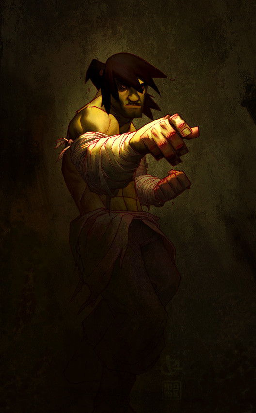
The theme of the last Eatpoo weekly was to color Gez Fry's lines. Gez Fry, for those of you who do not know, is one bad motherfucker and you should check out his website asap : [link]Digital Pencils: Gez Fry, obviously
Colors: Me (Monk)
Software: Photoshop CS
Related content


Comments: 172

Wow, that's a great painting.
I like the Japanese references like to Hokusai.
")
👍: 0 ⏩: 1

What's the reference?
I only colored this and have no idea, just curious.
👍: 0 ⏩: 1
Here ya go:
[link]
The first one is the most famous (the one in your work)
👍: 0 ⏩: 1
Oh sweet, thanks for the link!
👍: 0 ⏩: 1
 (Smile)")


First thing that came to my mind was...
"Fear me, I have monk shoes."

👍: 0 ⏩: 0

Baaaaaaaaaaaaaaaaaaaaaaaaaaaaaaaaaaaaad
so SIIIIIIIIIICK
evisu is greezy too
 (Wink)")
👍: 0 ⏩: 0


Oh man, you did Justice to this piece, is so much more better than the original because this have the "Oriental" feeling
👍: 0 ⏩: 0

dis is by far...the best ive seen from u bro!
👍: 0 ⏩: 0


i like the gray tones in this... gray tones are classy...i like a lot this one !!! but where did u got the lines...
i think u should have done the water at another color cos now i didn't even know that it was water untill i saw te original... but greate work
👍: 0 ⏩: 1
You mean the waves?
I originally had them more green/yellow, but they popped from the page too much for my liking so I toned them down.
👍: 0 ⏩: 1
okay then its fine for me ^^ hmm wot about gray toned... and soory for that mis understoodin GRAY on last post it suposed to read brown ^^
👍: 0 ⏩: 0

awesome perspective , and awesome detail, especially in the background 
👍: 0 ⏩: 0

Jackwhat luvs the monk. Was gunna ask on the poo if you had any progress shots. I fail hard a coloring lineart.
👍: 0 ⏩: 1
No progress shots, sorry dude.
👍: 0 ⏩: 0


I appreciate the details such as the discoloration of the bridge indicating wear or moss... and the texture in the rim of the box and stuff like that. You really brought life to this drawing.
And I also wanted to be your first comment for once.
👍: 0 ⏩: 0
<= Prev |