HOME | DD
 fantazsikart —
digital darling
fantazsikart —
digital darling
Published: 2005-03-29 08:33:21 +0000 UTC; Views: 25290; Favourites: 511; Downloads: 5502
Redirect to original
Description
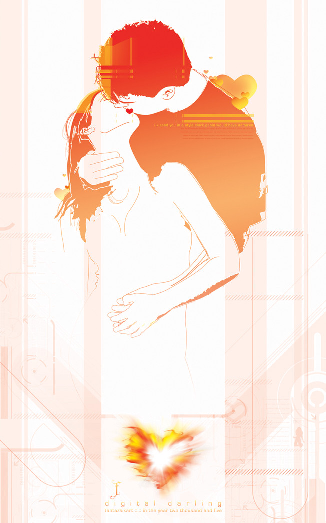
where to start.first off, the concept behind this is abstract. You can make of it what you will. I have my interpretation.
I actually started this piece with the idea to keep it simple and this is what happened. I don't know what the deal is? I really like to tell a story with my work and I guess that most of my stories are complex, and in direct correlation, so is my art.
I also consider this a WIP. I'm putting it on DA to see what you guys say about it. Sometimes you have some great comments and critiques and I belive your input can make this a great piece, so comment away peeps!!
Thanks to for the stock photo. [link]
edit May 21 05: another DD?? wow... cleaned up the image a bit... i still like the other one better, but hey! thanks to ©suzi9mm!
Related content


Comments: 138


i don't think so, i'm bad in english XD
👍: 0 ⏩: 0

i feel you...
would you care to ellaborate?
👍: 0 ⏩: 0


This is really cool, I like it alot. I like the heart at the bottom too. I do think the one on their lips looks slightly out of place. But if you like it there, then that's all that matters. Can't please everyone!  (Wink)")
👍: 0 ⏩: 0

I love these types of kissing positions. Great great beautiful
👍: 0 ⏩: 0

outstanding job. Its like that painting titles "a passionate kiss" great digital artistry on this one.
👍: 0 ⏩: 0

i love the colours you've used
the rest is minimal, which is great!
👍: 0 ⏩: 0

..Looks very great..
..I love the style you made it..
..I like it....
👍: 0 ⏩: 0

The colour is really good. It kinda emphasises the whole love thing.
I also like the pose of the people. And the stuff in the background and the little bits of yellow/orangeness on top of the main image. Works really well.
I think the heart looks good at the bottom. All fireyfied. Fire...
👍: 0 ⏩: 0


Mmmm yess. Postal Service is good
This is a beautiful vector, I love the heart!

👍: 0 ⏩: 2

")

Well I like this one better than the other one....the colors are just better.
👍: 0 ⏩: 1

wow, those colors are amazing. perfect mix of grunge and clear vector lines
👍: 0 ⏩: 0

no, but I suppose I could make one. It shouldn't be too hard. Have you seen the other version of this? check it out here. [link] I'm really starting to believe that I shouldn't have touched this one. I wasn't exactly happy at first with this one, but it's getting such great responses. ? Let me know what you think about the other one too! Look for the wallpaper version soon..........//
👍: 0 ⏩: 0

YES DUDE! Quality workage here. very fricken awesome. do you happen to have a wallpaper version?????????
👍: 0 ⏩: 0

Great job! I love how the lines show up on their faces.

👍: 0 ⏩: 0

Great piece brotha. Composition, colors... everything. Great. Okay now for the critique part. Not too content with the hearts, but of course that is only a matter of opinion. Do like the placement of the bottom heart, just not completely sure of the way it looks. The heart on the lips looks a bit off, kind of feel it takes away from the passion of the kiss, like cartoony. Forgive me if I sound a bit harsh, kind of distracted at the moment, but my intentions are true. Really do like the piece overall though.
👍: 0 ⏩: 1
excellent! thanks bro....//
👍: 0 ⏩: 0

Very nice colors, I like the gradient and the picture is kinda cool too  (Smile)")
👍: 0 ⏩: 0

i think you should've kept this image simple, perhaps it would be more striking without the techy looking background. my 2 cents
")
👍: 0 ⏩: 1
thanks so much for the comment bro. means a lot when someone of your caliber comments on a piece of mine.
👍: 0 ⏩: 0


i like the compotition and the hearts at the bottom, kinda old skool tattoo.... nice artwork dude ....i specially like the effect on the man and woman hair...
👍: 0 ⏩: 0

I totally disagree, I think the heart at the bottom is bloody fantastic. The pose of the people is brilliant, and I love the little quote/words/thingy. The techy stuff fits in perfectly with the piece, and the title. The colour scheme is excellent, and my only criticism would be the heart on their lips, I just don't think it fits. Apart from that, a great deviation. 
👍: 0 ⏩: 1
thanks for the comment and fav! much appreciated......//
👍: 0 ⏩: 0

I really like the color you chose for this piece. That pose is nice also. I'm a little unsure about the heart at the bottom... I see where it fits with the story but it just looks odd. Maybe if you had them inside a heart instead??

👍: 0 ⏩: 1
yeah. I was kinda thinking the same thing too. I just didn't want to let go of that heart! you know?!! But I might have to......
thanks so much for the critique! much appreciated.
")
👍: 0 ⏩: 1
you should check out my other piece i did. used the people, different bground and feel though.
[link] total submisson
let me know what you think on this one....//
👍: 0 ⏩: 0
<= Prev |