HOME | DD
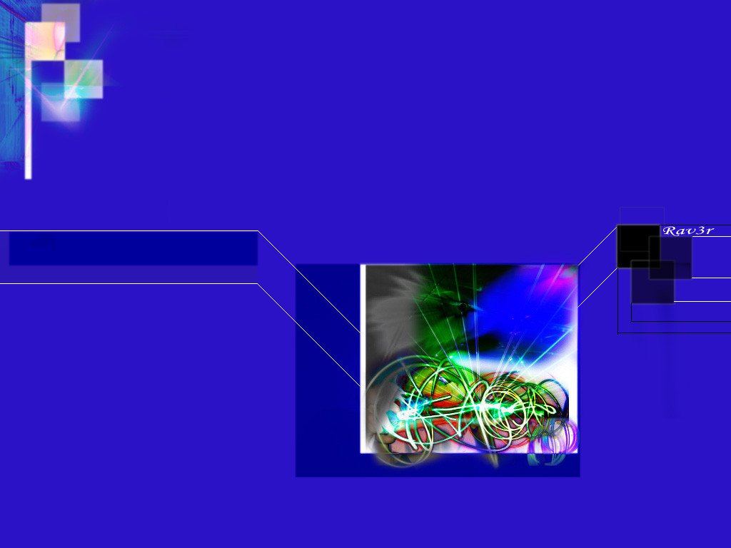
 fog-daredevil — Beginning or End
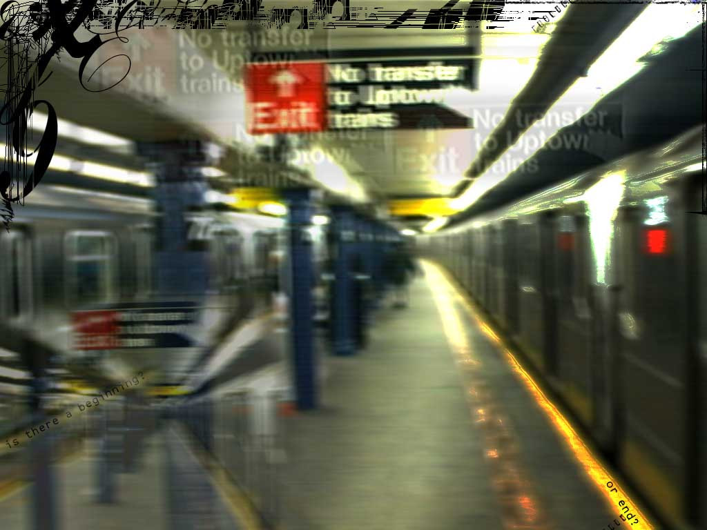
Published: 2001-06-15 10:10:01 +0000 UTC; Views: 684; Favourites: 4; Downloads: 155
Redirect to original
Description
My First work with Photoshop. Be mean, I want positive criticism to get betterRelated content


Comments: 7

I like the frilly stuff at the top, and the blurriness is good. But I think maybe you should do something with around the middle. Maybe a little more busy, to offset the blurriness.
-----
chem][x
👍: 0 ⏩: 0

Great shot, i love the blurryness, Neat color combination
-----
A photograph is a secret about a secret. The more it tells you the less you know. , Diane Arbus
4x6 www.fourbysix.com
👍: 0 ⏩: 0

i like the whole general picture but not the "add-ons",especially the smaller pic in the left corner, but the exit signs look good. post the original if you can . the lettering looks alil out of place too. does remind me of wandering home at 3.kepp up the good work.
👍: 0 ⏩: 0

Very interesting, espesially for a newbie. some of the vertical txt doesn't really work, but definitely the feeling of stumbling home at 3:30. ahhhhh....
👍: 0 ⏩: 0


Hehehe i like it!!
The typography type design in the upper left corner reminds me of The Cell, before j-lo kills the evil muddafuka... Awsome movie, awsome photoshop job bro!
(¯`·._(o-doyle)_.·´¯)
ICQ: 18995317
AIM: odoyledeviant
👍: 0 ⏩: 0
