HOME | DD
 genesis — The Visitor C
Published: 2003-03-27 07:32:51 +0000 UTC; Views: 1620; Favourites: 22; Downloads: 379
Redirect to original
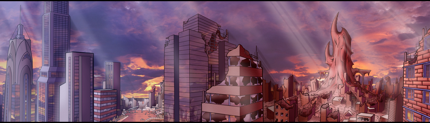
Description
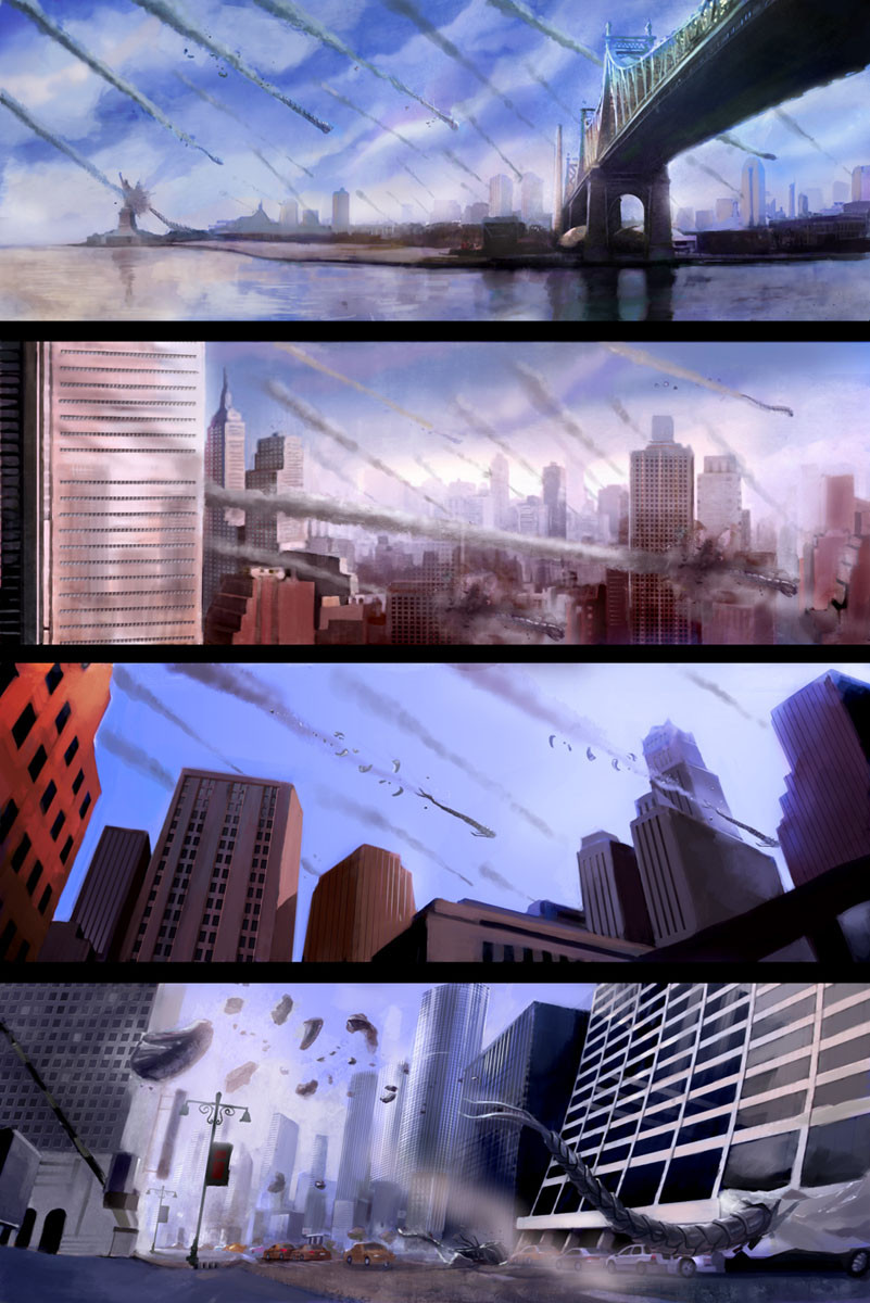
This is practically the final version of my PAN across my city for the 2D ASSIGNMENT for UNIVERSITY im working on. Starts off a spacecraft flys in from the left and goes into the distance to the big hive thing which has many other spaceships flying around it like flys. Anyways, comments welcome dont forget its for a short 2d film so it doesnt need too much detail but i still put a fair bit in, im only going to do a few more slight changes to this before its completely finished but so far so good. Comments and favourite additions welcome if you wish hehe.Related content


Comments: 15

Fantastic colouring, really brings it to life.
I especially love the way the reflections have been captured... only suggestion I have would be to maybe make the glass appear cracked and splintered where it's been broken.
Instant fav.
 (Smile)")
👍: 0 ⏩: 0


Fuck this looks mad your one of the best and i say that purly coz i like the detail and hard work you put into this great i mean great work.
👍: 0 ⏩: 0

dude what course are you ding at uni? or by now was doing maybe? Coz that bloodyrules. how can i create something liek that.... My stuff is nothing compared to that.
👍: 0 ⏩: 0

Great work !
I like the drawing and colors used.
I'm not sure that a photo for the background is the best choice but it fit well due to reflections on buildings. The only crit is about texture on building, they look like PS filters and not fit well with the drawing.
But in general this is an amazing work, i love it
")
👍: 0 ⏩: 0

This, my friend, is incredible. The sheer detail is, once again, mind boggling, and the combination of both digital and hand-drawn styles is, in my mind, perfect for this piece. In a way it goes along with the contrast of the shimmering, pristine skyscraper on the left, and the rusted ruin and carnage brought by the "visitor" on the right. I can imagine how impressive how this will be panning slowly over in your animation. This zoomed-out view looks even better, because all of the details blend and merge--they're visible, but they're even more part of the scenery because their actual composition isn't as noticable. The problem of the texturing looking too uniform on the brick buildings isn't really an issue anymore. Overall, this is astounding, and as all of your work, deserves a ton more attention. I'll keep lobbying for you, man, and you just keep producing this amazing art, aight?
👍: 0 ⏩: 0

unfortunately I am extremely busy, but I came across your gallery and this is amazing!! worth
cya around
👍: 0 ⏩: 0


Umm...its great. I love the sky, I love the contrast, I love the rays of light, I love all the little details.
👍: 0 ⏩: 0

Damn............ now this is fantastic. I mean there is soooo much to talk about (and sooo much ~designgeek mentioned
) Im really impressed.
I love the reflection in the building windows and the reflection in ther river or whatever it is... the idea is awesome in itself... I can image that little bugger flying straight to the hive... that would look awesome...
there is sooo much to stare at its make me happy... its like looking at a tiger for the first time... you just cant seem to blink, or look at something else... Most impressive...
Im personally sorry I didnt get to review this masterpiece earlier... tosay I as busy and crap. I just gotta say I have this feeling ( sence) thats telling me your gonna get an A+ or an A atleast... or else I'll kick that professor/teachers ass... alot... over and over again.
👍: 0 ⏩: 0

I hate it when you see the view count rack up on your work but no one comments.. its sincerely annoying especially when you put the work into it and most times your heart, thoughts and emotions too.
Well I like this, I presume your doing cell art animation of some kind or 2D digital animation. This background for the short film is good. The only reason I think the city looks more cartoony than the sky is because of the black outlines to the buildings, the lines are all one level of colour, no shading to it. Not darker in the foreground and then lighter less distinct lines the deeper into the scene you go.
I like to the left by the crysler building lookalike (I'm from england, I hope its a look alike ) the wake of destruction that kind of leads through behind the middle buildings to the thing glob that has invaded... hey.. its a B movie cartoon.. yayyy
What intregues me the most are the cloud reflections of the mirror buildings, good detail and an important one to make the scene real, maybe as you pan round you'll make the cloud reflections change slightly, this will give the illusion of movement more credentials.. more work I know but hey, its the little things that make it more solid.
Great work once again, will you be sumbitting the final work on an internet site so that we can see it.. its no good teasing us with the work up to the final and then not giving us the chance to see the short movie.. good luck.
Anyways I always do big comments, can't seem to do the small ones where you go .. cool I like!
👍: 0 ⏩: 0

I know, slow day for comments, darling.
I love the contrast. The organic vs the ... us. It's so cool. I rather enjoy the realistic, gorgeous sky. It makes me happy.
LadyGekko.
👍: 0 ⏩: 0


great work. only thing that bugs me is that the city is really cartoony (which isnt bad) compared to the sky. The sky seems too realistic for the city.
👍: 0 ⏩: 0

im alomost tempted to FAVOURITE this myself as noone is commenting.....its days like this that really suck.
👍: 0 ⏩: 0