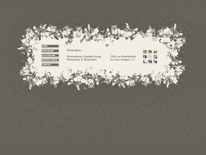
HOME | DD
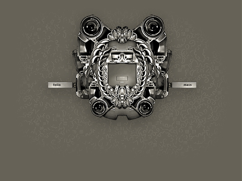
 GUNPAI — Splash Page Crest
Published: 2006-06-15 12:20:00 +0000 UTC; Views: 7089; Favourites: 25; Downloads: 387
Redirect to original
Description
This has been created for the splash page of my portfolio website. I wanted to create a crest made out of all the 'tools of the trade' e.g. scanner, mouse, camera, pc, webcam, speakers etc. Lots of images used and manipulated in photoshop. (stock from own collection)Related content


Comments: 72
")


links not workin? where do the links go?

👍: 0 ⏩: 0


")
thnx, im glad you like it
p.s. plus thnx for the fav

👍: 0 ⏩: 1

Wow! I like the pixel background and the camera lenses. Whenever I see something circular in a graphic I always think it's going to be another speaker. Nice to see something different
👍: 0 ⏩: 2

i agree with speakers tending to be used a lot, but i think as long as the artist makes it unique, its all good
👍: 0 ⏩: 0
Thnx
p.s. damn..im workin on one at the moment with hundreds of speakers lol.
👍: 0 ⏩: 1
BWHAHA.. make one a spinner or something!
👍: 0 ⏩: 1
aww man now i feel all wierd using speakers
👍: 0 ⏩: 1
Sorry didn't mean to burst your bubble, just that I've seen it a lot recently. If it's done in the right way I'm sure it'll be great!
👍: 0 ⏩: 1
")
👍: 0 ⏩: 0

is that a good or bad thing
")
👍: 0 ⏩: 1

+ I think its good, its very detailed and eye catching *_*
👍: 0 ⏩: 1
thanks  (Smile)")
👍: 0 ⏩: 1
+ Are you planning on using it?
👍: 0 ⏩: 1
ya its in use at the mo = [link]
Its unfinished though
👍: 0 ⏩: 2
the one above that goes to [link] (which is a 403 forbiden page)
👍: 0 ⏩: 1
oh , oops
ya my website is down at the moment, plus the crest isnt used on it anymore. I must remember to change the pic info
thnx for pointing in out
👍: 0 ⏩: 1
+ Hmm, so that's why i didn't recognize it; it will go on the Flash version, right?
👍: 0 ⏩: 1


Hi, saw your work on designerscouch...this is the shizznit. For sure! later
👍: 0 ⏩: 1

great design!!! i would have to suggest that u make the main content center on the page and have the colour to the very edges of the browser, as a background colour. This wil top off this amazing desin! well done!
👍: 0 ⏩: 1


nice idea! it'll make visitor spend much time examining the details and makes them interested in what the actual site'll look like. good.
i hope that in the final version you'll have jolly good outlines (these are a bit 'dirty').
then, i don't really like the buttons (flash, html) they're too simple for you. if you've managed to 'collage' that a pic, make 'em more original, ok.
👍: 0 ⏩: 1
thanks. How do you mean good outlines.... Does it look bitmappy, should i make em softer? How to make the buttons more original
👍: 0 ⏩: 1
softer is the right word!
as for the buttons. you know, there's a lot of 'web site buttons making' soft. your buttons look as if they were created in such a programm... no good. you could change the font, shape. i don't know. you're the designer.  (Wink)")
👍: 0 ⏩: 1
no probs, all critique is good critique. Buttons took me a while to make
👍: 0 ⏩: 1
thanks, ill upload a new version if anything works out and prepare myself for your comments
👍: 0 ⏩: 1
| Next =>