HOME | DD
 Hameed — Linear v1 - Collab
Published: 2003-01-28 16:04:10 +0000 UTC; Views: 4544; Favourites: 30; Downloads: 588
Redirect to original
Description
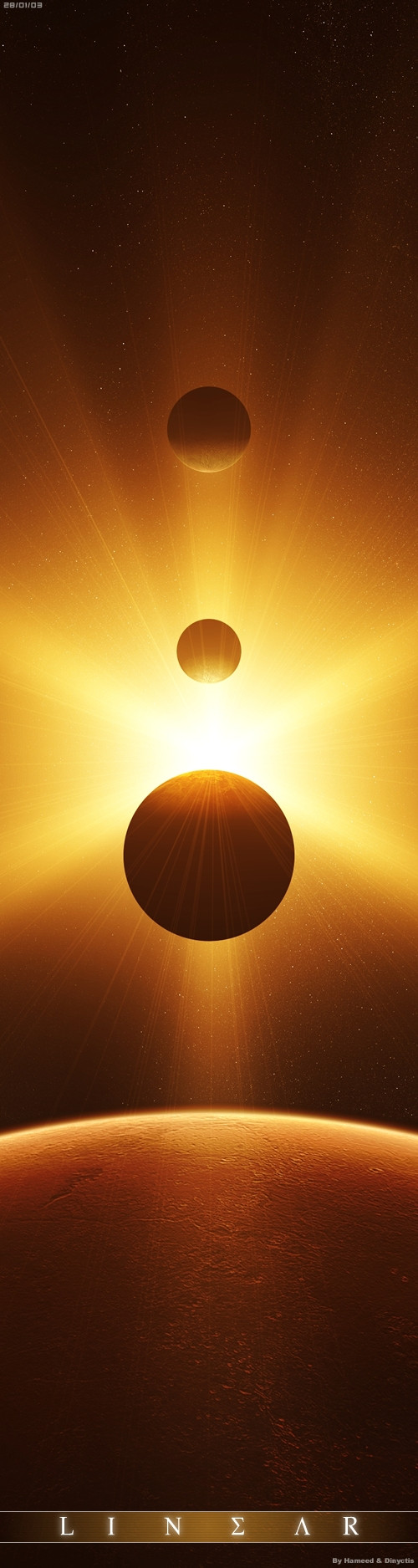
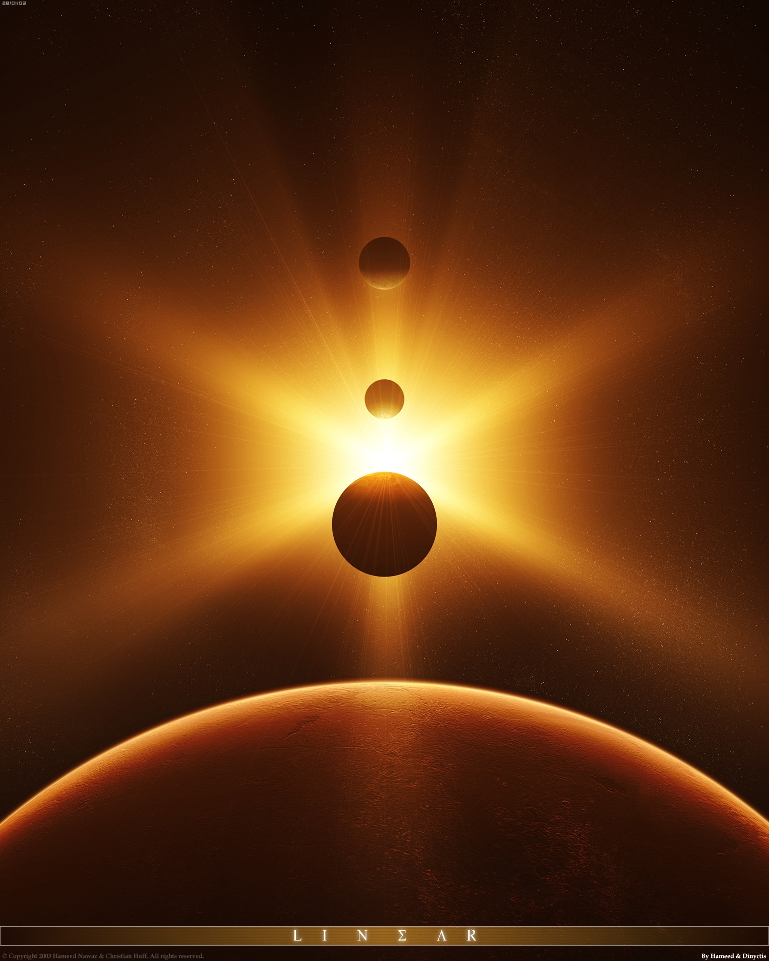
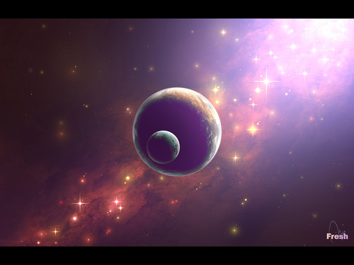
Every 50.000 years in a distant galaxy, an alineation occurs. A game of gravity shapes the climate of the planets and reveals the dawn of a new life for the living being.This version is a crop of [link] I posted this because the file size is much smaller than the other edition, also i like the aspect of this image better.
A part of the second collaboration between me and *dinyctis . I hope you all like it.
Related content


Comments: 23

wow that´s perfect .clap: the colorising and the lights are so clear and awesome

👍: 0 ⏩: 0

sheesh. your layout and designs skills are emaculate!
no way i can leave this gallery without faving something!
(hard not to fave ALOT of it! heh.)
amazing work!
👍: 0 ⏩: 0


Nice pix... the cropping emphasizes the planetoids more.
👍: 0 ⏩: 0

yes, this one gives a better framing for the objects. The alignment of planets has a very magical meaning, and seeing this work, to me, is almost emotional: seeing so much order in a universe that looks like chaos is certainly magical
👍: 0 ⏩: 0


The lighting and everything is just superb.... Love the cropping. +fav fav fav
👍: 0 ⏩: 0


i like this one, it shows the "linearness" more, heh
ive just noticed tho, u can tell from the light on the planets that the source is only slightly infront of them, kinda spoils the illusion slightly
👍: 0 ⏩: 0

Certain, I like much more the format of this pic
Amazing image
👍: 0 ⏩: 0


Gorgeous. I love this one more than the bigger one. There's something about it, but I can come up with how to say it so I'll just +fav it instead
I really like this. It's nice and simple.
👍: 0 ⏩: 0

i love the colors and the verticalness of this...as with your other work "amazing"
👍: 0 ⏩: 0


This is pretty nice, the idea is great, but the rays on the second planet from below are not very realistic. they shouldn't be showing. Still I like it a lot
👍: 0 ⏩: 0

both are great, this one though has a better sense of order, in a way
👍: 0 ⏩: 0


hmm yeah you're right, this aspect is better
but I already +faved the other one... whatever, I +fav this one, too
👍: 0 ⏩: 0

I like this crop version
looks better, goes with the flow haha
great work!
👍: 0 ⏩: 0
