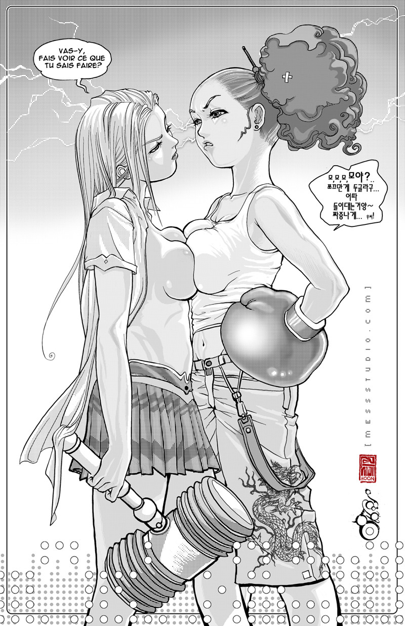
HOME | DD
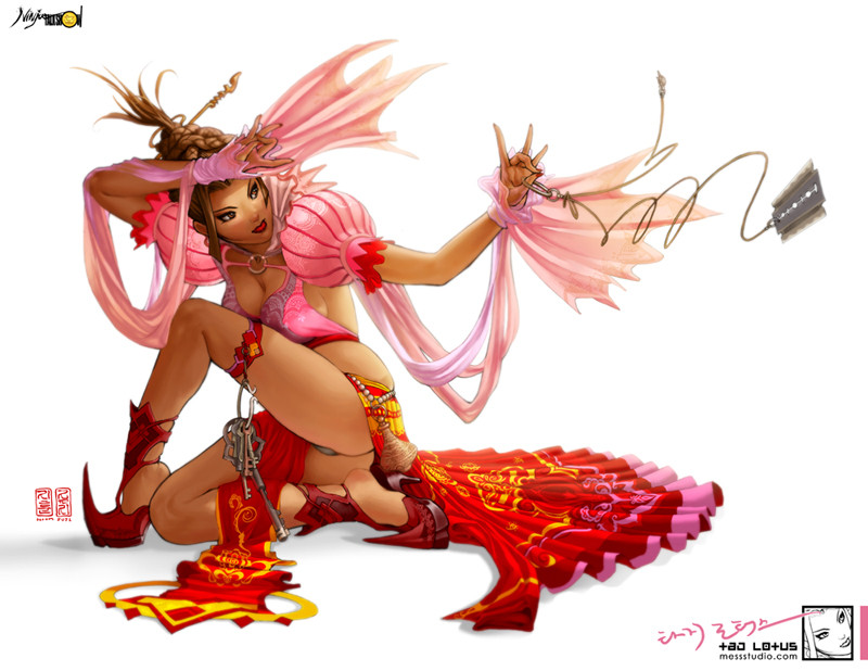
 HOON — Waiting for Harry Callahan

Published: 2004-08-11 18:28:34 +0000 UTC; Views: 58299; Favourites: 1152; Downloads: 14307
Redirect to original
Description
what we really need is harry callahan attitude!about 10 hours
my 6th PAINTER8 piece.
PSCS
WACOM
zero refs
first piece of its series
waiting for harry callahan,
Kikuchiyo, wish you were here, (7th)
and darth vader, cosmic cross-fader (8th work in progress)
web design concept!
details:
[link]
Related content


Comments: 296

i have no idea what it says but i like it alot. the hair is done really well. great style
👍: 0 ⏩: 0


Wow! this is pretty bright and all the red caught my eye! Also, may she be the champine of them all! *goes off before she starts to make even less sense*
👍: 0 ⏩: 0


SO GOOD
can yo tell me wath technique you use?
my english is too bad
good work
👍: 0 ⏩: 1

i used both painter and photoshop
painter: rendering
photoshop: color tune, layout design etc
👍: 0 ⏩: 1
THANXXXXXXXX!!!!!!!!!!!!!!!!!!!!!!!!!!
GOOD WORKS!!!!!!!
👍: 0 ⏩: 0

Amazing art. *_* I gotta dev watch you..
👍: 0 ⏩: 0

this is really wicked, but since its concept art and not a true web design interface, i dont see why it's submitted in this category
")
👍: 0 ⏩: 1
 (Wink)")

but it's not even a sketch for a layout, it's just the artwork that might be used in a layout. it doesn't belong in this section, just the like other(s).
👍: 0 ⏩: 1

right you are, but 
👍: 0 ⏩: 1
it's not that i'm trying to bitch or something, really, the artwork was way cool for that.
but since i often search for web design concepts in DA, i hardly every find something useful, since the category is flooded only with cool splash images, which do not consist a complete web interface.
just a matter of recategorisation, i suppose.
👍: 0 ⏩: 1

👍: 0 ⏩: 1
maybe i'll try that.
but sometimes it's just plain misreading from artists.
or, omg, even worse, when they submit to an alienated category just to get to DTF with 2-3 favs.. that's pathetic indeed! (of course, no pun intended for the artist now at stake ")
👍: 0 ⏩: 2
when i said i didnt mean my last point to be intended to you, i was absolutely frank.
i don't know why you take this so personally. i made a fuss about the categorisation because i'm tired of looking for web design ideas around DA and stumbling always over nice, but totally static and useless splash images.
and if you look close at the category description, you'll see what i mean.
it's a different thing to ponder about where to put your art, for example macabre + horror or dark art, and a completely different thing web design interface or misc digital art.
i respect your art, but please have respect in mine too.
and cut the sarcasm please, ok? don't be so bitter, i kindly made my point clear, deal with it.
👍: 0 ⏩: 1
i didnt realize i got response from you on my last comment until today, so here is my reaction to you.
i thought your previous comment, which did have good point was worth responding to, and thats what i did. RESPOND. and yes i may have been sarcastic since now you DONT seem to make clear point about the whole catagorization issue.
i really dont see why a piece of art, such painting or Photograph (like yours on your homepage) cant be catagorized as a web interface. button can be hidden as part of image, and such imagery can make better sense without typical frames, tables, boxes and buttons, especially for art sites. to give you an example, vector art, or oekaki can be catagorized into specific section because it requires certain technical approach to art, or tool. but there are number of catagories that have grey area, where you cannot pin point specifically. alot of the time, its reflects the artists' preferences.
i would still insist that i will call this particular piece web design because initially, even before i sketch this one out, i wanted to make web design, and when i finished it, thats what i got. Entire series... 3 in all, conveyed the same intention.
one day i came back here, and found out that the catagoriation of my art has been changed by the admins. i can deal with that. sure.
and i also realize that u are taking extra steps to bring a good point. but honestly, im still having hard time understanding your point. give me a good reason why a splash page design that consist of an image or a single painting.... or a web interface doesnt show buttons on the right or left column cant not be classified as web interface?
lastly... couple of things.
maybe we are operating in completely different platform and make no sense to each other, but im willing to find out what your real point is here. first thing i want to ask of you, is that stop making assumption.
my apology to you, if you thought i didnt respect your art.
do you mind telling me what made you think i have no respect for your art?
i actually thought it was disrespectful that you carried out a thread on my art that wasnt directed to me, but spoken to someone else....to general.
also, what do you mean by me being bitter? i thought i gave honest and respectful response to you without lying to anyone, or myself.
ill appreciate your forthcoming response. and that will help me to have better idea on catagorizing whatever i do in the future.
thanks for your time, sugar.
👍: 0 ⏩: 0
well, you can say its "intended," when you intend to make such point.
these pieces are exactly what it WAS classified as. web design. im developing characters for my website, and the site will operate around characters, instead of borders and frames, and what you called, "web interface design" Its absolutley waste of time for me to attempt classifying my art, cuz i never have such classification in my head when i initialy hold up a pencil to do something.
its a puny attempt we all try to classify art into sub catagories, because its allways fulfilling and seemingly-safe to divide everything into clasifications and put away in separate boxes, but i beg to differ.
i am not irritated that some of my new submissions re-CATAGORIZED into another unfitting subcatagory: DIGITAL ART: MISC(???) i rather find this whole thing amusing that some of you make a big deal between such a small differences of naming conventions.
I also wanna make another point to you sugar, ^^ (pun totally intended)
OMG, i dont give a damn about all that DTF or page-counts etc. i am not interested in DA politics and "little tricks to get your attention" either. im only in this to share art, and give exosure to my art and my team's endeavor. Having said that.... maybe i should consult You from now on before i post anything? cuz im really not sure about all this art classification bullshit, cuz you seem to know precisly what you are taling about?
well, i gotta go, so we will continue this later, sweet stuff?
👍: 0 ⏩: 0

shouldn't this be under digital art then instead of web interface? cuz it's not actually a layout yet, just a painting...
👍: 0 ⏩: 1
eek
is it really hard to believe that this could be a web interface? >_<
👍: 0 ⏩: 1


whoah, she looks mean and ready to take on anybody (run away!....) anyway nice pic i like the colors (i always like the color choices on your pics because you really bring them out-but is'nt that what every colored pic is supposed to do?) great job HOON as always.
👍: 0 ⏩: 0


just damned cool work. The pose is awesome -- really expressive and I love the vibrant colours and shading style.
Technically and creatively an excellent piece of work Hoon

👍: 0 ⏩: 0

rockin' very swish. love the lack of lines and the lips are so divine.
👍: 0 ⏩: 0

wow thats nice...looks like it may be a bit cold in there though hehe
👍: 0 ⏩: 0


Good work 
expression and composition everythibg is perfect
👍: 0 ⏩: 0

wow, you are marvellous , great great great job !!!!!*clapclap*
👍: 0 ⏩: 0


Perfect Job!!!! I Like the glow effect you made on the gloves, made them look more like real leather!
👍: 0 ⏩: 0

The bright red background caught my attention 

👍: 0 ⏩: 0

Omfg. Korean. 
👍: 0 ⏩: 1
haha
you knew though right?
i am who i am!
👍: 0 ⏩: 0


Your coloring skill rules, and the lines, are awesome. Her expression is what I like best ^___^ 
👍: 0 ⏩: 0

HA! Awesome!
+Fav
Great talent with a strong slice of style. Me luff you long time!
👍: 0 ⏩: 0

incredible
u did well on the expression and details
👍: 0 ⏩: 0


hahah this is awesome
Its very much itself..
and its very interesting
At the very least it draws attention.
And in a very good way.
Im very humored about how wonderfully chinese she looks. I love it.
Fave
👍: 0 ⏩: 0
<= Prev | | Next =>