HOME | DD
 introversion — Ted Leo and The Pharmacists
Published: 2004-01-27 06:41:20 +0000 UTC; Views: 181; Favourites: 0; Downloads: 22
Redirect to original
Description
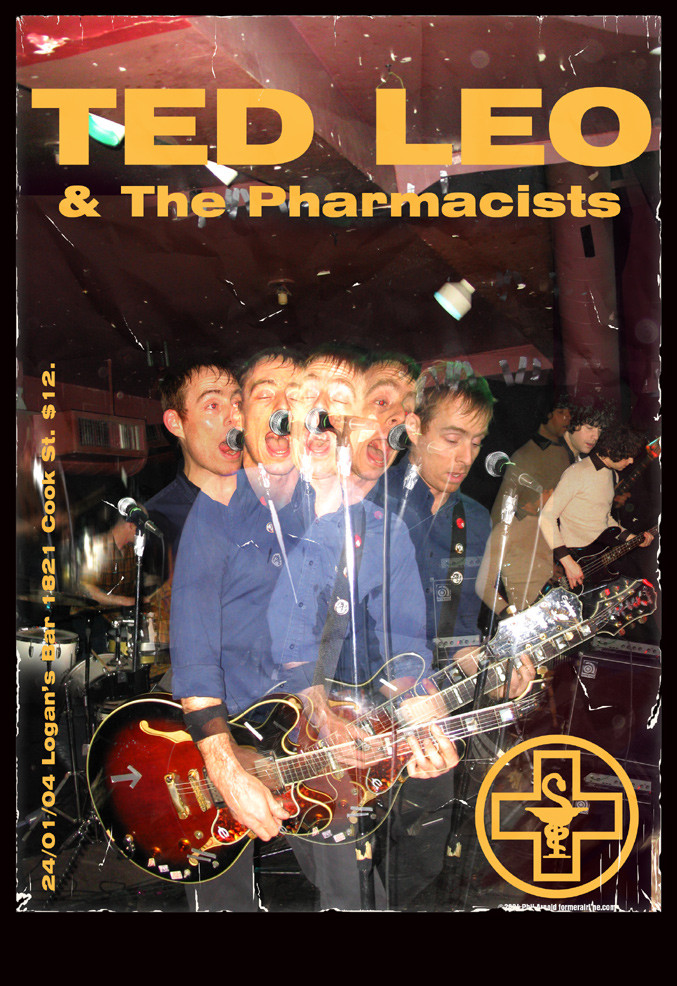
One Saturday I went to see Ted Leo and the Pharmacists, one of my favourite indie music acts. Fantastic show, high energy, great tunes. Ted is a fantastic performer and is a hilarious guy. [link]I took a lot of pictures at the show. The venue was microscopic so there wasn't really any freedom to move around to get a 'perfect' shot. My pictures weren't the best so to get the feeling of the energy of the show I rather hastily tossed a bunch of them together. Kind of worked. I prepared the band logo in Illustrator but the rest is photoshop. The image here is scaled downm I can make a nice poster for myself and put it on my wall.
I left the red-eye in. I could easily remove it but I liked it for some reason. Makes it more gritty, like the venue.
Related content


Comments: 4


Not bad as a poster, from what you said it fits the group's energy. The type is not quite there though.
Your sidebar is too big ( use regular or Univers thin ) and too far away from the edge.
Did you try having the title HUGE on the page? Ted and Leo are both 3 letters word, so you could have a giant square on top and then play around with " The Pharmacists" : place it inbetween maybe?
Now about the logo. Did you play with the different layer options? Hard Light, Soft Light, overlay and such? Maybe you could incorporate it in the type somehwere. right now it's like the sidebar, it looks accidentally placed. Try it huge, bleeding out of the frame, transparent, or don;t listen to me  (Smile)")
Don't be alarmed I liked it overall. It has more potential that you might want to seek out.
One question though : the scratches on the edges of the paper, done in the computer or did you print it out, threw it on the ground, rubbed it and then scanned it back in?
cheers!
👍: 0 ⏩: 0

I like the grungy look. Good job. The logo looks nice too.
👍: 0 ⏩: 0

I never cared for this guy save for the song "Treble In Trouble", but this is a great shot. after-images are cool.
👍: 0 ⏩: 0