HOME | DD
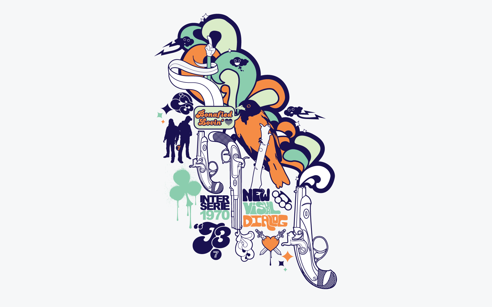
 j3concepts — Inter.Series.1970
Published: 2007-05-13 19:39:23 +0000 UTC; Views: 17657; Favourites: 116; Downloads: 1344
Redirect to original
Description
Just a different version of Bonafied Lovin' that I forgot to upload.I think I like this one better.
Related content


Comments: 22

i still use this cool work for my desktop. it works great on it, many thanks
")
👍: 0 ⏩: 0

i bit belated perhaps, but simply becuase i just today started using the other version of this wallpaper. i must say i think i prefer the colors of the other more to be honest.
was the title and art anyway inspired by a chromeo song of the same title by chance?
👍: 0 ⏩: 0


 (Smile)")


Really like the whole 70's style look.
Reminds me of my playful youth...
I really would like to see a style full screen, something like MIKA has on it's cover CD.
I really like that cover... [link]
Greetz,
Le Marquis
👍: 0 ⏩: 0


Nice, awesome to see that the rule "never use more than 2 fonts" can be broken and it still looks good. Massive how you combined all the different styles together, just as they would have to belong together
Greetings, nice colors too
")
👍: 0 ⏩: 0

These -70s pieces you have made are absolutely fantastic!!!!
Love to see more!!!
👍: 0 ⏩: 0

very nice, very difficult to tell which one is nicer.
the mickey hand owns bitch ass!
👍: 0 ⏩: 0

I love the Mickey Mouse style hand!
All your stuff is awesome! ^^
👍: 0 ⏩: 0

Haha! Fuck I love your stuff, smiley rain clouds next to majestic perched warblers!?
And it works too!!!
fucking +fav
👍: 0 ⏩: 0


The ariel font is out of place imo. Its just not fitting with the other wicked typo u got. But overall , rocks none the less boss.
👍: 0 ⏩: 0


that one looks awsome too, har to tell wich look better
👍: 0 ⏩: 0
