HOME | DD
 jasinski — Libra

Published: 2002-04-12 18:46:39 +0000 UTC; Views: 12999; Favourites: 290; Downloads: 1527
Redirect to original
Description
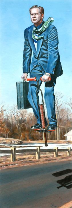
part of my series Signs and Sequence.Related content


Comments: 62

Nice!
-----
...Helping people love life through caring.
For Details: https://netguru.deviantart.com/journal/?j id=104898
Current Favorite: https://www.deviantart.com/deviation.php? id=220487
👍: 0 ⏩: 0

Brilliant! wow... I love the colors you use in your paintings!
+devwatch
-----
-Hessam
👍: 0 ⏩: 0

the teetertotter is very nice, the girls face is kinda "mona-lisa-ish" .. supurb, just like everything you do, into my faves
-----
._______. d ++
verve.april.15th.
prepare.yourself
http://www.alteredperception.org/ . _______.
👍: 0 ⏩: 0

thats great work!! the colors are so amazing, and how they blend together I love that see-saw thing too!
👍: 0 ⏩: 0

im absolutely stunned. the colors are breathtaking, as is they way you have painted this. the depth is just perfect.
+ fav
-----
-[ someday is sooner than you think ]-
👍: 0 ⏩: 0

this is ku. for some reason when i first looked at this i focused on the girl's shoes??? don't know why, probably how thier placeed on the seesaw? great job.
-----
.sean
👍: 0 ⏩: 0

awesome, i want to hang it on my wall....
-----
---------
~Azrael
👍: 0 ⏩: 0

This is such a cool interpretation of the scales idea. Fabulous.
-----
===
I like grey
Visit CAFE-HOUSE at http://www.cafe-house.com to debate and discuss issues!
👍: 0 ⏩: 0

This is a really nice illustration. I love the colors on the coat and the green sky.
👍: 0 ⏩: 0

new concept of the scales great i like it loads
x
👍: 0 ⏩: 0

that's actually really cool it looks like it should be one of the artworks in a business magazine of sorts, which is a good thing
i like the colors you used, and the subject matter is great also
awesome job on the painting, keep up the awesome work
-----
👍: 0 ⏩: 0
<= Prev |