HOME | DD
 jedeye459 — Simple 3
Published: 2003-08-23 00:00:11 +0000 UTC; Views: 2338; Favourites: 38; Downloads: 1154
Redirect to original
Description
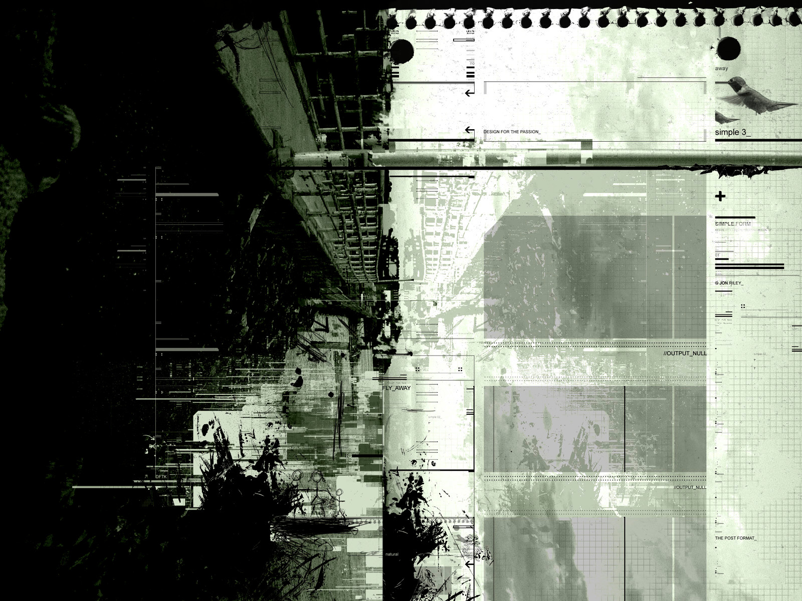
well I took it one more step... this is the final piece, enjoyRelated content


Comments: 50

simple... clean? crisp...
Absolutely fantabulous work!
")
👍: 0 ⏩: 0


wow, this sure is something you don't see everyday. very individual grunge style mixed with quite straight layers, and a nice color choice to top it off. I really like it alot
👍: 0 ⏩: 0

geez. this from an 20 yr old american? who would have guessed.
good work man. please keep this ish up.
👍: 0 ⏩: 0

damn.. nice intensity with the ink. great forms. i love it.
👍: 0 ⏩: 0

heh... I'm speachless as well... It's an absolute undeniable masterpiece with awesome class! +fav
👍: 0 ⏩: 0

It has a nice grit to it. I like how it looks like paper torn out of a spiral notebook in the top right.

👍: 0 ⏩: 0

Simple my ass! Very nice grunge - I love the effort you put into this, awe-inspiring.
👍: 0 ⏩: 0

The piece is very intersting. The contrasts between all the elements really work well. Very original and different. Great piece.

👍: 0 ⏩: 0

simple phenomenol work. its been great to see you grow so much as an artist. this piece defines you!
👍: 0 ⏩: 0


simple's not the word i would use for this piece.. xD my gosh, its so beaitiful gj!
👍: 0 ⏩: 0


I really like thr different elements in this, nicely composed! Very detailed.
👍: 0 ⏩: 0


this is sooo fucking cool. you never cease to amaze me jedeye. never!!
👍: 0 ⏩: 0


")

Awesome. There is a lot that I like about this. I really like the textures on the picture and the one created by the paper, the torn edges look really cool. The whole hue adds a great deal to the piece. The picture used is great, So simple to rotate it but it does a great job and abstracts it enough. The texture work over the whole thing is great. Awesome work.
👍: 0 ⏩: 0

lol if only it was simple
----------------------------------
please check out my stuff
[link]
👍: 0 ⏩: 0


The grid look super.
I like your 2d and your style (Smile)")
👍: 0 ⏩: 0

I'm not really feelin it, like the trendy 2d and the grunge should theoretically provide a nice contrast, but in practice I'm not real sure how well it works. I do like both elements individually though.
👍: 0 ⏩: 0


very good
i like it a lot and i dont know why. It just has a good look to it and it's YOU so it's naturally good.
👍: 0 ⏩: 0

super sweet! really cool combination of styles you have going on there!
👍: 0 ⏩: 0

This is just awesome.
Love the combined style.
Great work.
Breathtaking piece.
👍: 0 ⏩: 0


great piece!
awesome details and that notepad paper looks cool!
👍: 0 ⏩: 0


great bro
👍: 0 ⏩: 0


excellent work again. From memory I think this is probably my favourite of the three.
I really lke the complexity of it, and the depth all those lines give.
There is a lot of texture here, and it looks really good.
Well done Jedeye !
👍: 0 ⏩: 0

Nooo! This would've been my favorite of the 3, if not for that damn little humming bird in the top right corner. ")
👍: 0 ⏩: 0

great! great! love it like your other 2 peices.. but there might be something wrong with me because i dont like how the photo is completely verticle.. it makes me naturally tilt my head like i'm unbalanced :/
👍: 0 ⏩: 0

Love the old feel.
Love the graph lines.
I even like the bird.
Ofcourse I love the colors.
Love the overall feel.
But I really don't like the stick figures in the bootom.
")
👍: 0 ⏩: 0


sweet piece bro!
dc deadline is tomorrow,you gonna have anything to busy bro?
👍: 0 ⏩: 0


I am stunned. This is simply amazing. The torn off notepad paper really sets this apart. Definitely the right side is my favourite. Great Job!
👍: 0 ⏩: 0

The Simple series just gotten complex...sweeeet!!!
👍: 0 ⏩: 0

Nice design and details.. I also like the colors..
👍: 0 ⏩: 0
