HOME | DD
 joeyv7 — sleepWalk with me: colored2

Published: 2008-08-04 22:52:29 +0000 UTC; Views: 1584; Favourites: 48; Downloads: 0
Redirect to original
Description
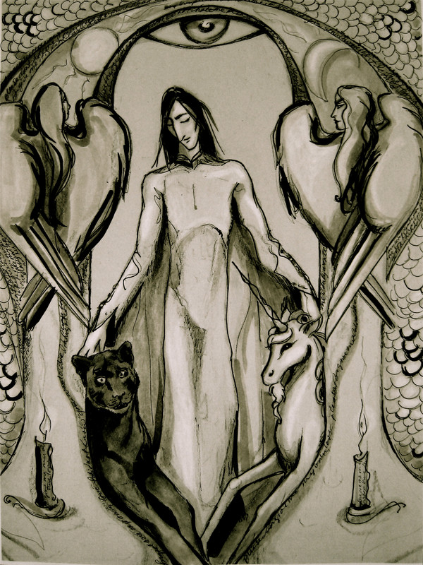
[*edit 8/12 - eventually this will be re - worked, lots to improve. Check the rampant derpitude on that panther, for one. ]Symbolist examination of the private iconography of dreams.
Brushes used -
 So many friends helped me navigate Photoshop to complete this. It's only fair that you choose which version goes in the Feature gallery, and which goes to Scraps. This version has an antique filter, which unifies the colors of the piece, and adds warmth. However, some detail and color is lost.
Related content


Comments: 86

Either way I love this kind of texture... and well the concept is totally beautiful... tell me.... what does it all represent?
👍: 0 ⏩: 0

I can hardly make up my mind which one I like better but if you beat me long enough I'd probably go for the original
👍: 0 ⏩: 1


Ok I vote for the original without

👍: 0 ⏩: 1

the SPANK emotie! Forgot we had that one
👍: 0 ⏩: 1
It's so usefull at times ")
Do you know this one ... I only just found it.
👍: 0 ⏩: 1
OH that's going in the zoo - it's so cute!!!!
where did yo find him ?
👍: 0 ⏩: 1
ohhhhhhhhh *dies* He looks like mine

👍: 0 ⏩: 1
He's in 'Susan' -
[link]
just a little cartoon to fill out the composition

👍: 0 ⏩: 1

me too - but here it definitely has a brassy/yellow cast . . . I do like how it unifies everything though.
👍: 0 ⏩: 0

i think this one is better because of the softness that antique filter adds to it, so it's more dream-ish.
but both of them are beautiful, can't they both stay?

👍: 0 ⏩: 1
Oh, I'm not dumping anything - I like Scraps as much as Featured; my scraps has more activity than the main gallery
 (Wink)")
👍: 0 ⏩: 1
haha,well in this case both of your deviations will be happy

👍: 0 ⏩: 0

I think this one captures the dream state more beautifully, but I don't think either of them deserve to be in scraps!
👍: 0 ⏩: 1
hmmm - scraps for me isn't the trash, it's more active than the main gallery
👍: 0 ⏩: 0

I like this one more, I think. It all fits better together. Green is not disturbing red anymore, and red seems warmer. Though... perhaps the rest of this work becomes a bit too red now.
Ah well, this one I'll 
👍: 0 ⏩: 1


I think the colors in this one look richer. The gold makes the red stand out more.
👍: 0 ⏩: 1


I really like the colors in this one best! If you like, you can keep it this color, and re-put in a the details over it to match the colors. If that seems like overkill...than I still like this one best! Nice work!
👍: 0 ⏩: 1
Thank you! - actually some of the details lost don't even need to be there, as they were pretty shaky to begin with.
👍: 0 ⏩: 0

Yes, because I like the composition of this. But not for awhile - I got to hating this thing for awhile there.
👍: 0 ⏩: 1
. . . and I'm back to hating it now.
👍: 0 ⏩: 0

I really like the idea of the colors molding together more but I agree here, that filter made it lose a bit of quality. but u don't have to use a filter like that: You can fool with it to your taste using the "adjust/hue saturation" I bet you could get more to the way you want it trying those on the original version.
👍: 0 ⏩: 2
well, I tweaked it as much as I trust myself to tweak right now - #1, that is 
👍: 0 ⏩: 1
yeah . . . lemme try that
*cannot believe I'm going to tweak it yet again*
👍: 0 ⏩: 2
btw, get my email?
👍: 0 ⏩: 0
oh for God's sake, that's what I shouldv'e done in the first place 
👍: 0 ⏩: 0
<= Prev |