HOME | DD
 jwtodd — SoundBoard LCD V2 -incomplete-
Published: 2002-05-23 04:44:56 +0000 UTC; Views: 186; Favourites: 1; Downloads: 42
Redirect to original
Description
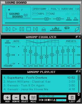
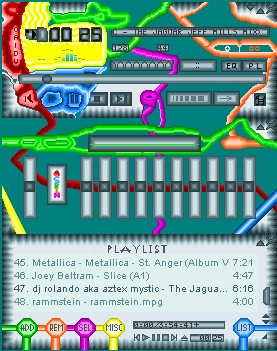
This is an update to the SoundBoard LCD skin I put up earlier today. As a result of some feedback regarading the plain look of the border of the skin, I've decided to see what I can do to improve the look. So far, only the border of the main window has been changed. I know I need to update the minimize/windowshade/close buttons (I'm thinking along the lines of Window 98 style) - the ones I currently have won't work with this design, I don't think.Any comments/suggestions would be welcome. In particular, I'm looking for an idea of what colour to use for the text in the title bar to differentiate between active and inactive windows.
Thanks!
JT
Related content


Comments: 4

Ok, I just woke up and I'm in a kinda trippy mood, so forgive any future silliness, but here's what I'm thinking... just hear me out and maybe try a few things...
Make the title a little brighter on the titlebar, so that it blends a little more... and when it's an active window, maybe make it pushed in whereas inactive is beveled, or the other way around?
I think the main thing you may want to look at is a coordinating color or a different shade of the current teal for the font color and all the designs on the LCD. I don't think there's quiiiite enough differentiation here. Maybe orange if you wanted it to be really bold, or perhaps a different blue? Green? Something that goes well, but looks a little different than the current. Right now, there's not quite enough contrast to make the metal borders be as effective as they could, methinks.
Ok, none of that sounds silly when read, but you should hear the weird inflections I had in my head when writing it. hah.
-----
~Xx
Beguiling Visions [link]
See my latest winamp skin: [link]
👍: 0 ⏩: 0

i liked the clean look... dont dig gradients... clean.. *points at you* clean
👍: 0 ⏩: 0

this is probably in complete contradiction to comments on your original design but personally I like the subtle minimalism of the original. the graduated chrome thing looks a bit cheesy to me, maybe you could find a more minimal and subtle 3D metal vibe, less shiny and without the clear graduation?
👍: 0 ⏩: 0
