HOME | DD
 krazytim — Simple Cream Portfolio Concept

Published: 2007-09-25 06:37:38 +0000 UTC; Views: 8168; Favourites: 41; Downloads: 366
Redirect to original
Description
Read Me: This is a deviation submitted under my old account (krazytim). My new account (timsilva) is here: [link] - Please watch my new account.Do not make comments or add this deviation to your favorites. Instead, go to the mirrored version of this deviation here: [link]
----------
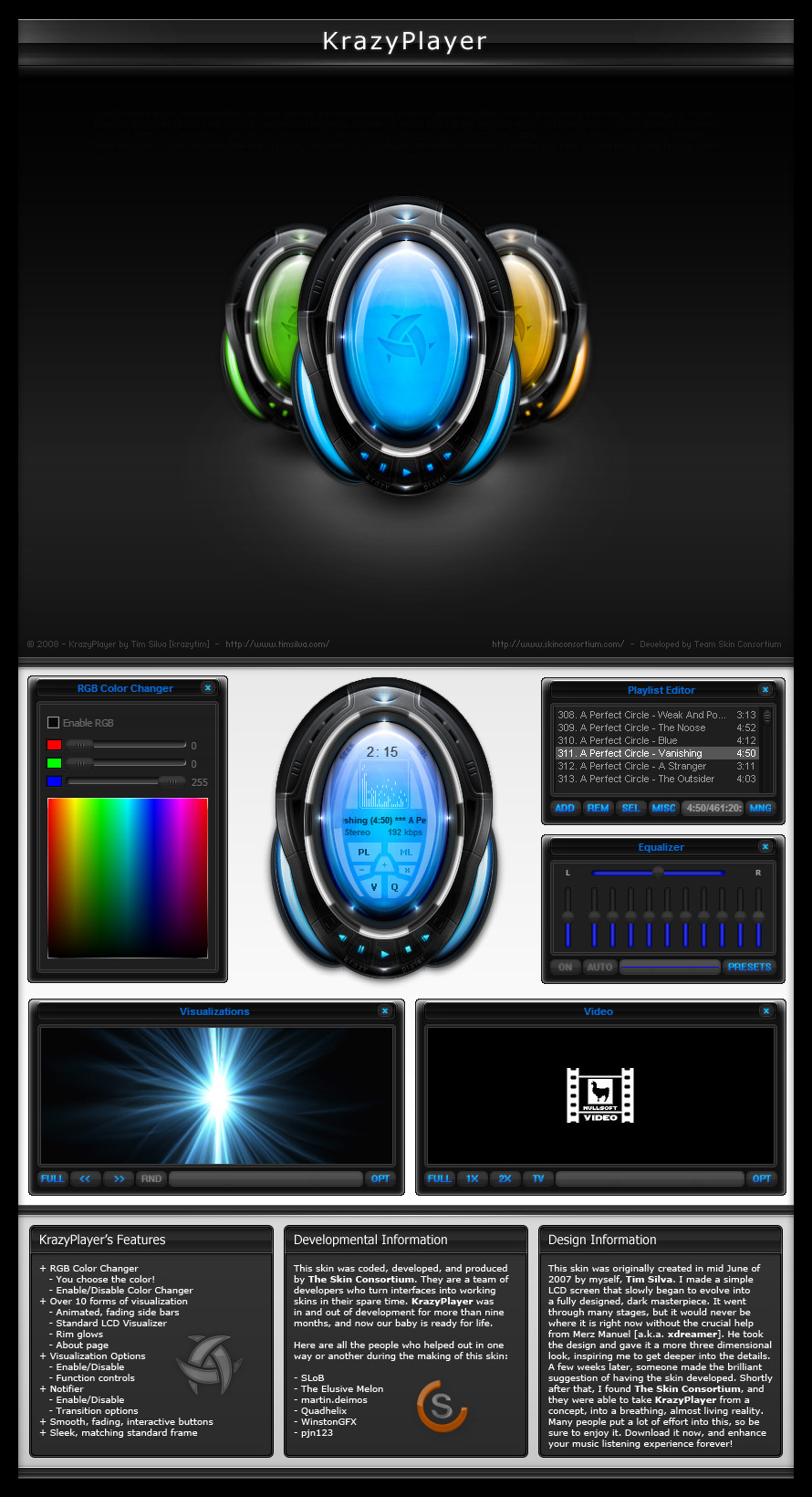
Not much to say about this one. I don't know what the title has to do with it, I just made it up on the spot
 (Wink)") I always liked these clean designs and I want to get better at them. I lost half to PSD to this because it come corrupted, but I was able to extract enough from it to work with and finish it up. Please enjoy
I always liked these clean designs and I want to get better at them. I lost half to PSD to this because it come corrupted, but I was able to extract enough from it to work with and finish it up. Please enjoy  (Smile)") All comments and +favs are greatly appreciated.
All comments and +favs are greatly appreciated.Also, I am fairly new to the whole clean/simple design area, so if anyone has any blunt but true comments about it that will help me improve my skills, please let me know. Does the content area flow well(?), is the navigation and logo aligned well(?), etc.
Related content


Comments: 73

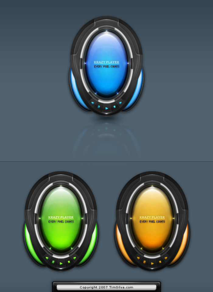
Same here, I'm glad I had a chance to make one. And yes, I wanted the logo to be bigger, but I lost that part of the psd
")
👍: 0 ⏩: 1

aww shucks. don't worry about it your next design will be better.
👍: 0 ⏩: 1


this looks realy simple but great! hope to see this coded?
👍: 0 ⏩: 1
Thank you
👍: 0 ⏩: 1
damn i wish i could do something simple XD ... im not very good on it ^^"
👍: 0 ⏩: 1
I know what you mean. Its actually hard to make simple looking designs compared to tech/cool ones. If you experiment it will come sooner than you think though
👍: 0 ⏩: 1
hmm .. maybe ^°" ... i think i give this a second try some day ^^
👍: 0 ⏩: 0


You could make the logo stand out a bit more. I also don't really like the nav that much but I'm sure it's easy to come up with something better.
Other than that, I can't see anything wrong that is major.
👍: 0 ⏩: 1
Thanks alex ")
👍: 0 ⏩: 0

Im not really a fan from the top menu, but the layout looks nice
👍: 0 ⏩: 1
That was the part of the PSD that got corrupted, so I had it on there as a flattened layer and just left it alone. There were more details in the body
👍: 0 ⏩: 0

Yea it's simple
👍: 0 ⏩: 1

No bad, simple and cool, i dont know why, but i think i like your logo
👍: 0 ⏩: 1
Thank you ")
👍: 0 ⏩: 0
<= Prev |