HOME | DD
 kriptoner — Razorium
Published: 2002-06-27 20:06:43 +0000 UTC; Views: 2591; Favourites: 14; Downloads: 858
Redirect to original
Description
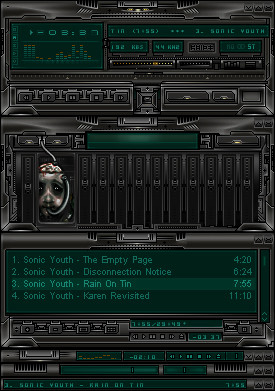
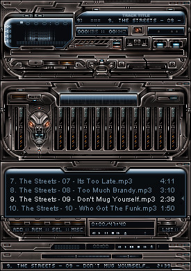
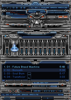
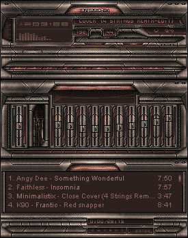
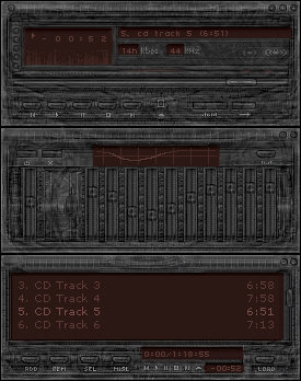
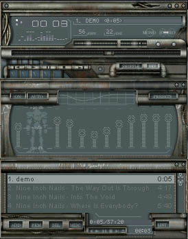
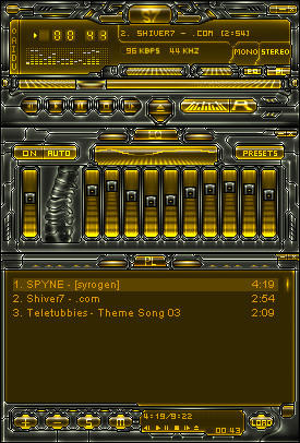
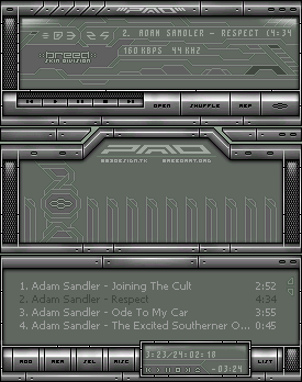
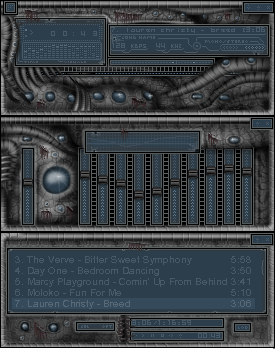
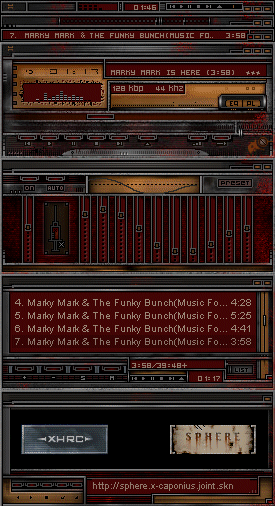
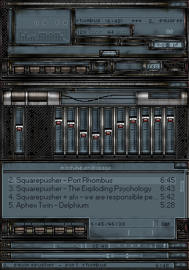
Skin created for Razorart issue 13[link]
Related content


Comments: 39

CooL, CooL, CooL, CooL, CooL, CooL, CooL, CooL, CooL, CooL, CooL, CooL, CooL, CooL, CooL, CooL, CooL, CooL, CooL, CooL, CooL, CooL, CooL, CooL, CooL, CooL, CooL, CooL, CooL, CooL, CooL, CooL, CooL, CooL, CooL, CooL, CooL, CooL, CooL, CooL, CooL, CooL, CooL, CooL, CooL, CooL, CooL, CooL, CooL, CooL, CooL, CooL, CooL, CooL, CooL, CooL, CooL, CooL, CooL, CooL, CooL, CooL, CooL, CooL, CooL, CooL, CooL, CooL, CooL, CooL, CooL, CooL, CooL, CooL, CooL, CooL, CooL, CooL, CooL, CooL, CooL, CooL, CooL, CooL,
👍: 0 ⏩: 0

Man I've really got to hand it to you on this one man!!! You did so excellent on choosing the colors and creativity!~
👍: 0 ⏩: 0

Goes good with my skin collection thanx
I like 'em dark and forboding
👍: 0 ⏩: 0


Nice, but too dark for my liking, but nice.. Excellent work as always.. I want to see your lighter side, you're versitale in any style you try at, and I must say, lightness is one of your best..
👍: 0 ⏩: 0

You have a very weird but cool style. A little stereo and a little sci-fi and grungy but not "grungy", you know? maybe you don't but that's what I think. The volume bars, cbuttons, playlist buttons and eq image is the best!
👍: 0 ⏩: 0

this is cool.
i'm going to add this to my collections.
👍: 0 ⏩: 0


got it from ra, it goes damn good on my desktop. just kinda hard to read the font in the pl. very well done
👍: 0 ⏩: 0

Using it right now. Downloaded it from Razorart
Nice interview.
I just love all the little animations you craft for your skins, and the cool style you imprint to them. Ok, I think this one's not your best, but it's cool none the less. I think a full b&w color scheme could have made it better, 'cos that green...
Anyway, great skin.
I can't wait to see Misanthrope II
👍: 0 ⏩: 0

incredible...it's like you're gonna be the next monaux
👍: 0 ⏩: 0


what a beautiful skin!!! wow...but I cannot download..
👍: 0 ⏩: 0

youpi ! tu sais déjà ske j'en pense
trop dla baaalle
👍: 0 ⏩: 0

Alright, this is good and bad, let me explain. The skin is beautiful, i give you that. I mean, it takes a lot of work to create a skin and this just goes to show how much work it takes. It's not just an overnight thing. But listen, this goes to all the skinmasters out there. CREATE SOMETHING ORIGINAL, STAND OUT, STEP UP A LEVEL! Seriously. I'm not trying to rip on your skin, but it's not original, take to buttons in the main. I've prolly seen the same buttons in about a thousand different skins. Without a doubt. Anyone will agree. This whole, robotic death and dark seen is far too over played. Anyways, I and I imagine many others would like to see something that stands out, totally blows everything out of the water, something new. Take TiH20 Equilibrium for instance. That stood out, changed the whole skinning age. Same with any other masterpiece. It has to be completely, in all forms, Original. I've noticed and I imagine about a billion others have also that the space between the equilizer main control and the other controls is always the same. It's always just a head, a hand, an animal, a number something just added in to make the skin complete. Lets see something different, something that blends in with the rest of the skin. Don't make the equilizer look like an actuall EQ. And another thing, the bottom of the playlist, same thing, create something different. Make something pop out instead of just having the same old thing with a few letters. Be CREATIVE! I'm sorry if i'm totally destroying this skin or any other skin, but what i'm saying is true. I don't mean to be too demanding, but lately, i just haven't seen anything pop up in my face and say "Holy shit, that's FUCKING AMAZING" Well, let me know what you all think, agreeing or disagreeing. Kryptoner, keep up the good work man, great skin.
👍: 0 ⏩: 0

DD! DD! DD! DD! DD! DD! DD!
MAKE THIS DD!
DD!
DD!
DD!
DD!
its great!
👍: 0 ⏩: 0

Kript == Elite.
Thanks for the interview, it was a blast.
Awesome skin!
👍: 0 ⏩: 0


Dont now why that happend ment to say that u should skin the AVS....Ʃ
👍: 0 ⏩: 0
wow VEry good skin doawnloaded and using it adding to +fav ....©Æ
👍: 0 ⏩: 0


yes, quite nice, but as stated previously its a little unoriginal. i think the window flow from main to eq to pl doesnt work too well. it looks a bit repetative, which is the disturbance to me.
i like the colours and lighting though
(( try something original for issue 14 if you will, this style is getting somewhat old. ))
👍: 0 ⏩: 0


I quite like it. It may lack some style, texture.
👍: 0 ⏩: 0
very nice skin. love the colors, and its the perfect shade of darkness. great work. i love your skins! BTW, congrats on featured skinner!
👍: 0 ⏩: 0

Nice dark skin. The image in the EQ is somewhat disturbing . I like the shade of green you used in the screens - very nice. And the orange peaks in the viz, and volume/balance sliders are a nice subtle contrast.
👍: 0 ⏩: 0


w00t, w00t, w00t and re-w00t !
a new Krip skin...nice looking, those guys at razorart are lucky
👍: 0 ⏩: 0