HOME | DD
 lassekongo83 — Auriel Visual Style
by-nc-sa
lassekongo83 — Auriel Visual Style
by-nc-sa
Published: 2008-09-05 08:31:43 +0000 UTC; Views: 248292; Favourites: 506; Downloads: 96867
Redirect to original
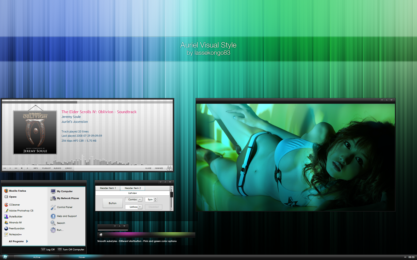
Description
This is what I wanted Shine VS to be like from the beginning.")
2 startbuttons to choose from. Windows flag or a house.
3 colors - Blue, Green and Pink.
Smooth and Opaque substyles.
Girl: Sayuri Anzu
Icons: Tango
Foobar2000: fooHydrangea
Wall: [link] (Modded)
It's simple to mod in Photoshop. CTRL+U - Change the hue. Also add a 90 degree 999 motion blur to smooth it out.
ANY QUESTIONS OR PROBLEMS WITH MY VISUAL STYLES? SEE MY FAQ FIRST! - [link]
Related content


Comments: 131

OH MY GOSH this one is awesome i don't know how describe it but it is just beatifull.

👍: 0 ⏩: 0


Love it...and a grey/black version?
Great job...you are the best...
👍: 0 ⏩: 0


any hope of anyone using sks5 to make this a wb skin??
Ruben
👍: 0 ⏩: 0


I like your theme, only that i like my Status bar as 2 lines width,
which the button doesn't suite.. :\
can you make a different button that would feel more touchy, and would cover the area where its supposed to be - better..?
👍: 0 ⏩: 0


the girl in wallpaper ! i need its , please post link download wallper , thanks
👍: 0 ⏩: 0

I lole it.
Sorry but you can post the link of this girl?
👍: 0 ⏩: 0


awesome, very good! thx
what is the media player's name?
👍: 0 ⏩: 0


This is awesome, really. Just one little thing. I keep getting these weird pink dots on the theme. They appear randomly, and are about 2 or 3 pixels big. Besides that, it's great
")
👍: 0 ⏩: 0

 (Wink)")


I love this so much...
question about the icons.
are you using tango icon patcher....
if so are you using the industrial option?
Also, You know of a way to change it with maybe a silver folders instead of orange.
👍: 0 ⏩: 0

this is a superb theme!! one of your best....and that's saying something
👍: 0 ⏩: 0


WONDERFUL!!!, changing it for my black shiftyjuly
THANX!!
👍: 0 ⏩: 0


I be liking me smooth #1 the best.Ya feel me dog  (Smile)")
👍: 0 ⏩: 0


There's a problem with some applications (ex. Scribus and Toon Boom Studio) during using this theme. I just can't access windows inside program, only status bars are visible. See screenshot:
[link]
Any idea how to fix it?
👍: 0 ⏩: 0


I love it. Nice effects and beautifuf girl as usual. 
-----------------------------------------------------------------------
© 2008 InfinityK4fx | infinityk4fx.deviantart.com
👍: 0 ⏩: 0

nice work combining the two ideas from the previous visual styles... i love it!
👍: 0 ⏩: 0


love it! This is what I wanted Shine VS to look like, I'm just not talented enough to make it myself!
👍: 0 ⏩: 0

You start menu icon reminds me of an old windowblinds 4 theme called "Black". It was one of those vista-like themes when vista very first came out. I wonder if anyone knows what im talking about... But hey, great theme man, nice and smooth
👍: 0 ⏩: 0

Thanks for this nice VS. Appreciated very much the Trebuchet font.
Can you ship the wallpaper (your blue green one) in the 7z package? Thanks for the instructions but I am quite ignorant in graphic tools.
About the VS, my first impression is that the inactive titlebar looks quite similar to the active one.
👍: 0 ⏩: 0

Fantastic! The glowing tabs are absolutely awesome. The only part that I miss in this style, are the CaptionButtons from Shiftie 2.
GREAT!
👍: 0 ⏩: 0

yea this really is def one of my faves of yours great work my friend! - featured today on jackrebel dot com.
👍: 0 ⏩: 0

It seems like all of your themes are not NEW themes in and of themselves, but new versions of the previous ones. As such, they just keep getting better and better!
Good taste in... music, by the way.
👍: 0 ⏩: 0


With this font/visual style, russian letters get so small that you can't see them. Do you know if there is anything I can do to get them as big as the normal letters (without changing font).
Thanks in advance.
👍: 0 ⏩: 0
| Next =>