HOME | DD
 matrix7 — Church On The Move - Draft 1
Published: 2003-10-16 21:14:50 +0000 UTC; Views: 401; Favourites: 0; Downloads: 159
Redirect to original
Description
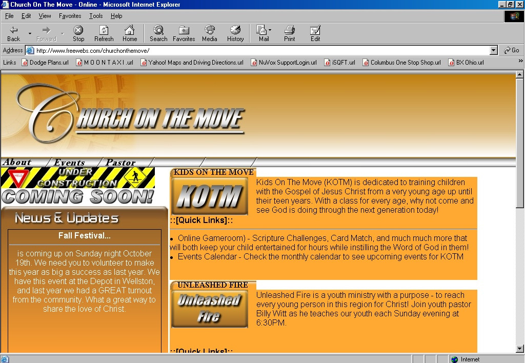
::[Church On The Move - Draft 2]::Told you guys I was working on a lot of sites
 (Smile)") This is the home page for my church in Wellston, Ohio (I am their IT guy, web designer, drummer and part time Sunday School teacher.
This is the home page for my church in Wellston, Ohio (I am their IT guy, web designer, drummer and part time Sunday School teacher. The orange/rust color was really an accident but they really liked it so I kept it. Major props to Sixwings [link] who also happens to go to COTM (he got me started at Devart too) for his suggestions on the logo, I think it turned out okay.
Going to keep with the orange/chrome contrast throughout the site. Maybe have some semi-transparencies going on... The News and Updates section uses a really slick looking javascript I pick up at Dynamic Drive that fades from one message to another (looks pretty nice). The desciptions section on the right will be completely overhauled. I want to keep the "manilla folder" feel using tabs and such, but I am thinking of only displaying one at a time (maybe some layers and z-indexing going on).
The horizontal bar along the top half of the screen will have a drop down menu with some transition effects built in. I am currently working the bugs out of the transitions or I would have a screeny there.
The URL doesn work, but keep in mind this is a tester page. We are finalizing our actual host this weekend and then deciding on a Domain name (woo hoo godaddy.com....cheap cheap cheap domains).
I think that's about it. I was wanting to do some flash work on the title but I am trying to keep the bandwidth down. I recently compressed all the jpg's so they are all about half the size and you can't tell the difference in quality (you'd be surprised how much of a difference in the file size a compression of 5 will make).
That's it guys. Comments welcome as always, and constructive criticism will be taken into consideration (long as you're nice :smile: )
L8terzzz guys
::[Matrix7]::
::[Studio Seven Designs]::
studioseven@peoplepc.com
Need a web site? Support a fellow deviant!
Reasonable rates, discount for DA members.
Related content


Comments: 3

Wow - much better than last time I saw this...
I agree with the piksel about the logo font tho.
That "C" looks good and the rest looks good, but for some reason it doesn't seem to go together great yet... make any sense?
I like the clean look of it tho

👍: 0 ⏩: 0

heyhey! I really love this color scheme but I do have some critics. (if I may...
I would consider changing the font of " hurch on the move". The logo is great, but the text doent seem to fit it, and do it justice.
The under construction part (the yellow and black) could be more intergrated, maybe try and put it in a window-tile?
But really nice and clean lay-out...
-Piksel
👍: 0 ⏩: 0

i think this works fine for a site with such a theme. everything seems easy to find... that counts.
👍: 0 ⏩: 0