HOME | DD
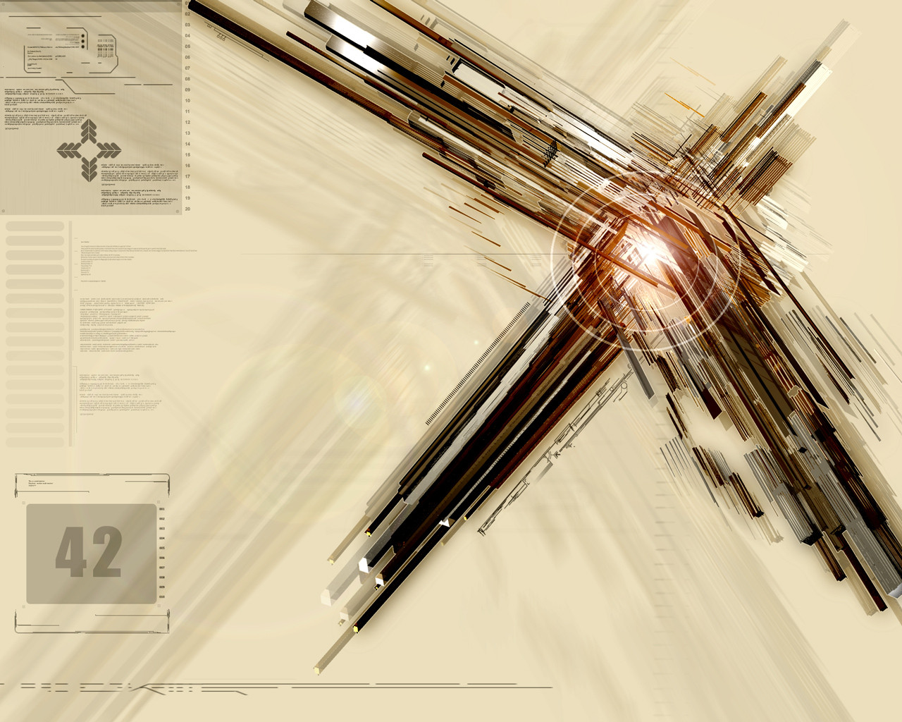
 MindPhase — :::42:::
Published: 2004-08-12 09:05:26 +0000 UTC; Views: 1529; Favourites: 22; Downloads: 426
Redirect to original
Description
I thought I would turn my hand at something different (for me at least).....and came up with this.Rendered in 3DSM6 and everthing else in PS with brushes from various people (I'm sorry I can't remember exactly who, but if you recognise your brush then note me and I will edit this to give credit).
This is my first mainstream effort at an abstract and I'm not sure its verys good.....it just seems to lack balance in my opinion, but I can't work out whats wrong....
I hope someone likes it though and as ever abuse/crit/comment/whipping is welcome if not compulsory
 (Wink)")
Related content


Comments: 69

hehehe yeah... i wish i knew how to advance my learning... the tutorials dont work for some reason on my computer anymore.. tried reinstalling etc multiple times.. i only got done with like.. 1/3 of them if that.. x.x' and all the online ones are either extremly simple.. or expect you to already know everything in the tutorials...><
👍: 0 ⏩: 1

I usually find that coming up with an initial idea and trying to carry it out works.....with the use of the simple tutorials of course
👍: 0 ⏩: 1
heheheh yea... helps alot when you can think up an idea.. 
👍: 0 ⏩: 1
I thought that - try and push yourself and you might find you can do it
👍: 0 ⏩: 0

hey, this is one of your best pieces babe!!
love the color theme and the compotision
stunning work getting better and better every submittion
")

👍: 0 ⏩: 1

You are too kind....and I still have a *lot* to learn....
👍: 0 ⏩: 0

the lens flare/brushing in the middle has gotta go.
IMO, the render involved isnt big enough for the peice. I dont think its wallpaper size works with it.
👍: 0 ⏩: 1
I thought that when I was doing it, but I didn't know how to change it.....its my first piece and I learnt a lot doing it, I still have a long way to go
As said by someone else above I think it would have helped if the lines going towards the bottome left had been carried on....it would have provided more balance and would have perhaps lead to the render fitting the size better.
You live and learn
👍: 0 ⏩: 0

Woah!
so dynamic, this looks cool!
gomen, i cant give constructive on this one cos this is not my area.

👍: 0 ⏩: 1
Heh - thanks for the comment though
 (Smile)")
👍: 0 ⏩: 0

I can understand why you think this is unbalanced, but I think it is more dramatic this way, since the lines lead to the focal point (which is dramatic because it is not centered). Only criticism are the lines coming down towards the left corner; it seems to bunch together and is not very pleasing to the eye. Compared to the other lines, those are not as detailed, and might affect the overall balance in terms of quality (if you understand my perspective). But this is a great abstraction.
👍: 0 ⏩: 1
Thank you very *very* much. Its comments like this that really help! I do understand what you mean and looking at it you are totally right.....it would flow more without the bunching and would provide a cleaner line.
Thank you again, especially for taking the time to comment and help me
👍: 0 ⏩: 1
No problem, I usually find comments such as "good job" or "nice" or something around those lines to be flattering, but not helpful. Nothing is perfect, and why not improve the quality of art that goes around dA, right?
👍: 0 ⏩: 1

looks about as balanced as an abstract need to be. This is a massive improvement on previous works tho. great colour space.
👍: 0 ⏩: 1
you are too kind....really!
/me is off to do another piece quickly

👍: 0 ⏩: 0

looks pretty much perfect to me...
👍: 0 ⏩: 1
You think? You don't think its kinda unbalanced? Glad you like it though
👍: 0 ⏩: 0
<= Prev |