HOME | DD
 MOK-SK — Study #4: Visual language
#drawing #study
Published: 2017-07-04 08:48:47 +0000 UTC; Views: 459; Favourites: 18; Downloads: 2
Redirect to original
Description
FacebookThis time I aimed at visual language.
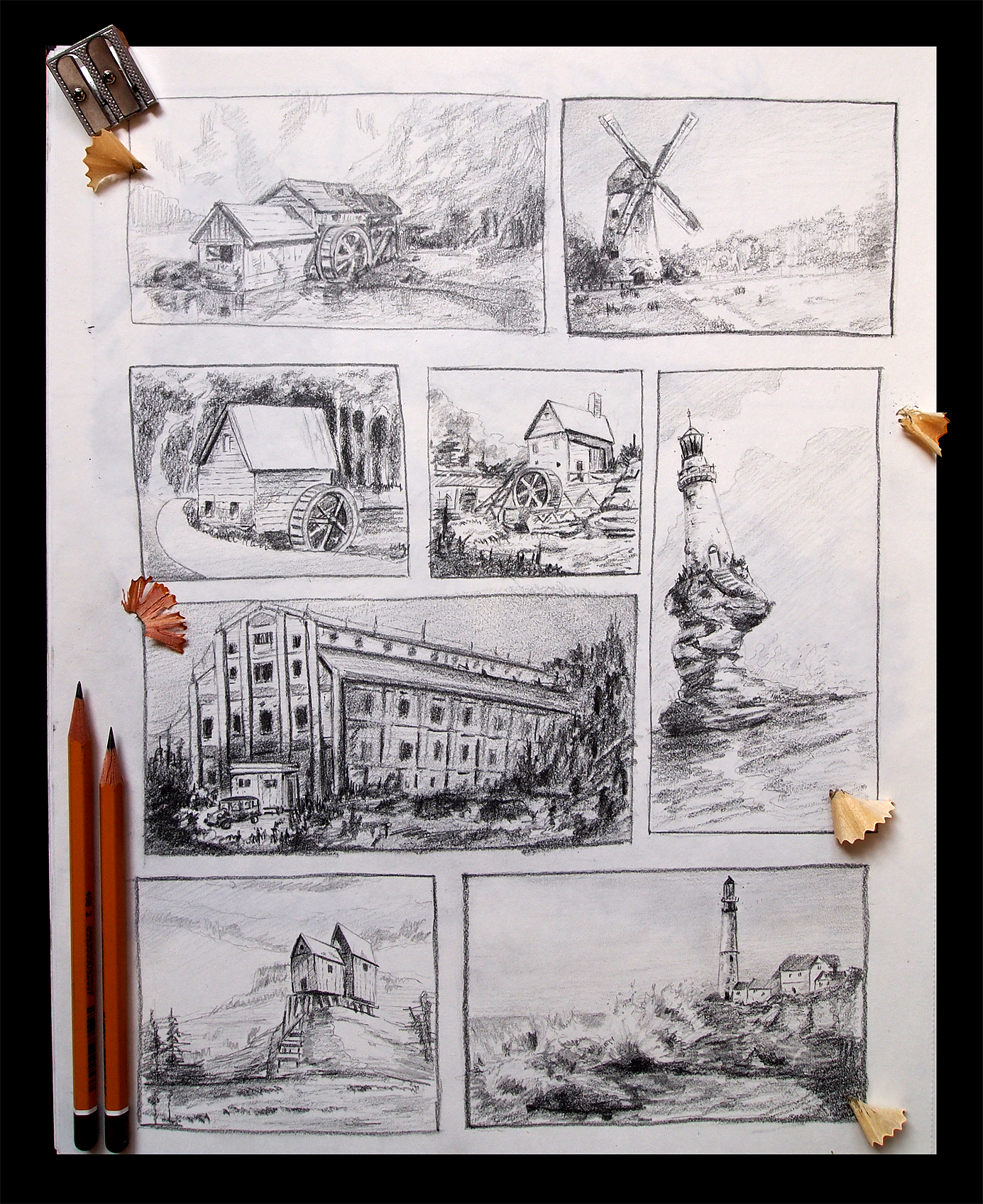
It is a language we visual artists use to express our story. When you know what you want to tell by your picture, you know what your focal point is and everything around it will serve to make that focal point pop out in a way you want. In each of these thumbnail sketches I have first decided what will the drawing be about and I have picked the focal point. Then I have decided how I want it to stand out in a way that will be interesting and nice to look at.
1. For example in the first (top left) I have done this by value and detail contrast.
2. In the second one to the right I have used the strong silhouette of the mill and direction of the trees that form a V shape intersecting at the mill.
3. The third one also uses value contrast but there is also the road that wraps around the small house thus framing it.
4. In the forth one in the middle there is no strong value contrast. There is a contrast of low versus high activity. The house itself (especially its roof) is the part where there is not much going on whereas the rest of the picture is quite full of different staff.
5. The lighthouse on the right forms a simple shape with the light cloud intersecting its dark top.
6. In the large building I have tried to face the overwhelming number of details on the structure. I have wanted to keep it all out of focus and let the small car pop out. There could be an interesting story - who knows. So a have reserved by lightest lights and my darkest darks as well as sharpest shapes for that area.
7. In the thumbnail with the two old houses in the bottom left corner, everything that is out of focus is horizontal whereas the focal point (the two houses) are vertical. Everything on them is vertical. Only things that are also vertical are trees at the edges of the drawing. Their serve as terminators against all that horizontal staff and they force the eye to stay in the picture. Perhaps they are too vertical and because of that they pop out maybe too much. I have tried to fix that by introducing more horizontal lines on them but with varying success
 (Smile)")
8. The last one combines value contrast, contrast of sharp versus smooth, direction of waves and direction of houses. It all tries to force your eye up the lighthouse.
There are other awesome tools of visual language and it is exciting to discover them. For example I really like to use direction when various key things points certain directions thus leading your eye across the picture always back to the focal point. It also introduces energy to the picture and to the story.
So go and explore!
")