HOME | DD
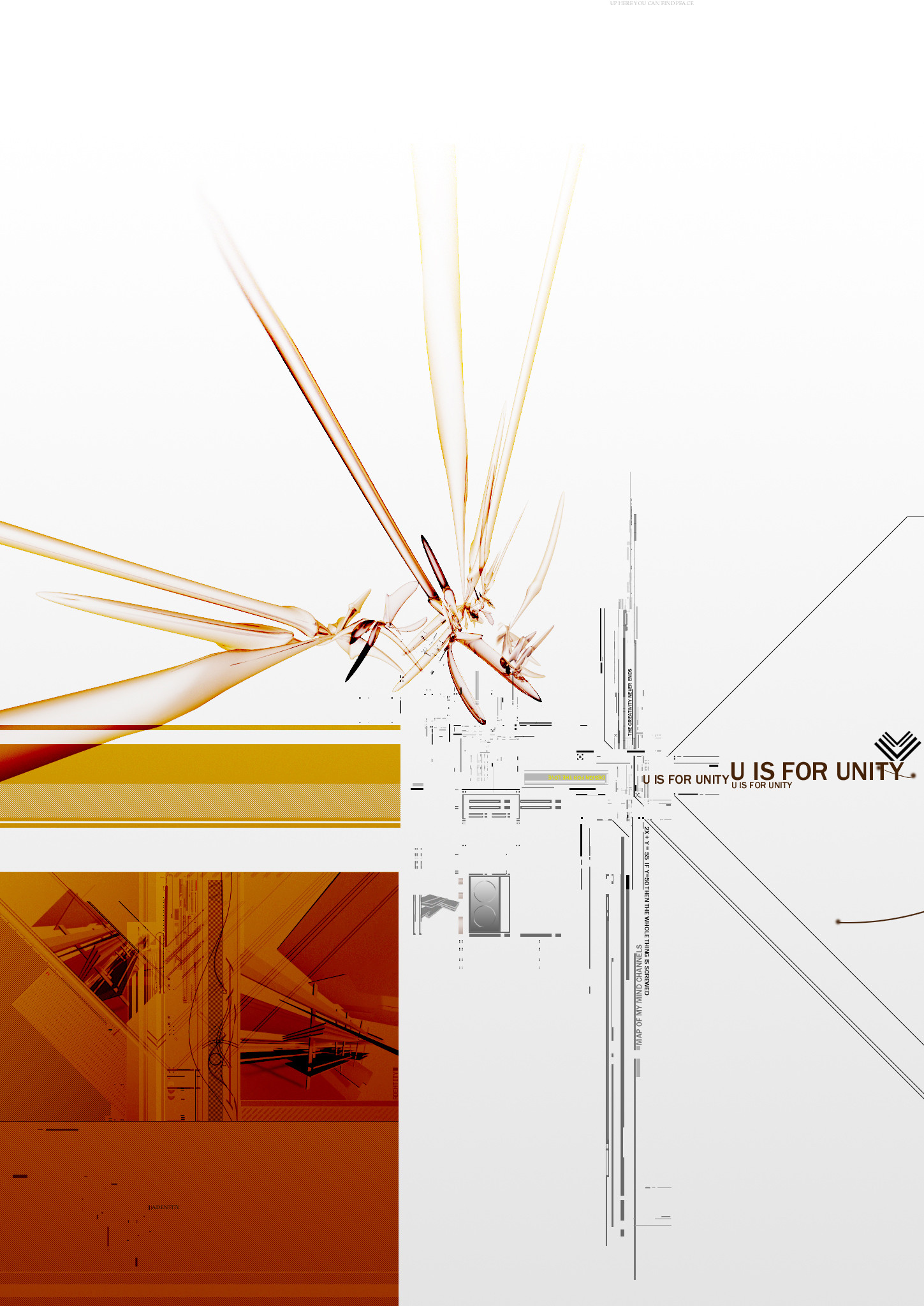
 movezig — First half of unity project
Published: 2002-09-30 00:59:52 +0000 UTC; Views: 5486; Favourites: 65; Downloads: 388
Redirect to original
Description
This is the top left half of the Unity project im doing for adentity.Related content


Comments: 83

Superb...A masterpiece!!!Can´t believe how great it is!! Love the hole thing! peace out!!
👍: 0 ⏩: 0


ouch, fix those jaggies, they really hurt on such a light backgound. Some nice 2d effects but i think the 3d is lacking a bit. IMHO the composition could be alot better, it will be interesting to see if the piece on a whole corrects this factor
👍: 0 ⏩: 0

Actually aint my style i really love, but the how u worked it out, the result is just very cool.
The only part i dont like is the upper opbject, there are some pixelation on it but fuck it^^
+favs man
👍: 0 ⏩: 0

yes.. indeed..i love the bottom left especially.
some minute AI problems with those 3d forms...after all this is going to be a poster..
looking forward to the other three!
👍: 0 ⏩: 0


A D E N T I T Y : ) have to send me that print of it, congrats front page
👍: 0 ⏩: 0

tight design. great colors. keep up the great work!
👍: 0 ⏩: 0

im not so sure about the abstract 3d objects... it could use a bit of anti-aliasing... i like clarity- minimalism is gr8 tho, very functionable, reminds me of russia... hah....
👍: 0 ⏩: 0


wow.................. Teach me your powers! hehe
+Favs
👍: 0 ⏩: 0

Yeah..um, spiffy and all, but like ass-itch is trying to say, in your description, it would be "there" not "their". Their is the possesive one..
👍: 0 ⏩: 0

OMG wow... this is sheer l33tness.. going straight into my +fav man.... definitely belongs in there wif the l33t stuff
👍: 0 ⏩: 0

well i dont want to be the first not to fav this... and even know i loved it the first time you showed me, I still love the detail just as much. wonderful piece, as the colors and composition of the balance in objects and overall concept are great. wonderful.
👍: 0 ⏩: 0


Yes, +fav indeed.
The typography is so intricately perfect, and the box in the bottom left is hot!
Only thing I don't like is the 3d in the center is a TINY jaggy.
👍: 0 ⏩: 0


wooaaaa
man nice to see u submitting again, specially when ur work is so dope like.
u rule this fucking place
👍: 0 ⏩: 0

thats pretty darn dope guy. keep it up m fellow adentity member
👍: 0 ⏩: 0

man. thats too sick for me heh. badass! lovely composition. the colors are nice. dope 2d there. great work.
-prelude
-adentity
👍: 0 ⏩: 0

that is dope dude, espeacially the bottom left corner, great to see some stuff from you
👍: 0 ⏩: 0

Slick work, my fellow adentity member I shall respect your being here at last.
_
formalphase
+adentity
👍: 0 ⏩: 0

<= Prev |