HOME | DD
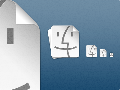
 NanaJ — Paper Finder
Published: 2010-04-03 22:11:49 +0000 UTC; Views: 9204; Favourites: 97; Downloads: 2288
Redirect to original
Description
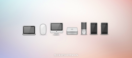
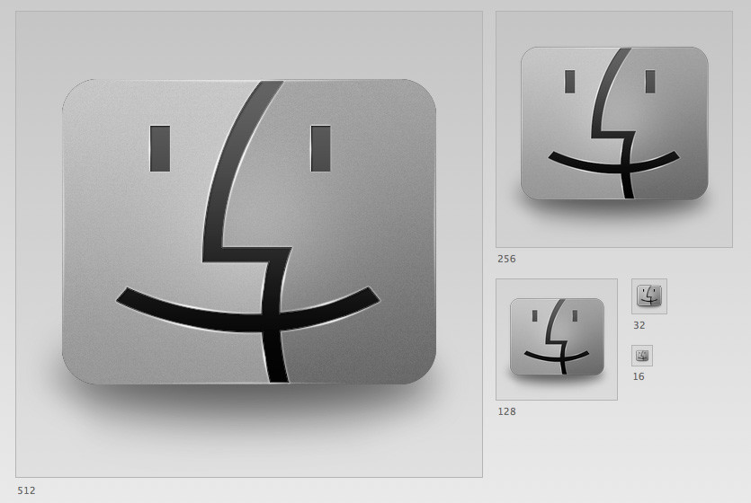
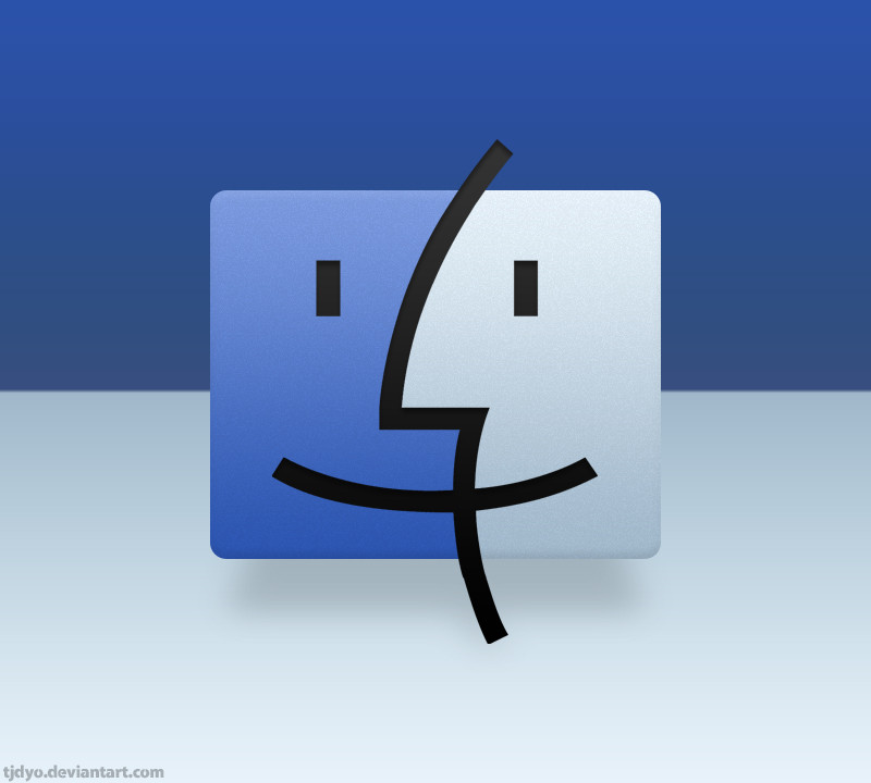
I felt like the Finder's face didn't make much sense when it came to the original metaphor, so I tried to come up with something that fit. Enjoy! (For Windows and Mac)Related content


Comments: 18


 (Smile)")


it would be awesome if you make other icons in that style
👍: 0 ⏩: 0


 (Wink)")


While this is nicely done, I'm really not too sure why only 3 of the 4 corners are rounded. Nonetheless, this is still pretty bitchin.
👍: 0 ⏩: 0


This is cute! It's a little plain for my system, but I can see it fitting in very well on one of those monochrome looks that many people use. I also like how you kept a lot of the Mac interface elements, like corners and the basic Finder look.
👍: 0 ⏩: 0


Such a simple but amazing design, awesome stuff!

👍: 0 ⏩: 0