HOME | DD
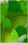
 netghost — ecoglitch-restrained
Published: 2002-11-14 05:20:49 +0000 UTC; Views: 3374; Favourites: 29; Downloads: 1058
Redirect to original
Description
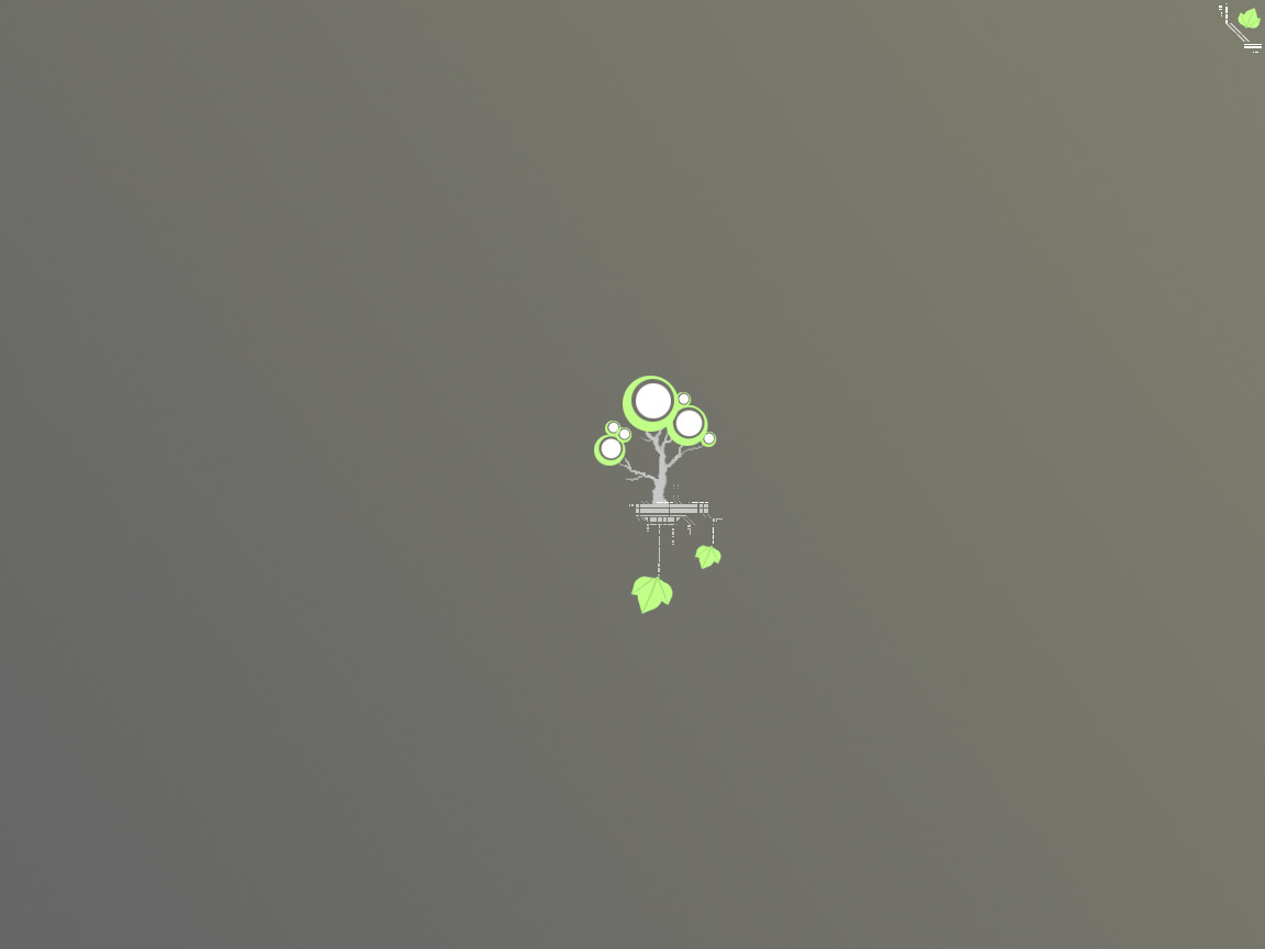
ecoglitch.restrainedEcological glitchy goodness. This is a minimalist musing of mine, a sample of things to come. Though you should know that I can rarely leave an image so simple
1oo% photoshop + tablet + glitch + restraint
.netghost
Related content


Comments: 30

Ah, I was looking for this wallpaper for quite some time. I love it! It will look great on my Desktop in conjunction with litestep.
Amazing job!
")
👍: 0 ⏩: 0

excellent composition!... a bigger version might be good.
 (Smile)")
👍: 0 ⏩: 0


I was looking through the wallpaper section of deviant art - needing something to replace my current one. After scrolling through a couple hundred very bland entries, I realised I was going to have to dig up some old favorite artists and see what they have.
The old favorites always come through.
👍: 0 ⏩: 0


i like this one more than all of your work...the minimalism of it it's amazing...
I will put that in my desktop,...for futher inspiration
keep up the good work
👍: 0 ⏩: 0

This is the best peice i have found on Deviant art. It is now my very inspiring wallpaper. Thank you for your complete originality.
👍: 0 ⏩: 0


this is awsome, though its not really a wallpaper, ill use it as one anyway
👍: 0 ⏩: 0


awesome, love your new direction....I like it so small and simple...Great proportion of the graphic to the negative space on the canvas, very interesting. Good job netghost!
👍: 0 ⏩: 0


thats cool! cool enought to go in to my wallpapers file
👍: 0 ⏩: 0


Yes, there is color banding. It's an artifact of the JPG compression. JPEG apparently does a poor job of compress subtle color shifts. I was thinking of posting a BMP version for download where the color banding is not visible, I still could if anyone would be interested.
Let me know,
.netghost
(Oh and salernopata, I did that on purpose and yes it's my wallpaper now, I like it, it forms that tiny bit of visual tension.
👍: 0 ⏩: 0

Nice looking stuff as usual, but unless this is a wallpaper and that thing in the corner is your "tag", I'd take that corner thing out. I keep wanting to glance away and look at it instead of the tree.
👍: 0 ⏩: 0

Looks great. I always love how you take something that looks "tech" and add the trees/leaves to it. Like everybody else said, love the minamilistic stuff.
The only question I want to ask though is why is there color bands on the gradient, they aren't really that noticable, but for some reason they are sticking out. Anyways great stuff man! (Yes im running 32bit color)
👍: 0 ⏩: 0

love minamilistic stuff like this, the colours go great
👍: 0 ⏩: 0

Simplistic and really nifty...Like WP's clean....Maybe you could have used another grey color but good job...
👍: 0 ⏩: 0


Minimalistic coolness gets the thumbs up from me!
Good Green \ Grey contrasting colours btw.
👍: 0 ⏩: 0

i like the pic in the middle, how the 2 leaves hand down, but grey is a bit too dim for my pref. i prefer either white or black (with glowing leaves )
👍: 0 ⏩: 0

Not sure what it is about this one. Just sexy. And so simple. +Fav. More from you please.
👍: 0 ⏩: 0
