HOME | DD
 new-model — Sub 2017

Published: 2001-10-23 14:07:13 +0000 UTC; Views: 859; Favourites: 3; Downloads: 516
Redirect to original
Description
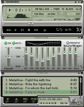
Another oldie for deviantart....Related content


Comments: 15

Weird...
But I like it...
- razer http://subdamage.infernoware.net
👍: 0 ⏩: 0

I love this one, and also it looks JUST, and I mean JUST like my mates Hi-Fi!
-- Dredwerk
MSN IM: Dredwerk
AIM : dredwerk123
👍: 0 ⏩: 0

Great colors, they go very well with the design.
-Tsp
I lost my fetish, will you help me find it?
👍: 0 ⏩: 0


hotta shit... maybe easy, simple, clean, and ar+(ish) color-contrast
👍: 0 ⏩: 0

The colours are great (Blue/ grey-ya cant beat it! )
Also, it all fit together so damn well! Awesome skin dude!
I can see this getting DS!
----------
If the pen is indeed mightier than the sword then the words we write could be used as ammunition for WAR!!
👍: 0 ⏩: 0

ah.. this one is nice.. secialy the EQ sliders.. looks great
_________________
skweenoriffic
👍: 0 ⏩: 0

I dont think the blue title bar goes with the rest of the gray. That's just my opinion.
___________________________
be healthy, eat
keeb
aim: antl hate
http://www.forefrontstudios.net
👍: 0 ⏩: 0

After using it i have to admit its fuckin great!!!
..:: Fu©k M3 B|T¢H ::..
👍: 0 ⏩: 0
I really dig it...except for the blue
its very easy to eyes...
thats a good thing for Wa skinz
Great work!
..:: Fu©k M3 B|T¢H ::..
👍: 0 ⏩: 0

Love it. Totally love it. Love the blending of the blue and grey.
.::[X-treme]::.
-
Lack of updates are due
to an increase in social life
-
👍: 0 ⏩: 0

this is nice but i don't like the yellow tone
=/
[kyle]
http://www.thegrue.com/files/users/satur n/web
👍: 0 ⏩: 0


Cool feel to this. Pulling off the metal style, and not making it look cheap. Nice.
imp: http://imp.poptart.net
devious: https://nard.deviantart.com
cheap- like your mother...
👍: 0 ⏩: 0

You get straight As for this one. Its really cool. The time font is really cool.
:frown:
Gor Crikey!
👍: 0 ⏩: 0