HOME | DD
 oneskillwonder —
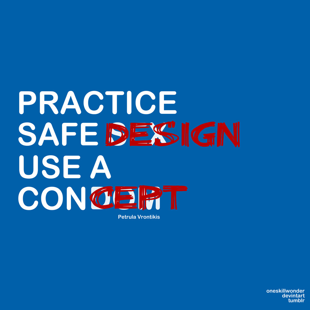
Practice Safe Design
oneskillwonder —
Practice Safe Design
Published: 2010-05-29 13:07:53 +0000 UTC; Views: 42096; Favourites: 1947; Downloads: 1417
Redirect to original
Description
This is my first typography project and there are areas that can be improved so any suggestions are welcome.you can now buy t-shirts/hoodie/sticker here [link]
Done through PS.
Edit:
WOW
I really did not expect this. Thank you so much for DD and to all who like this.
You can download them as wallpaper >[link]
Related content


Comments: 197
")


I know right, had it there forever too.

👍: 0 ⏩: 1


")


Love this one, nice thinking
👍: 0 ⏩: 0


This is hilarious! I love it. I would buy it except I'm flat broke. Cool work though.
👍: 0 ⏩: 1


Awesome... I so wanna print that on a t-shirt O___O
👍: 0 ⏩: 0


I certainly hope you don't mind, but I shared this with my online classmates and Instructor. You have been given credit in class so all is well there.
This is definitely an outstanding message that a lot of designers, professional and amateur, need to get. Well Done!
👍: 0 ⏩: 1

omg thank you so much!! thanks for all your classmates and instructor too!!
👍: 0 ⏩: 1

I want to let you know that this beautiful artwork has been included in my Daily beauties 6 I'd appreciate it if you take a look, perhaps you'll find something to suit your taste. :]
👍: 0 ⏩: 1
AAA! thank you so much!! I really appreciated! I'll definitely look into it.
👍: 0 ⏩: 0
can you give me some suggestions??
👍: 0 ⏩: 1

Here you go: [link]
This is how I would do it. You see what I mean? Here is a version without explanations so you can see how it looks like when it's aligned better: [link]
My deviations aren't so good... I'm just a perfectionist
")
👍: 0 ⏩: 1
thank you so much for taking the time to do all this!!
i'll definitely fix it soon!
👍: 0 ⏩: 1
No problem, I'm glad I could help!
👍: 0 ⏩: 0

jajajaja, funny! True! The two things, sex and design... Great!
👍: 0 ⏩: 0


Oh lol, that is pretty a funny contrast, witty  (Smile)")
👍: 0 ⏩: 0

*fave'd* ... Very amusing, yet thought-provoking, variation on a sad meme of our time.
The contrast works better with this rounded face than it would with any serif one. Those letter-ends also, apropos of "condom," suggest things that fit neatly into other things {grin}
👍: 0 ⏩: 1
i have no better words but your comment is awesome!!!
👍: 0 ⏩: 0


<= Prev |