HOME | DD
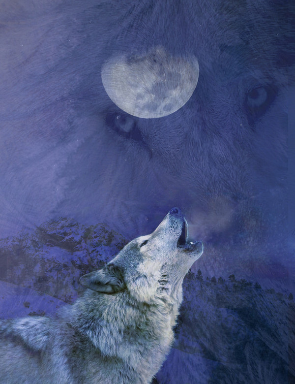
 oORazorIceOo — Crying Wolf.

Published: 2006-06-07 16:46:52 +0000 UTC; Views: 5398; Favourites: 133; Downloads: 241
Redirect to original
Description
New Vector Work, got the inspiration from and idea from Pocohantes, if u recal the part she sings "Have you ever heard the Wolf Cry to the blue corn moon" anywayz would like some comments on it
THIS ONE IS DEDICATED TO DANA.
Related content


Comments: 241

great silhouette, and the lighting in the sky is excellent
👍: 0 ⏩: 0

That's really cool for vector art. It actually looks 3-D. Nice job!
👍: 0 ⏩: 0

Very beautiful and serene work. I love the blue tone work and the lighting, a very peaceful atmosphere
👍: 0 ⏩: 0

wow, this is really good, i love the silouette (cant spell lol)
👍: 0 ⏩: 0

the outline looks great in this!
very nice job
👍: 0 ⏩: 0

i really like this......has a very surreal quality to it....i particularly like the tones of the hills and how the light hits them
👍: 0 ⏩: 0

Simple and pretty. I like how the hills look like a paper cutout.
👍: 0 ⏩: 0

I like it, especially the cartooness of the hills!
👍: 0 ⏩: 0

Wowwee! Thats so awesomee!! Keep up the great work, I love the colours used.
👍: 0 ⏩: 0

this is great simplistic yet clear and detailed good work
👍: 0 ⏩: 0

Great use of color, and I love how you did the hills. There looks to be a lone cloud in the middle of the picture... It is kind of distracting. Maybe adding a few more clouds will help balance it out.
👍: 0 ⏩: 1

Thanx for the comment  (Smile)")
👍: 0 ⏩: 0

I like the blue and black coloration. It reminds me of something out of a book or a movie.
👍: 0 ⏩: 0

Very soft and wonderful. I love the overall feel.
👍: 0 ⏩: 0

nice tone, but I think I'd like the hill lines to be a bit less harsh
👍: 0 ⏩: 0
nice tone, but I think I'd like the hill lines to be a bit less harsh
👍: 0 ⏩: 0

I really love the shading on this piece, and how the moonlight falls on the hills. Really neat. I love Pocahontas ")
👍: 0 ⏩: 0

its cool, but yeah i would love to see a bit of reall landscape in there
and a lightneing bolt! jk
👍: 0 ⏩: 0


Though the hills the wolf is standing on is that realistic, it's still really nice.
👍: 0 ⏩: 0
Blanke In reply to ??? [2006-06-11 23:20:35 +0000 UTC]
The color blue is awesome, and so are monochromes that aren't just black and white, so this caught my eye right away, naturally. Those are some really nice shades of blue you used for this; it makes the image very soothing and reflective. (reflective as in thinking deep thoughts, not bouncing off light...) and I like the lighting, with one ray from the moon shining down on the wolf. I'd give a critique, but I really can't find anything wrong with this. Part of me is thinking that there's too much blank black space on the bottom and some should be cropped out, but the other part is saying that makes it clearer that the wolf is standing on higher ground.
👍: 0 ⏩: 0

I love the colours, the blue and black are really good together. The moon seems a little too blue, but apart from that, it's cool! The round hills work well, and I like the colour gradient on them
👍: 0 ⏩: 0

This actually looks really nice, althought I enjoy much crisp looking artwork. Its nice anyway.
👍: 0 ⏩: 0

I like the blue and that it's so clear and crispy, almost minimalistic. I'd crop it a bit at the bottom though. Or perhaps add something there, now it's just dark.
👍: 0 ⏩: 0


really simple but the dark and lighter shades of blue make it really intense
👍: 0 ⏩: 0


Very nice. Excellent use of shadows. Great attention to detail.
👍: 0 ⏩: 0


Wow, that's absolutely AMAZING. There's so much detail in this compared to a lot of other vectors. Nice job.
👍: 0 ⏩: 1


It looks a little simple (what do I know?)... but it looks nice in it's simplicity.
👍: 0 ⏩: 0

i really love the tone..
btw, how did you do the bg?
👍: 0 ⏩: 1
all by photoshop soft brush with blues and whites.
👍: 0 ⏩: 0


Gorgeous work. I really like this
👍: 0 ⏩: 0


I love all the different shades of blue in this
👍: 0 ⏩: 0

i like especially the colours! they r so cold & let me fell the loneliness . . .
👍: 0 ⏩: 0

IMO the landscape is fine...goes with the whole...ummm...how do i put this....simple lines art direction...thingo...u know?
all in all a great piece of work!! do i see a print option coming up in the near future?
 (Wink)")
👍: 0 ⏩: 1
hah
anyway thx for the comment!
👍: 0 ⏩: 1
👍: 0 ⏩: 0")
yeah

all in all a lovely piece
I think tis could be really cool too if you make it with a terragen background
👍: 0 ⏩: 0
<= Prev | | Next =>