HOME | DD
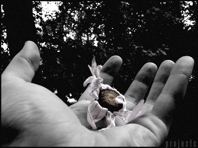
 projectc — projectc - a dying hope - bw
Published: 2003-09-02 10:36:48 +0000 UTC; Views: 361; Favourites: 3; Downloads: 119
Redirect to original
Description
The basic version of [link] without the purple overlay. This was more true to what I first envisioned, but decided to go with the purple of the first submission. It just seemed to stand out a little more. But after a few comments and me looking it over again, I realize the purple does distract from the overall meaning of the photo.In this I added a slight bit of color to the flower, to emphasize the little hope that is left. I also added a little bit of a grainy feel to give it more of an older look to it.
All the purple haters, this one's for you.
Related content


Comments: 4

Incredible... effective, it seems as if it was caught as it was falling, the little bit of hope... a perfect moment.
👍: 0 ⏩: 0

Funny thing is, I LOVE purple, but I think this looks 10x more effective.

👍: 0 ⏩: 0

Awesome!! I really love... good job on b& w!!
Continue...
👍: 0 ⏩: 0

 (Smile)")