HOME | DD
 pseudopod — TECH DUMP
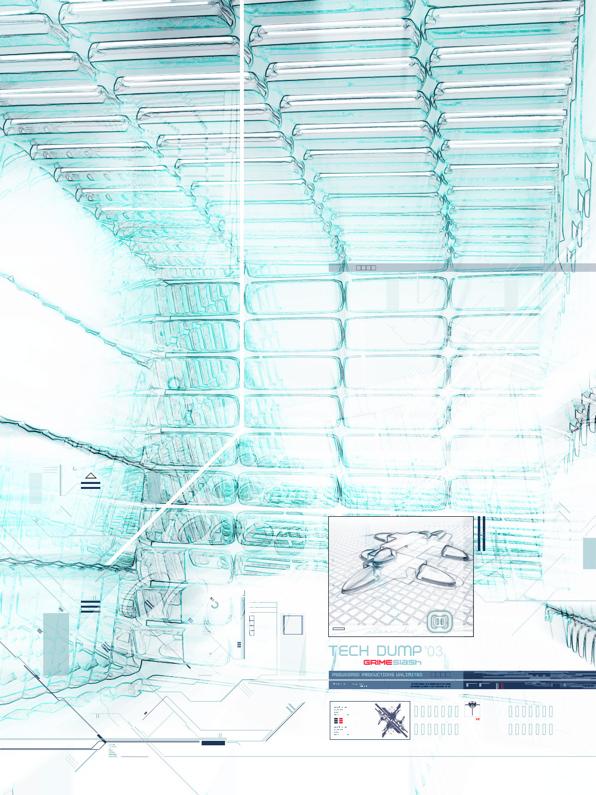
Published: 2003-01-09 11:25:33 +0000 UTC; Views: 2286; Favourites: 19; Downloads: 254
Redirect to original
Description
GRIME SLASHRelated content


Comments: 36


reminds me of ice !
i always wonder how you do stuff like this ! really impressive work mate !
👍: 0 ⏩: 0

Wow, this is stunning, simply stunning...
A really sensitive combination of some diverse elements - they provoke a feeling of unity and totality, really comprehensive and detailed vector/2d compliments the savvy 3d work - beautiful image!
👍: 0 ⏩: 0

arghhh! again with the inverse of my screen resolution! so frustrating . ah well still an awesome image, i rotate 90degrees to use as a wp, but the text going the wrong way looks dodgy...
. anyway good work, as always, keep it up
.
+fav for the hell of it
👍: 0 ⏩: 0


that edging effect has never been to my liking, honestly.
👍: 0 ⏩: 0


oh man thats sweet... it really has a tech look to it.. like somthing in production sweet job man
👍: 0 ⏩: 0

i faved before i commented
awesome!!! love the blending, love the feel of a hand drawing, love the colors... the structure... love everything! yum!
👍: 0 ⏩: 0


an interesting mix of hues... almost dangerous. it works quite well though, the shock of having these usually conflicting hues is overlooked by the positioning and framing of the differing elements.
👍: 0 ⏩: 0

very nice vectory work and 3d...nice deoth as usual also..the concept is good..A bit bright in my view but still nice.
👍: 0 ⏩: 0


wow. I love the almost transparent look of the objects, the shadows and reflections on them are great. There are so many different elements in this that I love. Blah blah blah, just a lot of myself repeating... basically I like this a lot, excellent job and awesome style.
👍: 0 ⏩: 0


I like the washed out/distorted colors and the great shapes. I especially like the form in the box. The 2D word ain't bad either.
👍: 0 ⏩: 0

Great Golly Majesub!!!
i think i just....... (being good, being good)
ya... i'm going to have to take you off my devWatch for fear of death!!
just plain mad work dahling!!!
👍: 0 ⏩: 0


this'd be a pretty cool print...would definately brighten up anyones room or office.
👍: 0 ⏩: 0


Absolutely dreamy. The bottom corner looks like a calendar.
👍: 0 ⏩: 0


You have great talent and I love your designs. Love the color and perspective of this piece. Great work.
👍: 0 ⏩: 0

I love the style, and the concept, and you do a good job of this modern futuristic stuff. LOVE IT!
👍: 0 ⏩: 0

wow this is pretty cool, it looks almost sketched in pencil or something
👍: 0 ⏩: 0


wow man...gotta love that style..i just love the composition and depth you get with these excellent
👍: 0 ⏩: 0

this looks really nice, i've seen this style from you for awhile now. i like how it's bright, but it appears sketched over roughly, with frustration. it's kind of an angry piece but not in the sense that it makes me feel angry, it looks like it was put together in a fit of rage, kind of. my favourite section is the piece that looks like a softly sketched aeroplane, my eye is kind of drawn to it, that square of this looks calm, put together with love.
👍: 0 ⏩: 0


I really love your designs, mate!
The background is nice, but my favorite is the bottom right corner. You know your alignements!
👍: 0 ⏩: 0