HOME | DD
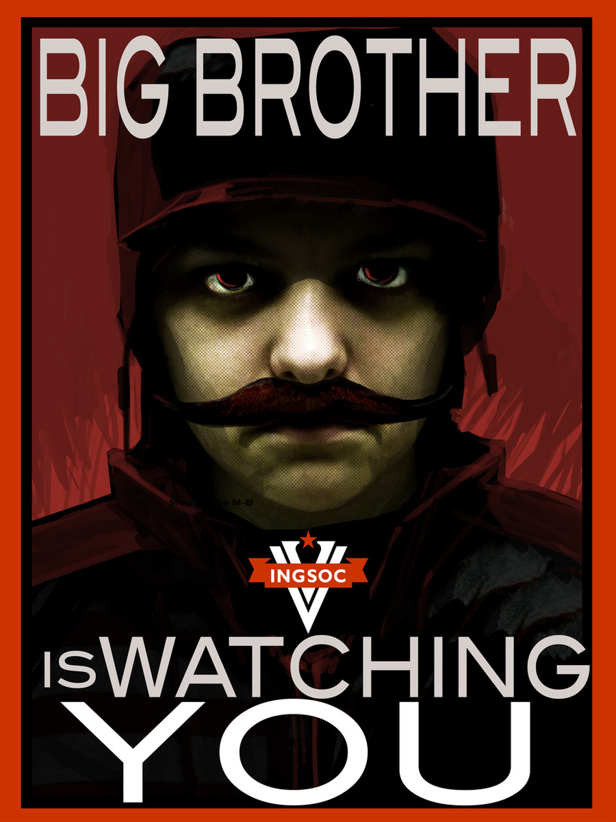
 Pythosart — Big Brother
Published: 2012-01-25 13:56:47 +0000 UTC; Views: 1500; Favourites: 26; Downloads: 0
Redirect to original
Description
This is for a school project. That up there is me with a moustache and a whole lot of Photoshop.If you hadn't guessed, we're reading 1984.
[EDIT] Fixed text, made moustache more moustache-y
[EDIT] Changed font and border colors
Related content


Comments: 25

Is it just me or does the original face kinda resemble yours? Might be the lighting... IDK
👍: 0 ⏩: 1

That would be because it's a photo of me
")
👍: 0 ⏩: 1
Lol K. I didn't want to say: "THAT'S YOU!" and you say: "Nope, I used an ugly cow picture for this." That would be so awkward.
👍: 0 ⏩: 1

 (Wink)")

Haha- in the thumbnail I thought it looked an awful lot like Stalin. Must be the mustache. Instead of it being a self portrait, if it was a portrait of Sam, it would be terrifying.
👍: 0 ⏩: 0

Haha. And with all the SOPA and PIPA junk going on too...
👍: 0 ⏩: 1
I'm such a rebel. PUCK THE FOLICE
👍: 0 ⏩: 0

Wow. Way to have only like the best project in the class. That is amazing. Honestly, it doesn't look that much like you. Mad photoshop skills ftw.
 (Smile)")
👍: 0 ⏩: 0

What a coincidence! My school is putting on that play... xD And I'm gonna go watch it.
👍: 0 ⏩: 1
We're just reading it for AP English IV
👍: 0 ⏩: 0

Given I'm doing graphic design at Uni, I've picked up a few typography skills and you may want to adjust the kerning on "WATCHING" so that the "WAT" isn't so spaced out and the "HIN" isn't so packed together. If you have a program able to do that .-. artistic wise, I would give the moustache a dryer texture; add some greyish tones to the top with flicks of fine brushes outwards to suggest hair. It'll blend more with the nose this way. The placement of the "IS" might be better if put with "WATCHING", so it's all on the same line.. perhaps. Aside from that it's interesting! I can't give you my thoughts as to how it relates to the book because I haven't read it, but, the colours together are nice and I like how you've edited the skin. Another concern is that.. given you needed someone with a British accent, is this set in Britain? 'Cause it's a very American style looking poster with Russian colours and boldness.
👍: 0 ⏩: 1
Thanks! I'll fix it next period. I find it funny that I know what kerning is. It's probably from being on dA way too much.
It's set in London, 1984, under the control of a governing body known as "The Party". The British Isles have been renamed "Airstrip 1" and are part of a superpower known as Oceania (made up of the Americas, the UK, Australia, and South Africa). 1984 world map [link]
The posters are supposed to reflect the Communist propaganda. I mean, look:[link] [link] [link]
This is George Orwell we're talking about here.
I am curious, though. How does it look American? I wouldn't know.
👍: 0 ⏩: 1
It's the font you chose with those blocky serifs and the relatively thick boarder; it strongly associates with American highschool gym teams xD and the width of it too. The goldness of the boarder and the slightly desaturated shade of red. It would definitely feel more British if you had a dark shade of blue in there somewhere.. but.. that might communicate more of a democracy.. maybe whiten the gold and use a harsher, brighter shade of red, akin to the INGSOC banner.
👍: 0 ⏩: 1
Ah, I can see that. I'll change it on the dA copy but unfortunately I had to go ahead and print it last night so we could finish filming. I would be happy to print you a smaller copy of the new version if you don't like the original. The big color prints are $23 for matte finish, $30 for gloss D:
How does it look now? I decided to be rid of the yellow entirely and replace it with black. The yellow was far too bright for my taste.
👍: 0 ⏩: 1
xD don't worry about printing me a copy lD
It looks better. I think the "IS" should be the same size as "WATCHING" though and the "YOU" and "WATCHING" aren't contained within the black boarder either D: experiment with making the black boarder the strong red and the outer red boarder, white? .. I'm not sure if that would improve it.. but, it's looking much more appropriate xD
👍: 0 ⏩: 0

")
Oh yes, I have a moustache.
👍: 0 ⏩: 0


1984? I would have guessed "My Little Pony: The Mystery of Pinkie Pie's Lost Diary."
👍: 0 ⏩: 1
Well, that's pretty close. I can see how you would mistake it for that.
👍: 0 ⏩: 0